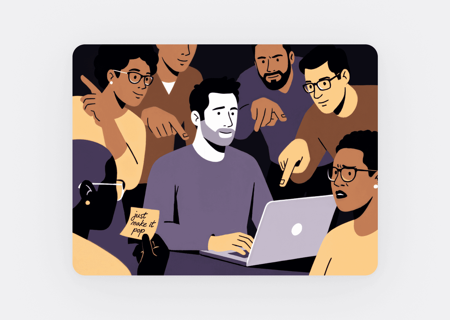
What Series A SaaS Teams Get Wrong About Product Design
Series A SaaS teams treat product design as polish. It isn't. Here are five UX design mistakes that compound quietly — and what to fix before your next raise.
Key takeaways
- Hiring UI designers to fix UX problems polishes broken screens while activation stays flat and churn quietly accelerates.
- Designing dashboards for the executive buyer's demo neglects daily users, producing products that sell well but retain poorly.
- Validating a flow with one 30-minute user interview kills bad designs before engineering wastes three weeks building them.
- Skipping a design system makes teams ship up to 52% slower and erodes the trust B2B buyers need.
"When we see startups pitch product-led growth as their primary GTM strategy with zero product design experience on the team, it's an immediate red flag."
That's Sandhya Hegde, General Partner at Unusual Ventures. She's not talking about taste. She's talking about survival.
Most Series A SaaS teams are making the same product design mistakes right now — not because they don't care, but because they have the wrong mental model of what SaaS UX design actually is. It's not decoration. It's the structure of how your product works. And when that structure is wrong, no amount of visual polish fixes it.
These are the five mistakes we see most often, what they actually cost, and what to do instead:
- Treating UI polish as a UX solution
- Designing for demos, not for daily users
- Building features without validating the UX first
- Skipping the design system
- Treating onboarding as an afterthought
Why Series A is the inflection point
At Seed, speed is the right priority. You're validating assumptions, cutting corners, shipping to learn. Design debt is almost always the correct trade-off at that stage.
At Series A, the priorities change. Now you're optimizing for activation, retention, and conversion at scale. The product that got you here — with its founder-logic UI, inconsistent patterns, and shortcuts — isn't the product that gets you to Series B. The design decisions you deferred at Seed start compounding against you, quietly, in churn metrics and activation rates that don't respond to engineering work alone.
This is the moment most teams double down on the wrong things.
Mistake 1: Treating UI polish as a UX solution
This is the most expensive mistake in SaaS design, and the hardest to see from the inside.
Your designer ships beautiful screens. Investors say the product looks great. The sales team uses the new UI in demos and it closes deals. Everything feels like momentum.
Then six months later, activation is flat. Power users complain they can't find things. Support tickets are rising. Churn is quietly accelerating.
What happened: the team hired UI designers to solve UX problems. The screens look polished, but the architecture — the information structure, the user flows, the mental models — is broken. As one UX practitioner put it bluntly:
"Most companies hire UI designers to solve UX problems, then wonder why their beautiful app has terrible retention."
This happens because UI is visible and UX is structural. A founder can point to a screen and say "make this better." UX requires understanding why users navigate the way they do, what they're actually trying to accomplish, and where friction exists in their real workflow — before touching a single pixel.
The signal: if your design reviews spend more time on visual details — spacing, color, font weight — than on flow, task completion, and drop-off points, you have a UI team doing UX work. They're optimizing the wrong variable.
The fix isn't hiring more designers. It's changing what design is measured against. Activation rate. Time-to-first-value. Trial-to-paid conversion. Those are UX metrics, not UI metrics, and they need to be the brief. If you're not sure where your product's UX breaks down, a structured UX audit is usually the fastest way to find out.
Mistake 2: Designing for demos, not for daily use
B2B SaaS products serve multiple audiences simultaneously: the executive buyer who approved the budget, the admin who manages configurations, and the daily users who live inside the product every working day.
Series A teams almost universally prioritize the first group. Dashboards get packed with analytics, KPI summaries, and executive-level reporting that looks impressive in a 45-minute sales call. The daily user experience — the workflows people repeat dozens of times a week — gets neglected in favor of the demo.
The result is a specific and painful churn pattern: the product sells well but retains poorly. The champion who signed the contract is satisfied. The people actually using it quietly stop using it. Renewal conversations get difficult.
Part of this is Conway's Law in practice. Startups build UIs that mirror their internal team structure rather than user tasks. Navigation is named after engineering concepts or internal departments instead of what users are actually trying to do. The product makes perfect sense to the people who built it — and confuses everyone else.
"Founders build interfaces that mirror system architecture instead of user goals."
The user is not the person who understands your system. The user is the person who needs to accomplish a task.
The discipline required: separate your demo environment from your product metrics. Let your sales team have what they need to close deals. Measure the product team on what daily users actually do — activation, feature adoption, session frequency, and retention. Those two scorecards will often point in different directions. Follow the retention one.
Mistake 3: Building features without validating the UX first
The sequence matters more than most teams realize.
The typical build order at a Series A startup:
- Engineer a solution
- Design the UI
- Ship it
- Wait for feedback
The correct order:
- Understand what the user is actually trying to accomplish
- Validate the flow and structure before designing
- Design the interface
- Build
The trap is designing for yourself. Founders understand their product deeply — the backend logic, the data model, what every setting does. That knowledge creates a blind spot. They build interfaces that make perfect sense to someone who knows the system and are confusing to everyone else. The product feels intuitive to the team that built it and opaque to everyone who didn't.
One 30-minute user interview can kill a bad flow before engineering spends three weeks building it. Every hour spent in discovery saves three to five hours in redesign. This isn't a design principle — it's a math problem.
The minimum viable process: before any new feature goes to design, someone on the team needs to have watched a real user attempt to accomplish the relevant task. Not assumed what they'd do. Watched.
The business case: what the numbers say
Before continuing, the ROI context is worth establishing — with one honest caveat.
McKinsey tracked 300 companies over five years and found that top-quartile design organizations achieved 32 percentage points higher revenue growth and 56 percentage points higher total shareholder returns than their peers. These aren't SaaS-specific figures — the study covers medical technology, consumer goods, and retail banking. But the directional logic holds.
The SaaS-specific mechanisms are concrete:
Activation: Better onboarding and first-session UX converts more trials to paid. Even a modest improvement in trial-to-paid conversion — say, from 8% to 14% — compounds significantly at scale without adding a single dollar to acquisition costs.
Retention: UX friction is a leading indicator of churn. Users who can't accomplish their goal in a reasonable number of steps don't stay. They cancel quietly at renewal.
Engineering velocity: Uber rebuilt their design system in 2018 and cut feature delivery time from 8 weeks to approximately 2.3 weeks. Not by adding engineers — by eliminating the design fragmentation that was making every sprint slower.
Tomer London, co-founder of Gusto, put it plainly:
"Design is still the most under-appreciated part of what makes startups win. Truly understanding that puts you ahead of 90% of the competition."
Mistake 4: Skipping the design system
This one has a slow fuse.
At Series A, your product typically has three to five major flows, each built at different times by different people under different constraints. Buttons look slightly different across sections. Modals behave differently depending on where you are. Error states are inconsistent. Color usage is arbitrary.
Users notice this — even when they can't articulate it. Inconsistency signals instability. In B2B SaaS, where trust is foundational to the product relationship, visual and behavioral inconsistency erodes that trust more than founders expect.
Jeff Kalmikoff, who served as first or sole designer at Digg and SimpleGeo, described the debt problem directly:
"If you don't take on design debt the same way engineers take on technical debt, you're not going to be able to make progress at the same rate."
He wasn't being abstract — he was describing the moment when every new feature takes longer than it should because every team is making the same low-level decisions from scratch.
Without a shared component library, developers rebuild slightly different versions of the same elements repeatedly. Research suggests teams without design systems ship up to 52% slower. That's not a UX problem in isolation — it's a business velocity problem.
The investment required at Series A is real but bounded: roughly $50K–$100K to build a foundational system. Within 6–12 months, that typically pays for itself in recovered engineering hours alone — not counting the retention benefit of a more coherent product experience.
The common objection is timing: "we'll do it when we have a bigger team." This gets it backwards. The bigger the team gets without a system, the more expensive the system becomes to build. Build it while the codebase is still manageable.
Mistake 5: Treating onboarding as an afterthought
Onboarding is where retention is won or lost. Not in the core product — in the first session.
The most common failure pattern: users log in for the first time and see an empty dashboard. No data, no guidance, no clear next step. In our experience reviewing onboarding flows across B2B SaaS products, the majority present new users with a blank state and expect them to figure out what to do next.
The pattern compounds. Feature-first onboarding tours that walk users through every button before they've seen any value. Generic flows that treat a developer and a marketing manager identically. No clear next step after the first successful action. Each additional minute of required onboarding reduces trial conversion by approximately 3%.
A 12-step onboarding flow isn't just slow — it's directly destroying revenue. The math is merciless.
The teams who get this right operate on a single principle: get users to their first meaningful outcome as fast as possible. Everything else — secondary features, account configuration, advanced settings — waits until after the user has seen the value of the product for themselves. We've written a detailed breakdown of what high-converting SaaS onboarding actually looks like if you want to go deeper.
David Dat Nguyen, first designer at Gusto:
"If you wait to start thinking of structure when the team is larger, it's already too late."
Onboarding is structure. If it isn't designed deliberately from the start, it gets bolted on later — and it never works as well as it would have if it had been built into the product's architecture from the beginning.
What the right design motion looks like at Series A
Teams that get design right at this stage share a few characteristics.
They treat design as a business function, not a delivery function. Design decisions are tied explicitly to activation rates, trial-to-paid conversion, and retention — not to how good the product looks in a screenshot or a sales demo.
They validate structure before building. Discovery and flow definition happen before anything goes into Figma. User interviews happen before engineering begins. The process sounds slow; it's actually faster, because it eliminates the expensive redesign cycles that happen when you skip it.
They invest in systems early. Not perfect systems — just enough standardization to prevent the fragmentation that will slow down every engineer and designer who joins after Series A.
They separate what the sales team needs from what the product team is measured on. Both matter. They're not the same thing.
And critically: they have someone responsible for this who isn't also responsible for everything else. Founder-led design works at Seed. It breaks at Series A — not because founders can't design, but because they can't also be designing while running fundraising, hiring, and customer conversations simultaneously.
A note on how you resource this
There's a practical question underneath all of this: who does the work?
| Full-time hire | Freelancer | Embedded team | |
|---|---|---|---|
| Cost | $13.5K–$18K/mo loaded | $20–$40/hr, variable | $4K–$7K/mo T&M |
| Time to start | 2–4 months to hire | 1–2 weeks | Days |
| Context retention | High — but takes 3–6 months to build | Low — resets each engagement | High — compounds over time |
| Management overhead | High (HR, onboarding, career pathing) | High (briefing, reviews, re-onboarding) | Low — integrates into your workflow |
| Best for | Series B+ with stable roadmap | Isolated one-off tasks | Series A–B moving fast |
Full-time senior designers carry a fully-loaded cost of $13.5K–$18K per month — salary plus benefits, taxes, and overhead. Add 2–4 months to hire and another 3–6 months before they're genuinely effective. That's a significant runway commitment during a period when priorities are still shifting.
Freelancers look cheap at $20–$40/hr, but the math changes when you factor in management overhead, re-onboarding every engagement, and the context that evaporates between projects. At 80 hours a month, you're paying $1.6K–$3.2K for fragmented, part-time attention with no continuity.
An embedded team at $4K–$7K/month delivers senior output, accumulates product context over time, and costs 40–60% less than a full-time hire — without the recruiting cycle.
The embedded design team model — a dedicated senior designer (or a small embedded team) integrated directly into your product workflow, your Figma, your standups — exists because the timing problem at Series A is real. You need senior-level execution now, without the overhead of a full hiring cycle.
This is how we work with Series A and Series B teams at Masterly. If you're at that inflection point and want to understand what the right design motion looks like for your specific product and stage, the conversation starts here.