AI Product Design: How to Build Interfaces Users Actually Trust
84% of developers use AI tools. Only 29% trust the output. We break down the UX patterns that close the gap — with real product examples, failure cases, and a framework for building AI interfaces that earn trust.

Users adopt AI products they can verify, not just use: 84% of developers use AI tools but only 29% trust the output. The interfaces that close that gap follow four principles — show reasoning, signal uncertainty honestly, defer to humans on irreversible actions, and design recovery paths for the moments the AI is confidently wrong.
Key takeaways
- AI adoption and trust are diverging: 84% of developers use AI tools but only 29% trust the output to be accurate.
- The core failure mode is confident wrongness at a high-stakes moment with no recovery path, as Air Canada, Klarna, and Cursor show.
- Design AI interfaces around four principles: Show reasoning, Signal uncertainty honestly, Defer to humans on irreversible actions, and Recover from errors.
- Onboard by showing one useful job on the user's own content, and state what the AI cannot do as core onboarding, not fine print.
There is a widening gap at the center of every AI product right now. According to Stack Overflow's 2025 developer survey, 84% of developers use or plan to use AI tools — usage is rising every year. In the same survey, only 29% trust AI outputs to be accurate. That's down from 40% in 2024. And KPMG's 2025 global study across 47 countries found that while 66% of people use AI regularly, only 46% are willing to trust it. Usage and trust are moving in opposite directions.
This is not a model problem. The models are improving rapidly. It is a design problem — and the most expensive version of it is a product that users try once, hit a bad answer with no recovery path, and abandon permanently. Trust in AI is asymmetric: many positive interactions to build it, one bad answer in a high-stakes flow to collapse it.
Gartner estimates that 30% of generative AI projects will be abandoned after proof-of-concept, citing poor data quality, inadequate risk controls, and unclear business value. The design teams working on those products didn't fail because their features were technically weak. They failed because the interface wasn't designed for the reality of probabilistic output.
The Failure Gallery: What Destroyed Trust in Real Products
The clearest way to understand AI UX is to study where it went wrong in production. The failures below are not edge cases — they are now the reference cases for what not to do.
Air Canada's chatbot invented a policy it had no authority to create.
In Moffatt v. Air Canada (2024 BCCRT 149), Air Canada's AI chatbot told a grieving customer that a non-existent retroactive bereavement fare discount was available. The BC Civil Resolution Tribunal ruled against Air Canada and ordered it to pay C$812. Tribunal Member Christopher Rivers wrote what should be posted on every AI product team's wall:
"It should be obvious to Air Canada that it is responsible for all the information on its website. It makes no difference whether the information comes from a static page or a chatbot."
The design failure was a single missing constraint: the chatbot had no grounding in actual policy documents and no fallback that said "I'm not certain — contact support."
Klarna replaced 700 agents with AI, then reversed course publicly.
In February 2024, Klarna announced its AI assistant was doing the equivalent work of 700 full-time agents. Headcount dropped from 5,527 to 3,422. In May 2025, CEO Sebastian Siemiatkowski reversed course on Bloomberg:
"From a brand perspective, a company perspective, I just think it's so critical that you are clear to your customer that there will always be a human if you want. As cost unfortunately seems to have been a too predominant evaluation factor when organizing this, what you end up having is lower quality."
The design failure was deploying autopilot without a human escalation path at scale, treating cost reduction as the design brief rather than user outcome.
Apple Intelligence's error state was invisible.
The product's AI summarized news headlines — and got them badly wrong. Summaries falsely reported that a high-profile suspect had shot himself, that a world leader had been arrested, and that a celebrity athlete had come out as gay. Apple paused news summarization on January 16, 2025 following a formal BBC complaint. The critical design failure was the error state: a small glyph marked AI-summarized content, but it was too subtle to protect publishers' reputations or signal to readers that verification was needed.
Cursor's undisclosed AI support agent created a legal and PR incident.
When a race-condition bug caused unexpected subscription cancellations, an AI support agent named "Sam" — with no disclosure that it was AI — told developers that a non-existent "one device per subscription" policy had always existed. Developer cancellations went public on Hacker News. CEO Michael Truell issued a formal apology. Cursor now labels AI responses explicitly. The design failure: deploying an AI agent with no identity disclosure and no mechanism to say
"I don't know the current policy — let me connect you to a human."
There is a compounding dynamic worth naming. As AI compresses workflows that previously required multiple human reviewers into a single-operator task, the "Reviewer Trusts the Research Layer" phenomenon emerges: the professional assumes the AI's high-fidelity, well-formatted output has already been validated. The Deloitte government report incident is the clearest example — a $290K engagement delivered a 237-page document with fabricated court citations and a hallucinated Federal Court judgment. The internal review process was optimized for human error, not for high-confidence synthetic inaccuracy.
The pattern across all these cases is the same: confident wrongness at a high-stakes moment, with no recovery path. Research by Dietvorst, Simmons & Massey confirms this is structural — people lose confidence in AI forecasters faster than in human forecasters after a single mistake, even when the AI demonstrably outperforms. The interface compounds this when it presents every output with the same confident tone, regardless of the model's actual certainty.
The Four Principles: Show, Signal, Defer, Recover
The Masterly AI Interface Framework organizes AI UX decisions into four principles, each addressing a different layer of the trust problem.
Show — make reasoning visible.
Signal — communicate uncertainty honestly.
Defer — know when to involve a human.
Recover — design for when the AI gets it wrong.
Show: Make Reasoning Visible
Users trust what they can verify. AI output presented without reasoning forces users to either accept it uncritically or reject it entirely — neither of which is the behavior you want in a product that competes on reliability.
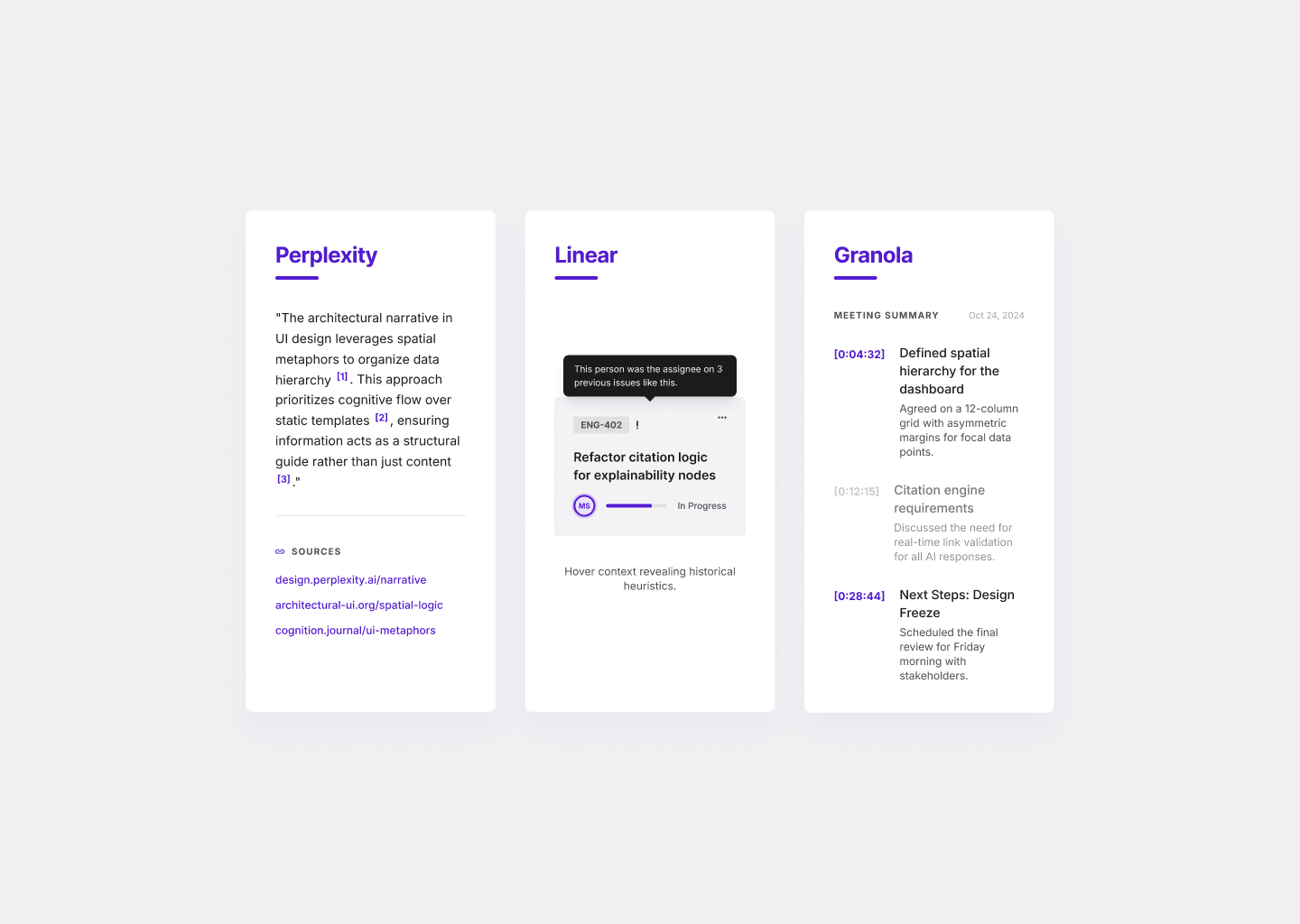
Perplexity is the clearest production example of explainability done well. Every answer shows numbered inline citations placed immediately after the sentence they support. Above each response, a sources panel displays 5–10 cards with favicon, publication, title, and snippet. Crucially, Perplexity will decline to generate an answer when retrieval surfaces no reputable sources — refusal as a trust signal, not a failure state. The interface is saying: "I won't guess. Here's what I found."
Linear's Triage Intelligence uses a different model — natural language attribution rather than citations. A hover on an AI assignment suggestion shows:
"This person was the assignee on previous issues related to performance problems in the mobile app launch flow."
Linear's own framing:
"If you are going to act on AI-generated suggestions, you need to see where they came from and believe in their accuracy. The UI makes that distinction clear, so you always know what came from the system and what came from your team."
Granola pushes timestamp attribution to its logical limit. Every AI-added bullet renders in gray (user-typed content renders in black) and hyperlinks directly to the exact second in the meeting transcript where the information appeared. The authorship distinction is visual and immediately verifiable. Gong does the same for deal intelligence — every AI-generated warning links to the call clip that drove it.
GitHub Copilot takes a different approach entirely: it doesn't explain suggestions in prose. It reduces mystery through context-awareness. The suggestion appears in-line with the code you're already writing, dimmed as ghost text. The implicit reasoning is
"this came from your codebase, your patterns, your context."
The trust signal is familiarity, not citation. It works because rejection is free (one keystroke) and the low commitment cost means users don't need certainty before trying.
In fintech, a particularly powerful form of explainability is the counterfactual: instead of just explaining why a loan was declined, the interface shows what would need to change to get a different outcome —
"If your income were $500 higher, this loan would be approved."
This shifts the output from a verdict into actionable information, which is the difference between explainability as compliance and explainability as product value.
The principle applies across product types. If your AI classifies a support ticket as high priority, show the signals that drove it. If your AI flags a transaction as suspicious, show the pattern that matched. Reasoning doesn't need to be a technical explanation — it needs to be enough signal for a user to say "yes, that makes sense" or "no, that's wrong, let me fix it."
Signal: Communicate Uncertainty Honestly
Not all AI output is equally reliable. The problem is that most interfaces present it as if it were. A label, a recommendation, a summary, a classification — they all look identical on screen, regardless of the model's actual confidence behind them.
MIT research found that AI models use 34% more confident language when hallucinating than when correct. The most dangerous product decision is showing miscalibrated confidence — it is worse than showing none.
Gong's AI Deal Predictor is the clearest example of getting this right. It explicitly states that the score is a percentile rank, not a probability: a deal scored 80 has
"a better chance of closing than 80% of your other open deals"
— not
"an 80% chance of closing."
This single clarification prevents an entire class of misinterpretation that would otherwise cause salespeople to over-rely on the score in the wrong situations.
Grammarly uses visual weight as confidence encoding. High-confidence grammar errors get prominent red underlines. Stylistic suggestions get softer blue, purple, or green — a different color tier that communicates
"this is optional judgment, not a definite error."
Users calibrate naturally without reading any explanation.
Ramp's Accounting Agent adds an icon-and-color hierarchy. Icons signal source (person = human, bolt = rule, AI icon = AI-coded). Colors signal confidence tier — yellow for medium-low with hover details explaining why. Crucially, the AI never overrides values already set by an employee, admin, or rule. There is a clear, visible hierarchy of trust built into the product's visual language.
Stripe Radar deprecated its single raw fraud score in favor of category-specific models — a fraudulent-dispute score, an early-fraud-warning score, a bot score — each with its own threshold and categorical label (normal, elevated, highest). The explicit acknowledgment that a single confidence number is a blunt instrument is itself a trust signal.
The pattern that works across all of these: calibrated confidence, not inflated certainty. Labels like "likely," "needs review," "low confidence," or a confidence-based routing path that escalates uncertain cases to humans rather than presenting everything with equal authority. The goal, as Google PAIR frames it, is not maximum trust — it is accurate trust.
Defer: Know When to Involve a Human
Andrej Karpathy's framing from YC AI Startup School in 2025 now describes how the best B2B AI products are built:
"Less AGI hype and flashy demos that don't work. More partial autonomy, custom GUIs and autonomy sliders."
The insight is that the right level of automation is not a fixed product decision — it is a product surface that should be designed, configured, and surfaced to users.
Cursor's four modes (Tab inline completion → ⌘K inline edit → ⌘L chat → ⌘I Agent) is the canonical implementation. Each mode represents a different point on the autonomy slider. Agent mode streams a live activity log of every file read, write, and command executed — making the AI's actions transparent and stoppable at any point. Automatic checkpoints snapshot state before each action and surface one-click restore on every prior message. The kill-switch is a feature, not a failsafe.
Intercom Fin shows the same principle at the support level. The product is involved in 99% of conversations but resolves 51–65% end-to-end. The remainder escalates with full context — conversation history, customer record, resolution attempt — so the human agent doesn't start from zero. The escalation path is designed, not an accident. Adding a well-designed escalation path lifts best deployments from the ~60–70% resolution ceiling that pure autopilot hits before satisfaction collapses.
A powerful pattern for any agentic or multi-step AI action is the "Action Plan": before executing, the AI shows the steps it intends to take and waits for confirmation. This turns a one-shot command into a collaborative refinement. Cursor's Agent mode does this by streaming the plan before writing code. The pattern is particularly important for irreversible actions — sending an email, updating a shared record, executing a payment — where the cost of a misunderstanding is asymmetrically high.
The general rules for when to defer:
Use human review when the output is hard to reverse (sent emails, published content, executed payments), externally visible (customer-facing messages, public records), or carries legal or compliance consequence (healthcare decisions, financial advice, contract language). The approval gate before irreversible action is not friction. It is the product being honest about the stakes.
Confidence-based escalation is the operational implementation: above a high-confidence threshold, auto-execute; in the middle range, show but require confirmation; below a low-confidence floor, route to human review or decline to generate. Stripe Radar blocks highest-risk transactions by default. All 13+ FDA-cleared AI stroke detection systems alert physicians but require physician confirmation before treatment — regulatory design that forced a good HITL pattern.
The Klarna CEO's reversal is the data point worth remembering. Pure autopilot without escalation is an optimization for one metric (cost per ticket) at the expense of the metric that actually compounds: user trust.

Recover: Design for When AI Gets It Wrong
Every AI product will produce wrong output. The question is not whether — it is whether the interface is designed to handle it without destroying the relationship.
Good AI error recovery has three parts. First, a legible failure state: the interface tells users what went wrong in terms they can act on. Not "something went wrong" — but "we couldn't find an answer in your workspace for this query. Try rephrasing, or expand to general knowledge." Notion AI Q&A uses exactly this pattern: a specific failure message followed by an offer to expand scope.
Second, a correction path: users can tell the system it was wrong, provide better context, or override the output. This is where most products fail. They present AI output as a read-only result rather than a starting point. A summary field that can't be edited, a classification that can't be disputed, a recommendation with no "this is wrong" mechanism — these tell users the system doesn't expect to be wrong, which makes the inevitable mistake feel worse. Diff previews with Accept/Reject UI (Cursor's multi-file review, Copilot's Tab/Esc, Notion's suggested edits) encode this correctly: every AI output is a proposal until the user approves it.
Third, a feedback signal: corrections should improve future outputs or at minimum be acknowledged. The ability to modify output beats any confidence display for reducing algorithm aversion — Dietvorst, Simmons & Massey's 2018 research found that even allowing users to slightly modify algorithmic forecasts dramatically reduces abandonment, even when users don't actually change anything.
The audit trail matters especially in regulated industries. Healthcare, finance, and legal products need to show what the AI recommended, when, based on what input, and what the human did with it. This is not overhead — it is the feature that makes AI usable in those contexts at all. Harvey, the legal AI, publishes a hallucination rate of approximately 0.2% on internal benchmarks and provides a full paper trail of reasoning steps and citations for every output. That paper trail is not a liability disclosure — it is the product's core trust signal.
Onboarding: Teach AI Without a Manual
The four principles above govern what happens during use. There's a prior question that determines whether users ever get there: what happens before the first interaction.
The worst AI onboarding is a product tour that explains what the AI is. The best AI onboarding shows users one useful job, in the real context where the feature appears, on their own content.
Notion's launch retrospective confirms this: the team discovered that users needed to see the feature working on their own documents and databases — not on a demo. The disconnect between "impressive in a demo" and "useful in my actual workflow" is where most AI feature activation drops off. They also found users preferred "Improve Writing" over content generation, which was the opposite of initial assumptions — a reminder that AI onboarding should be shaped by observed behavior, not product intuition.
The specific patterns that work across the products we've studied:
Empty-state suggestion cards with workspace-aware prompts (Notion Q&A shows rotating examples tied to the user's recent pages), one click to insert.
Input-label change as the cheapest onboarding mechanism — Cursor's Composer placeholder changes from "ask me code questions" to "Tell me what to build..." when Agent mode is toggled. The input field itself teaches the new capability.
Opt-in activation paired with plain-language disclosure consistently outperforms opt-out default. Arc Max, Superhuman, and Grammarly Business all require explicit activation — and user trust is measurably higher than products that default AI on.
Interactive sandboxes before deployment (Intercom Fin's preview-against-your-content flow before going live) sets accurate expectations before a single customer interaction.
The most important thing to communicate early is what the AI cannot do. Notion Q&A's documentation lists explicit constraints: "Doesn't search through databases (yet)... Can't reach into private pages you don't have access to... Doesn't have access to wider knowledge." Capability boundaries are onboarding content, not fine print.
One counter-intuitive finding from a Prototypr.ai experiment: inverting onboarding from "explain the system" to "show an AI output first" lifted Day-1 retention by 53%. When value precedes explanation, friction drops and activation rises.
The Masterly AI Interface Framework
Four questions that map to the four principles — and reveal where a given product is leaving trust on the table.
| Principle | The question | Weak signal | Strong signal |
|---|---|---|---|
| Show | Can users see why the AI said what it said? | Output appears with no reasoning or source | Inline citations, attribution tooltip, or explicit reasoning visible |
| Signal | Does the interface communicate uncertainty honestly? | All outputs look equally confident | Calibrated labels, confidence tiers, or "needs review" flags |
| Defer | Does the system know when to involve a human? | AI takes irreversible actions automatically | Approval gates, escalation thresholds, configurable autonomy level |
| Recover | Can users correct the AI and move forward? | Output is read-only, no feedback mechanism | Edit, reject, and feedback affordances on every AI output |
The stakes of getting this wrong are measurable. One documented case shows AI categorization tool adoption collapsing from 89% to 11% within three days — simply because the tool added confidence scores and reasoning after initially shipping without them. Users didn't distrust the AI because it was wrong. They distrusted it because it couldn't tell them how confident it was.
A product that scores "strong signal" on all four dimensions is one where users can calibrate how much to trust the AI, verify its reasoning, correct it when it's wrong, and understand what it's doing — which is the foundation for sustained, expanding usage rather than initial curiosity followed by abandonment.
The Klarna CEO's reversal quote is the right framing for the whole framework:
"I just think it's so critical that you are clear to your customer that there will always be a human if you want."
The companies that learn that earlier will ship the AI products the next decade is built on.
AI products fail not because the technology is wrong but because the interface isn't designed for the reality of probabilistic output. That requires a different design posture: uncertainty made visible, reasoning made legible, humans kept in the loop where stakes demand it, and recovery paths built for the failure case, not just the happy path.
94% of B2B buyers now use LLMs during their research phase. The interface of your AI product is increasingly the first thing a prospective customer evaluates — not the model behind it. Building that interface well is not a UX problem. It is a growth problem.
We help product teams design AI interfaces that users actually trust — and keep using after the first mistake.
Talk to us about your AI product →
Related: Do You Actually Need a Design System? · Fintech Design in 2026: Why Most Apps Look the Same · How to Conduct a UX Audit