Fintech Design Trends 2026: Why Apps Look the Same (And What Works)
We analyzed Stripe, Wise, Mercury, Ramp & Brex — the UX patterns that drive conversion and retention. Real fintech design decisions, not theory.
 Written ByVlad Hrynchuk
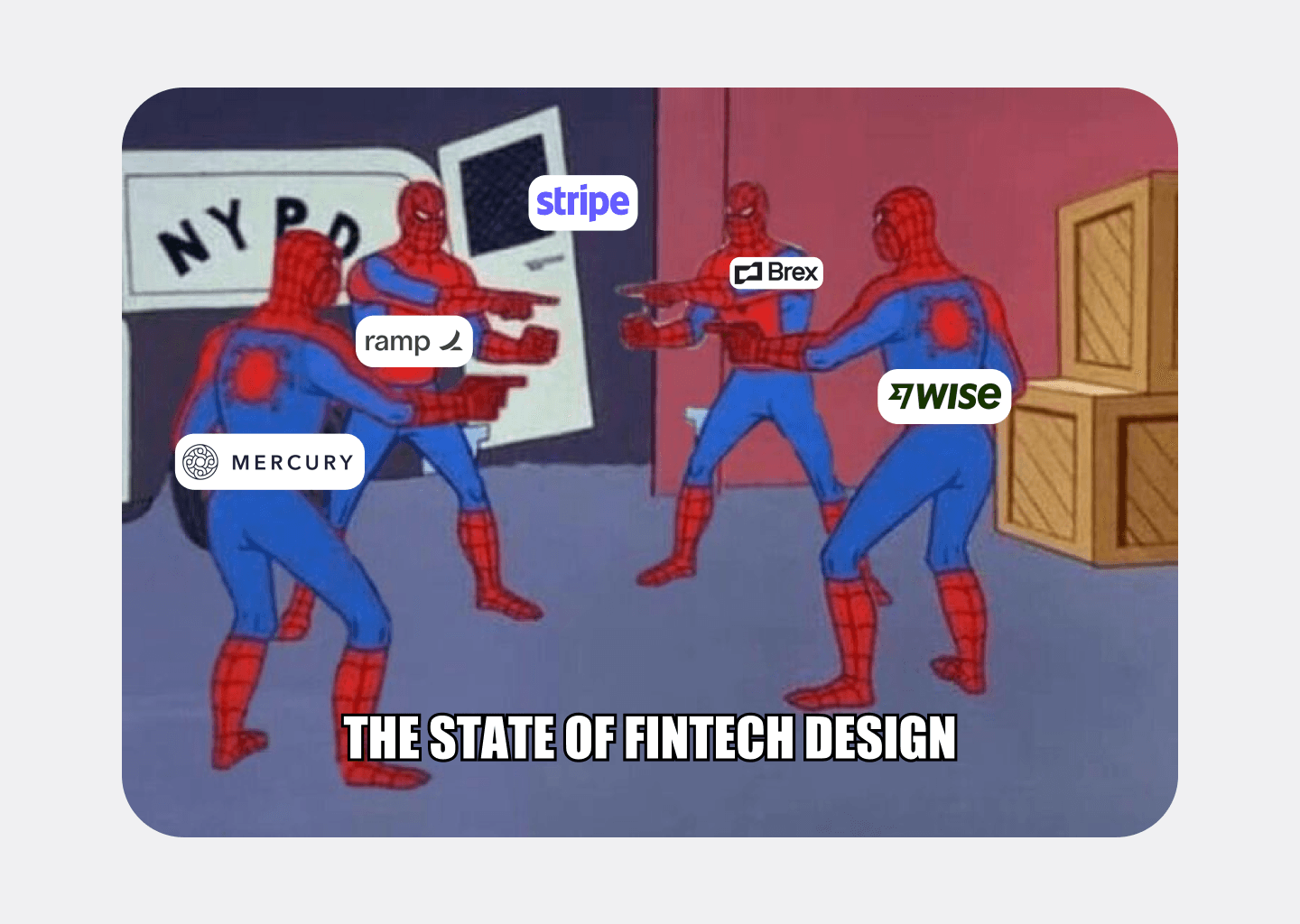
Strong fintech design is a trust system, not a visual style. The pattern behind Stripe, Wise, Mercury, and Ramp: make the core action obvious for one specific user role, show the numbers competitors hide — fees, rates, limits — and treat deliberate friction in high-stakes flows as a feature, not a bug.
Key takeaways
- Most fintech apps copy Stripe's visual surface — dark UI, Inter, monospace, bento grids — but skip the design logic underneath.
- Great fintech design makes the core action obvious for a specific user role, not a generic composite user.
- Trust comes from showing the data competitors hide — fees, rates, limits — not from badges and decoration.
- Ramp's 2024 expense-flow redesign delivered 33% faster reviews and 50% faster repayments through hierarchy, not aesthetics.
Open almost any fintech product launched in the past three years. Dark background or clinical white. Clean sans-serif — almost certainly Inter. A gradient somewhere. Monospace elements near anything that looks like a number. Maybe a bento grid on the marketing page.
It looks credible. It looks modern. It looks exactly like everything else.
This isn't coincidence. It's what happens when an industry decides to optimize by copying its most successful player.
And Lenny Rachitsky put the problem bluntly:
"Too many teams try the 'copy Stripe, copy Retool, copy OpenAI' shortcut and then wonder why the same moves fizzle."
Stripe's design is one of the most influential interfaces in B2B software history. It made complex payment infrastructure feel approachable, earned developer trust before enterprise buyers existed, and established a visual language so coherent that thousands of products adopted it wholesale. The problem: most of them adopted the surface, not the logic underneath.
We analyzed five products — Stripe, Wise, Ramp, Brex, and Mercury — to understand what their design actually communicates, why it works for their specific users, and what gets lost in translation when those decisions are copied without context.
What We Analyzed
Five fintech products, each frequently cited as a design reference when a fintech team says "we want to look like that" — and each one that's made meaningfully different design decisions from the others.
| Product | Category | Primary user |
|---|---|---|
| Stripe | Payment infrastructure | Developers + finance teams |
| Wise | International transfers | Individuals + SMBs |
| Ramp | Corporate cards + spend management | Finance teams at growth-stage companies |
| Brex | Corporate finance platform | Startups + mid-market finance teams |
| Mercury | Banking for startups | Founders + early-stage operators |
The analysis focused on: information hierarchy on core user flows, trust signals and how they're communicated, visual differentiation relative to ICP, and how each product handles data density — the defining challenge of financial UX.
What the Best Fintech Products Actually Do
Pattern 1: The core action is never ambiguous
The most consistent differentiator between products that feel polished and products that feel generic: whether the most important thing a user needs to do is immediately obvious.
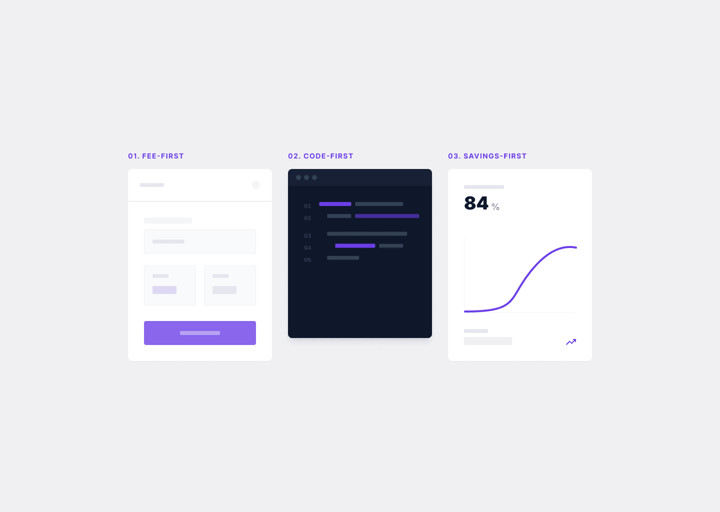
Wise makes this a brand principle. Before committing to anything, a user sees the exact fee and exact exchange rate for their specific transfer. The fee calculator isn't buried in a flow — it's the hero. The design communicates: we have nothing to hide, and we know the fee question is the first thing you want answered. That's not just good UX. It's a competitive position rendered as interface.
Ramp's dashboard leads with savings. Not transactions, not account balance — savings. Specifically, how much the company saved this period compared to prior spend. For a finance team whose job is to control and reduce expenditure, this is the most relevant number in the product. A 2024 expense-flow refresh made the hierarchy more precise: after the update, Ramp customers saw 20% of memos auto-suggested by AI, 33% faster transaction review, and 50% faster repayment of non-compliant spend. These aren't branding wins. They're the product of choosing the right hierarchy for the right user.
The specific decisions behind dashboard hierarchy — metric selection, data density, role-aware views — are covered in detail in our fintech dashboard design patterns guide.
Stripe does it differently again. Every product page leads with the simplest possible implementation — a code snippet, a dashboard screenshot, a flow diagram. Complexity is always one level deeper than you need right now. The design says: start here, go deeper when you're ready. For a developer evaluating infrastructure, this is exactly the right hierarchy.
Core Action Clarity
Pattern 2: Designing for the actual buyer role — not a generic user
The biggest design failure in fintech isn't bad aesthetics. It's designing for a fictional user — a composite of consumer and professional, sophisticated and beginner, emotional and analytical.
Ramp is built for finance teams. Not founders, not individual contributors — finance professionals managing company spend at scale. The product's data density would feel overwhelming in a consumer context. In a corporate finance context, it's appropriate and expected. CEO Eric Glyman frames the company's entire design philosophy around this: Ramp is a "finance automation platform" that helps businesses cut expenses by approximately 3.4% per year and shorten month-end close by about a week. The product isn't selling a financial product. It's selling time.
"Sell time, not money"
That's how Glyman describes Ramp's positioning. The design follows from the positioning.
Mercury went in a different direction and got it right for a different reason. The user is a founder in the first 18 months of their company, doing their own banking because there's no one else. They're sophisticated about their business but not necessarily about banking operations. Mercury's interface is simple not because it's for unsophisticated users, but because the user's attention is elsewhere.
Founder Immad Akhund has written about what "taste" actually means in product design: many startups mistake multicolored gradients and dark-mode homepages for taste, when real taste is a product that does exactly what users need with minimal friction, feels intuitive but anticipatory, and aligns with what Dieter Rams called "less but better." Mercury's design doesn't look minimal by accident — it looks minimal because that's the correct answer for a founder who should be running their company, not navigating their bank.
Brex sits between the two — and handles it in the most structurally interesting way. Rather than pretending there is one fintech user, the company built the product as a finance operating system. The 2025 Spring Release introduced custom fields, custom roles, and a policy engine that lets finance teams bring their own HRIS or ERP data into Brex to automatically provision cards, set limits, and automate accounting. One policy adapts dynamically across department, entity, and spend type. The result is an interface that looks less like a banking app and more like an administrative console where finance leaders map their org chart to financial rules. The visual language follows from that structural decision — not from copying a competitor's color palette.
Mercury made an equally deliberate structural choice in the other direction. In March 2026, the company published a piece called "Designing in the Open" — confirming that they had launched a fully public product demo with no contact form, no gate, no sales call required. Prospects entered sales conversations already knowing the product could handle their use case. It's a trust decision expressed not through the interface itself, but through the decision to expose the interface before commitment.
Pattern 3: Trust through data, not decoration
Financial products have a trust problem that design alone cannot solve — but design can either close the gap or widen it.
The conventional approach: badges, certifications, security logos, recognizable client testimonials. These signal credibility but don't demonstrate it.
Wise's approach is different, and it came from a specific strategic decision. After years of iteration, Wise's own design leadership recognized that the company had "slowly started drowning in the sea of sameness, getting lost in the mix of every other fintech and bank in the market with no key differentiators." The rebrand that followed wasn't primarily a visual exercise — it was a commitment to making differentiation real rather than cosmetic. The mechanism: show the numbers a competitor would hide. The fee. The exchange rate. The comparison to what your bank would charge. The design says look at what we're showing you rather than look at these logos.
A UX analysis of Wise's iOS app praised its multi-step transfer flow specifically for this reason: transparent fee breakdowns appear in a dedicated step, the pre-transfer review page shows amounts, fees, and timelines before the user commits, and a post-payment timeline builds trust by showing work-in-progress rather than hiding processing states. These are instances of what designers call "intentional friction" — the product slows down to show its work, because in high-stakes money transfers, speed can feel like loss of control.
Stripe earns trust through a different mechanism: documentation completeness. The developer who can read the API docs and immediately understand every edge case is a developer who trusts the product. As one technical analysis put it, Stripe's real moat is "not its gradients but its structural design decisions — clear documentation, thoughtful error states, and an architecture that 'absorbs complexity' so integrators don't have to." The completeness is the trust signal. The interface invites inspection rather than discouraging it.
Mercury builds trust through transparency about limits. When Mercury communicates clearly about what FDIC insurance covers and what it doesn't, that honesty reinforces trust more effectively than any badge placement. The "10-minute application" is a UX commitment, not marketing copy — the onboarding is designed to deliver on it.
One insight that runs counter to most UX orthodoxy: in high-stakes financial flows, friction is the trust signal. For large transfers or significant transactions, users don't want instant — they want a visible pause that signals the system is performing security checks. This is what designers call "purposeful friction": a one-second processing delay during a wire transfer, a haptic pulse when a payment completes, a final confirmation screen that functions as a digital receipt. The instinct to eliminate all friction from financial UX misunderstands what users actually feel in high-stakes moments. Speed can register as carelessness.
The contrast with dark patterns makes this point sharper. The industry is rife with design that weaponizes the opposite impulse — obscuring fees until the final step, pre-selecting high tip amounts in earned wage access apps, making cancellation flows deliberately confusing. In 2026, the UK's Consumer Duty standard now legally requires fintech firms to demonstrate that their UX facilitates genuine customer understanding, not just buried disclosures. The gap between "trust-first" design and dark-pattern design is widening — and it's being measured in regulatory exposure as much as user satisfaction.
Pattern 4: Visual conviction that matches the brand promise
Brex made a deliberate choice: orange and black in a category dominated by blues, grays, and whites. That's not a minor decision. Blue signals trustworthiness and stability — the default for anything involving money. Orange signals energy, speed, and a willingness to challenge convention.
For a corporate card company positioning itself against legacy expense management tools and traditional corporate banking, orange is coherent. It says: we're not a bank, and we're not trying to be. The company's Chief Design Officer put it explicitly: design has become "central to so many decisions at Brex — shaping product vision, driving strategy, and pushing forward our brand as one that will be here in 100 years." That's not the language of a team adding visual polish. That's a team treating visual conviction as a strategic commitment.
Mercury chose the opposite signals. The company built its visual identity around a custom typeface (Arcadia), cinematic photography, dark-first palettes, and intentional use of purple rather than the blue and green that dominate financial color conventions. The choice to avoid blue is deliberate — it signals "we are not a traditional bank." A detailed design analysis of Mercury's visual system described the result as closer in aesthetic register to luxury automotive or fashion than to conventional bank UI. For a user who is already suspicious of banks and wants their finances to feel more like their other SaaS tools, that signal is exactly right.
Most products copying Stripe copy neither the logic nor the conviction. They adopt a vague version of "clean and modern" that communicates nothing. The irony is that Stripe's aesthetic communicates something very specific: this is infrastructure built by engineers who care about craft. When applied to a B2C payment app or a consumer neobank, that signal doesn't transfer — it just looks like a product that looked at Stripe.
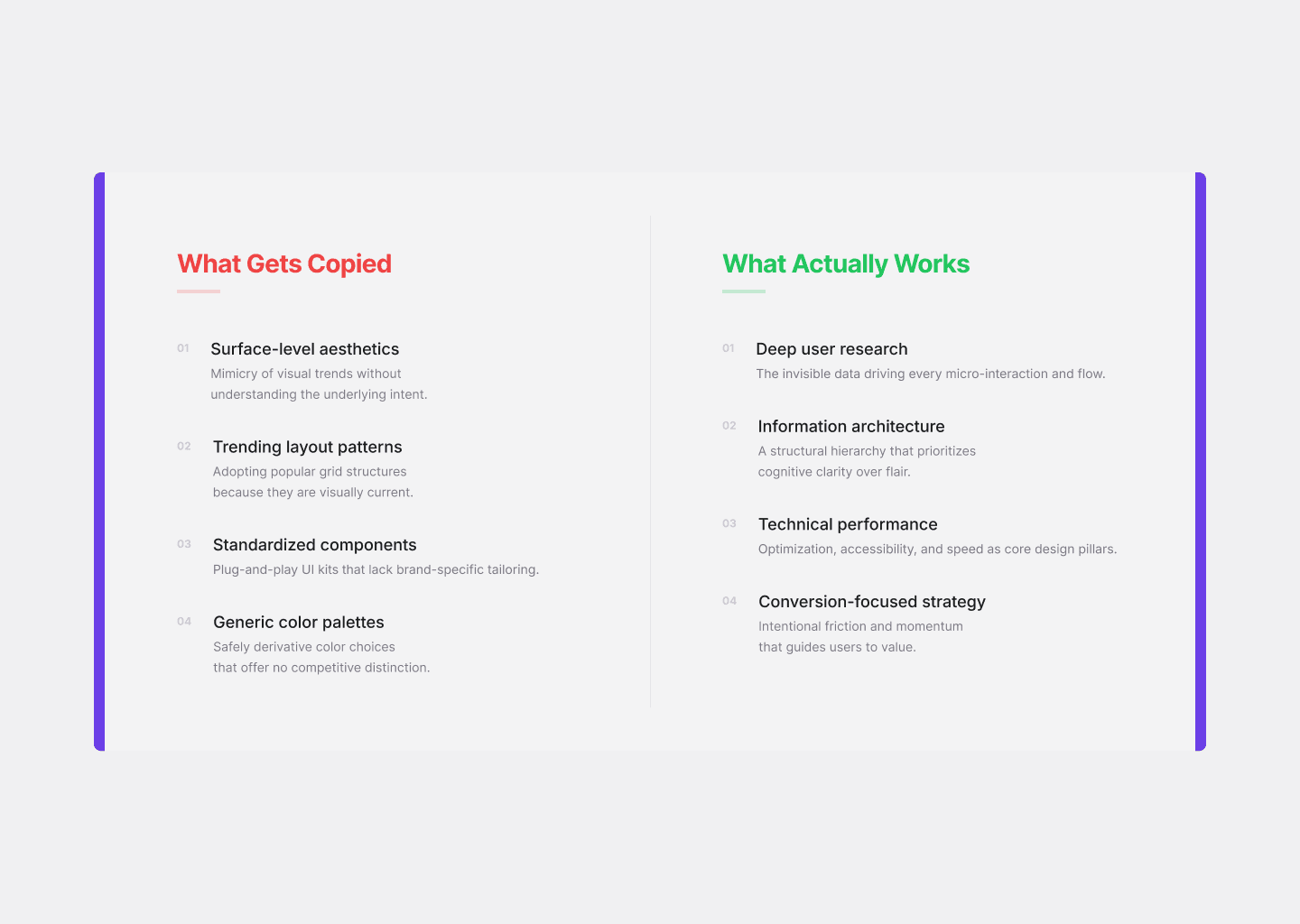
The Stripe Monoculture: What Gets Copied vs. What Actually Works
The Stripe design monoculture is real, and it's specific. One analysis of B2B SaaS branding in 2026 noted that "most developers can identify Stripe aesthetic on sight" and warned that fintech teams now default to the look — dark background, gradient accents, Inter typography — "without a deeper brand story, contributing to a sense of visual sameness."
Design commentary has named the pattern directly: a 2025 piece on aesthetic homogeneity described AI and big-tech-adjacent design culture as producing "visual averaging" — with Stripe sitting at the center of the ecosystem and its design patterns functioning as a gravitational default rather than a deliberate choice.
Here's what gets copied:
- Dark backgrounds or dark-accented marketing pages
- Monospace type near numbers or code
- Bento grid layouts on product marketing pages
- Minimal color with one gradient accent (usually indigo-to-purple)
- Dense, data-forward dashboard aesthetics
The failures are predictable and recurring.
Event logs without guidance: Stripe's transaction logs are useful because developers can replicate API calls and inspect side effects. Fintech clones mimic the format — rows of events as the primary interface — expecting non-technical users to infer meaning. Without context or next-step recommendations, the log is noise.
Code-like aesthetics in consumer interfaces: internal IDs, hash-like reference numbers, and dark developer themes applied to consumer products or SMB tools feel alien and raise anxiety. They signal determinism to engineers; they signal confusion to everyone else.
Density as a proxy for seriousness: packing dashboards with charts and toggles reads as professional in a screenshot, but raises cognitive load for non-finance users and hides the actual value proposition.
Three-column layouts without interactive content: Stripe's famously structured documentation — navigation left, content center, live code right — works because every column has a distinct functional role (hovering text highlights the corresponding code sample, everything is linked to an API call). The same layout without that logic is just clutter.
Here's what doesn't get copied — and what makes Stripe's design actually work:
What Gets Copied vs. What Actually Works
Progressive disclosure of complexity
Stripe hides nothing, but surfaces the simplest path first. The complexity is always accessible — it's never the default. A developer can go from zero to implementation before needing to understand the full system.
Developer-first information hierarchy
Every design decision assumes a user who will read the docs, inspect the API, and evaluate the product technically before committing. The design doesn't just look credible to this user — it communicates in their language.
Trust through transparency and completeness
As Stripe's own technical analysis stated:
"Stripe didn't simplify payments visually. They simplified them structurally... trust scales when risk is handled inside the system, not pushed to the integrator."
The design reflects a systemic decision, not an aesthetic one.
Aesthetic coherence with ICP
Stripe's design looks like tools that developers already trust — GitHub, Linear, Vercel. The visual language is borrowed from a world the user already inhabits.
When a consumer neobank adopts Stripe's dark palette and bento layout, none of this transfers. The user isn't a developer. The product isn't infrastructure. The trust signals don't map. The result: a product that looks credible in a screenshot and feels generic in use.
Masterly Fintech Design Clarity Framework
Three questions that separate fintech products that differentiate from fintech products that blend in.
| Dimension | The question | What good looks like |
|---|---|---|
| Clarity | Is the core action immediately obvious for this specific user? | Wise's fee-first hero. Ramp's savings-first dashboard. One thing, one hierarchy. |
| Context | Is the design built for the actual buyer role — not a generic user? | Ramp for finance teams. Mercury for founders. Brex for growth-stage operators. Different densities, different tones. |
| Conviction | Does the visual language match the brand's actual position? | Brex's orange challenges banking convention. Mercury's Arcadia typeface and dark palette signal software-first. Neither is accidental. |
A product that scores well on all three doesn't need to look like Stripe. It looks like itself — which is the only differentiator that compounds over time.
The Numbers Behind Good Fintech UX
Good design in fintech isn't just aesthetically satisfying — it's measurable. A 2026 benchmark report on fintech experimentation found an average conversion rate of approximately 5.5% for core application flows, with top-quartile performers reaching around 11%. The gap between median and top quartile isn't primarily explained by visual polish — it's explained by trust cues, flow simplicity, and transparency of pricing and status.
Ramp's 2024 expense-flow data makes the same point at the workflow level: the gains from redesigning micro-interactions and automating friction points (20% memos auto-suggested, 33% faster reviews, 50% faster repayments) were larger than most visual redesigns deliver. The design investment was in the right place — inside the product's actual critical path, not on the marketing site.
The KYC onboarding data tells the same story at the acquisition layer. Traditional fintech onboarding — manual data entry, disconnected verification steps, no progress visibility — sees roughly 68% of users abandoning mid-flow. High-performing onboarding in 2026, built on API-based instant verification, intelligent OCR auto-fill, and progressive disclosure with visible progress indicators, measurably closes that gap. The difference isn't the color of the button. It's whether the structural design respects the user's time and anxiety level during an inherently high-friction moment.
The implication: most fintech teams are optimizing the wrong layer. They're refining the surface while leaving the structure — the hierarchy, the trust architecture, the workflow — unchanged.
What to Do If Your Product Has This Problem
Most fintech teams know their product looks generic. They attribute it to constraints — timeline, team size, budget, "we'll fix it after launch." But the problem is usually upstream of execution. It's a positioning problem that surfaces as a design problem.
Three diagnostic questions worth asking before a redesign:
1. Can you describe your user's job role in one sentence?
Not their demographic, not their pain point — their actual professional accountability. What are they measured on? What decision are they making right now? If you can't answer this precisely, your design doesn't know who it's for either.
2. What is the one number or action your user needs to see first?
Not the most impressive metric, not the most complex feature — the thing that most directly maps to why they're in the product right now. Ramp chose savings. Wise chose the fee. Stripe chose the implementation path. If your answer is "it depends," the hierarchy is unresolved.
3. If you removed your logo, could a user tell who built this product?
If the answer is no — if it could be any of twelve companies — the visual conviction is missing. Mercury's dark palette and custom typeface are recognizable without a logo. Brex's orange is recognizable without a logo. That's the bar.
These aren't purely design questions. They're strategy questions that have design answers.
If your fintech product looks polished in a screenshot but feels generic in use — the problem is usually not execution. It's that the design doesn't know who it's for.
We work with fintech teams to close the gap between what the product looks like and what it needs to communicate. Brand, product design, and design systems built around a specific user and a specific position.
Talk to us about your fintech product →
Related: The Hims Effect: Why Healthtech Built a Clone Factory · Fintech Dashboard Design Patterns · How to Conduct a UX Audit · The Complete Guide to SaaS Onboarding UX