The Hims Effect: Why Healthtech Built a Clone Factory (And What It's Costing You)
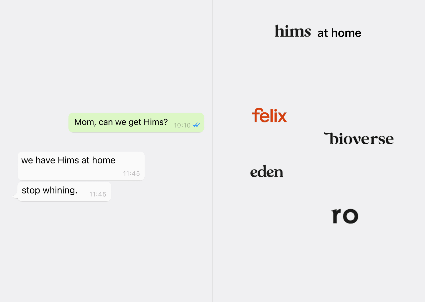
Five healthtech brands. One design. We analyzed how Felix, Ro, Bioverse, and Eden became Hims clones — and what it's costing their conversion.
The short answer
Felix, Ro, Bioverse, and Eden all look like Hims — and it costs them conversion. Hims' minimal design only works because $15–60M a month in advertising warms its audience before they reach the site. Cloning the UI copies the output of that strategy without the funnel behind it, and in a look-alike vertical, comparison shoppers default to the original.
Key takeaways
- Hims' minimal design works only because $15-60M/month in ads warms the audience before they ever reach the site.
- Copying Hims' UI clones the output of its strategy, not the positioning, audience, or funnel that made it convert.
- When every brand in a vertical looks like Hims, comparison-shopping users default to Hims, so clones market their own competitor.
- The clone factory starts with the founder brief; "make it like Hims" replaces real positioning work with a cognitive shortcut.
Open Five Tabs. See One Website.
Here's a test. Open these URLs simultaneously:
Give yourself 10 seconds per site, then close all tabs. Now try to describe which was which.
You probably can't. Not because your memory is bad — because the sites look nearly identical.
Same hero: a confident lifestyle photo of someone who clearly uses the product. Same layout: two or three large feature cards on top, a row of smaller category tiles below. Same copy tone: short, declarative, benefit-led. Same product treatment: the pill or vial isolated against a soft colored background like it's a luxury object. Same CTA: "Get started" or "Start now," rounded pill button, sitting quietly at the bottom of the hero.
This isn't coincidence. This is what happens when every founder in a vertical says the same four words to their designer:
"Make it like Hims."
How the Clone Factory Works
The process is almost ritualistic at this point.
A healthtech founder — let's call him Adam — has a telemedicine platform. Six verticals: weight loss, hair loss, skincare, labs, mental health, sexual health. He's spent money on a designer. The designer delivered something. Adam hates it. He opens his laptop in a discovery call and shares his screen. He navigates to hims.com.
"I want something like this," he says. "Clean. Minimal. You know — like Hims."
The designer nods, opens Figma, and starts reproducing: the warm amber, the serif-meets-sans-serif pairing, the product cards with the slightly rounded corners. They're not thinking about Adam's business. They're copying a reference.
Adam gets a deliverable that looks like a slightly worse version of Hims. He's not happy but he can't articulate why. The designer defends the work. They part ways. The cycle repeats.
This is happening at scale. Walk through any healthtech pitch deck and you'll find a "design inspiration" slide that leads directly back to Hims. Hims has become the design specification for an entire industry.
What Hims Actually Did
Let's be precise about what made Hims' design work — because this is where every copy gets it wrong.
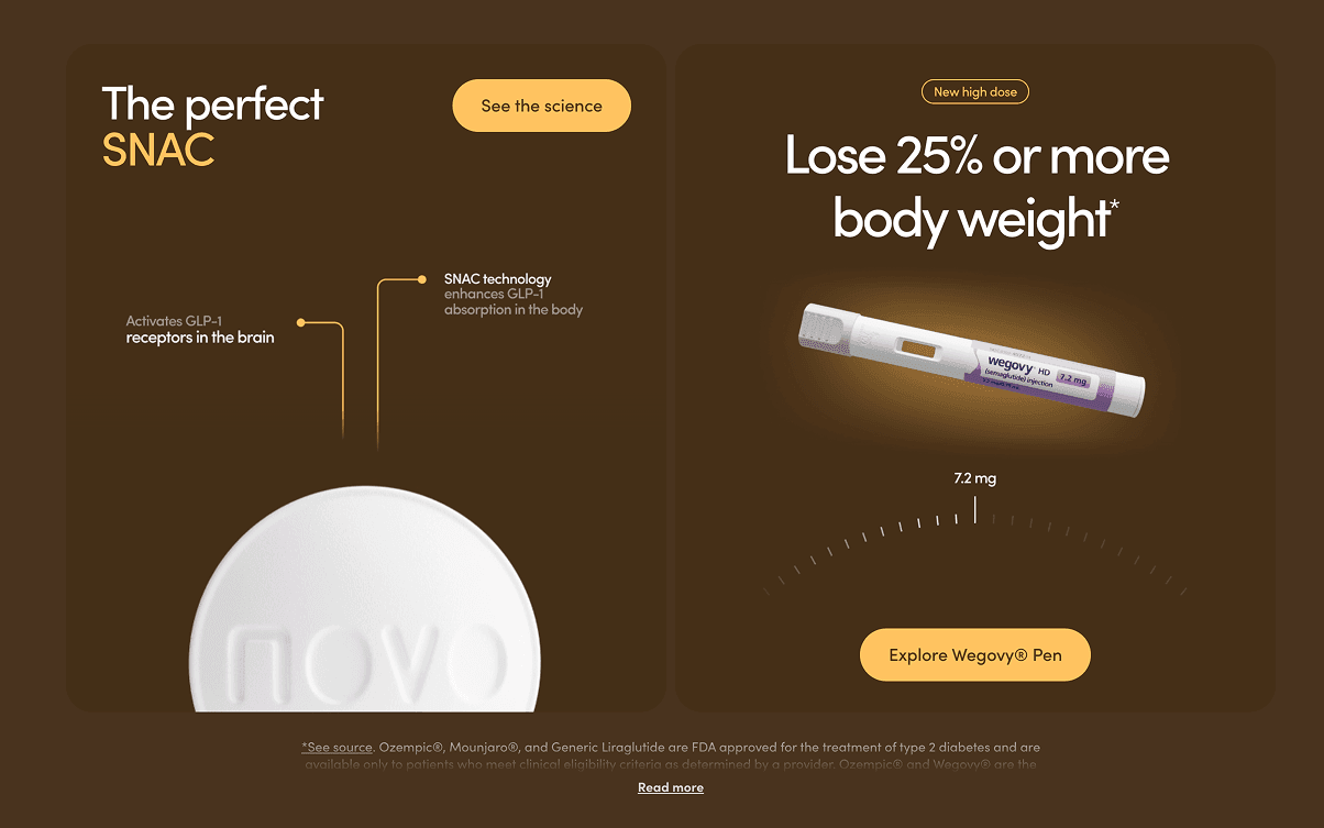
Hims didn't design a pretty website and then build a business around it. They built a brand narrative first, and the design was the output of that narrative.
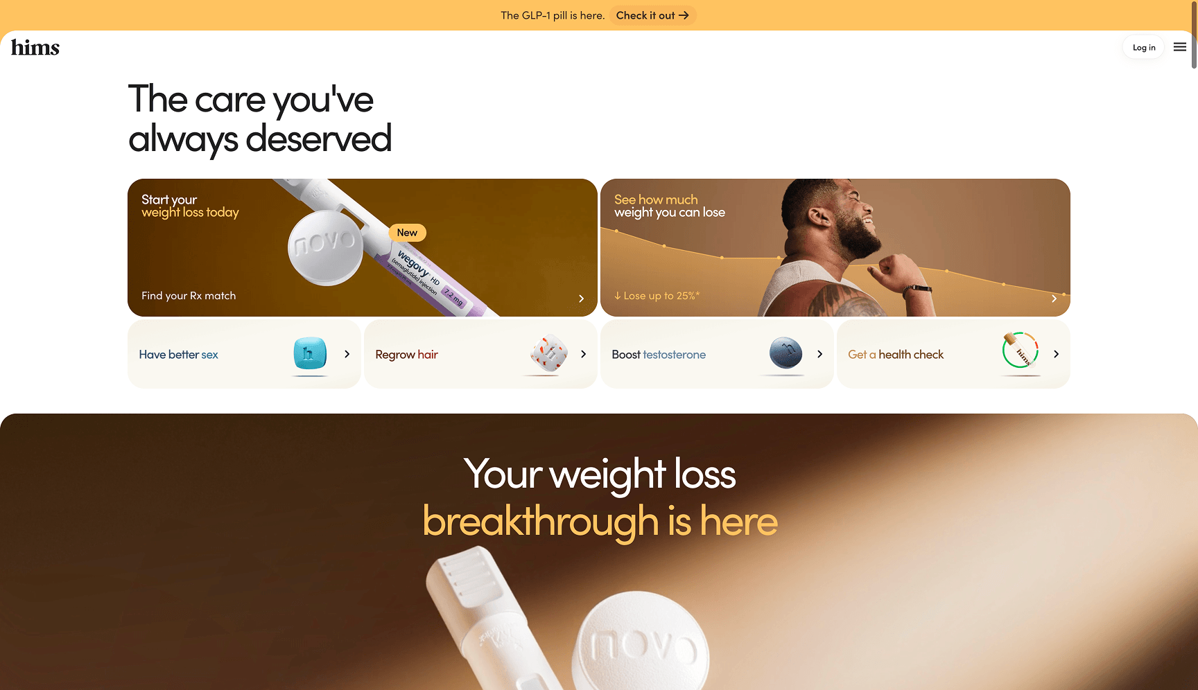
The Hims narrative is: men's health is normal, not shameful, and you can handle it yourself, on your terms, discreetly. Everything in the UI expresses that narrative. The warm tones say "approachable, not clinical." The lifestyle photography says "this is your life, not a medical condition." The minimal copy says "we respect your intelligence, we're not going to over-explain." The hidden-in-plain-sight CTA says "no pressure, you come to us."
Every pixel is in service of a positioning decision.
Now here's the part that matters: Hims also spends somewhere between $15 million and $60 million per month on paid advertising. That number is not a typo. By the time a user lands on hims.com, they've already seen the brand dozens of times across Instagram, YouTube, and connected TV. They know what Hims is. The website doesn't need to explain the company — it just needs to close.
That's why the copy is minimal. That's why the CTAs are quiet. That's why there's almost no educational content above the fold. Hims doesn't need to sell itself to a cold audience because it almost never has a cold audience.
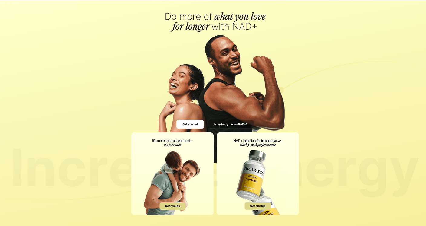
But scroll past the fold and the homepage shifts visual modes entirely — per category, per product, per emotional context.
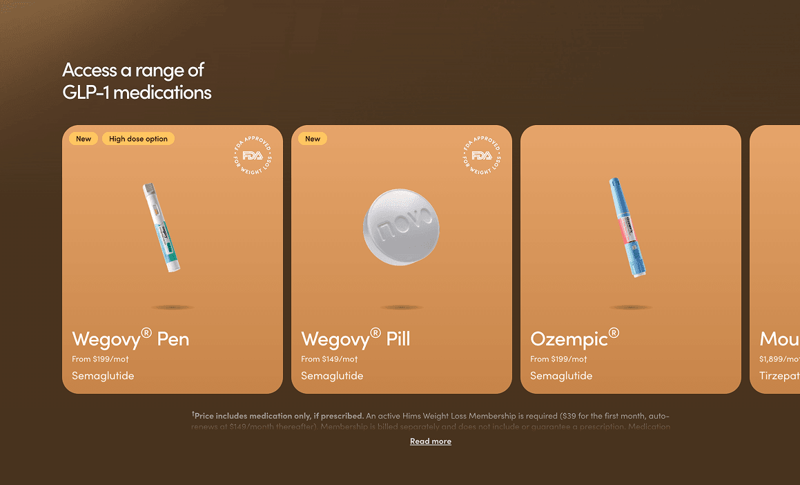
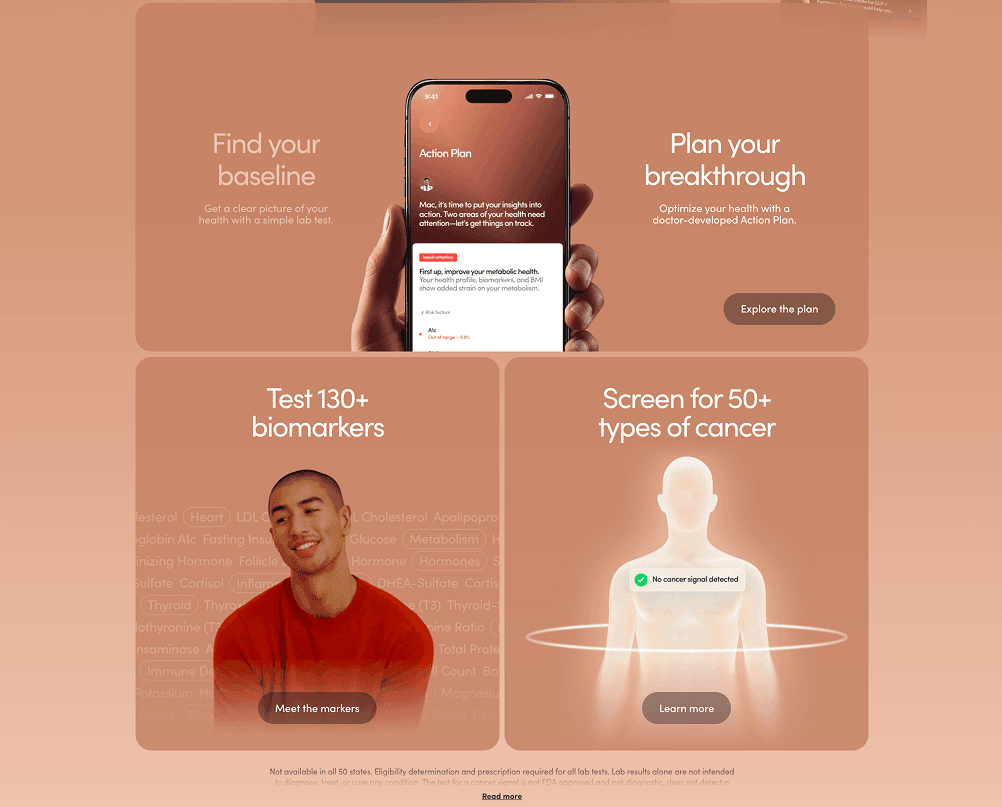
Same homepage. Five different visual environments. This is a design system built from a brand strategy — not a template. The competitors copy the first screen and call it done.
When you copy the Hims UI without the Hims advertising engine, you copy the endpoint of a funnel and attach it to the beginning of a journey. It doesn't convert. It confuses.
Brand by Brand: What They Copied and What They Missed
Felix (felixforyou.ca)
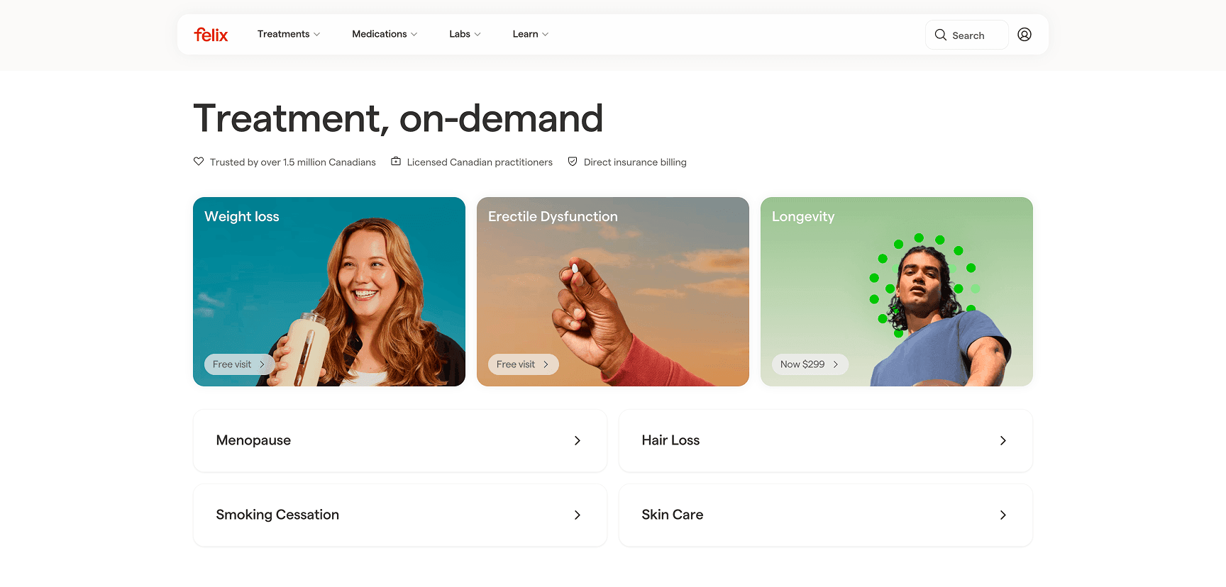
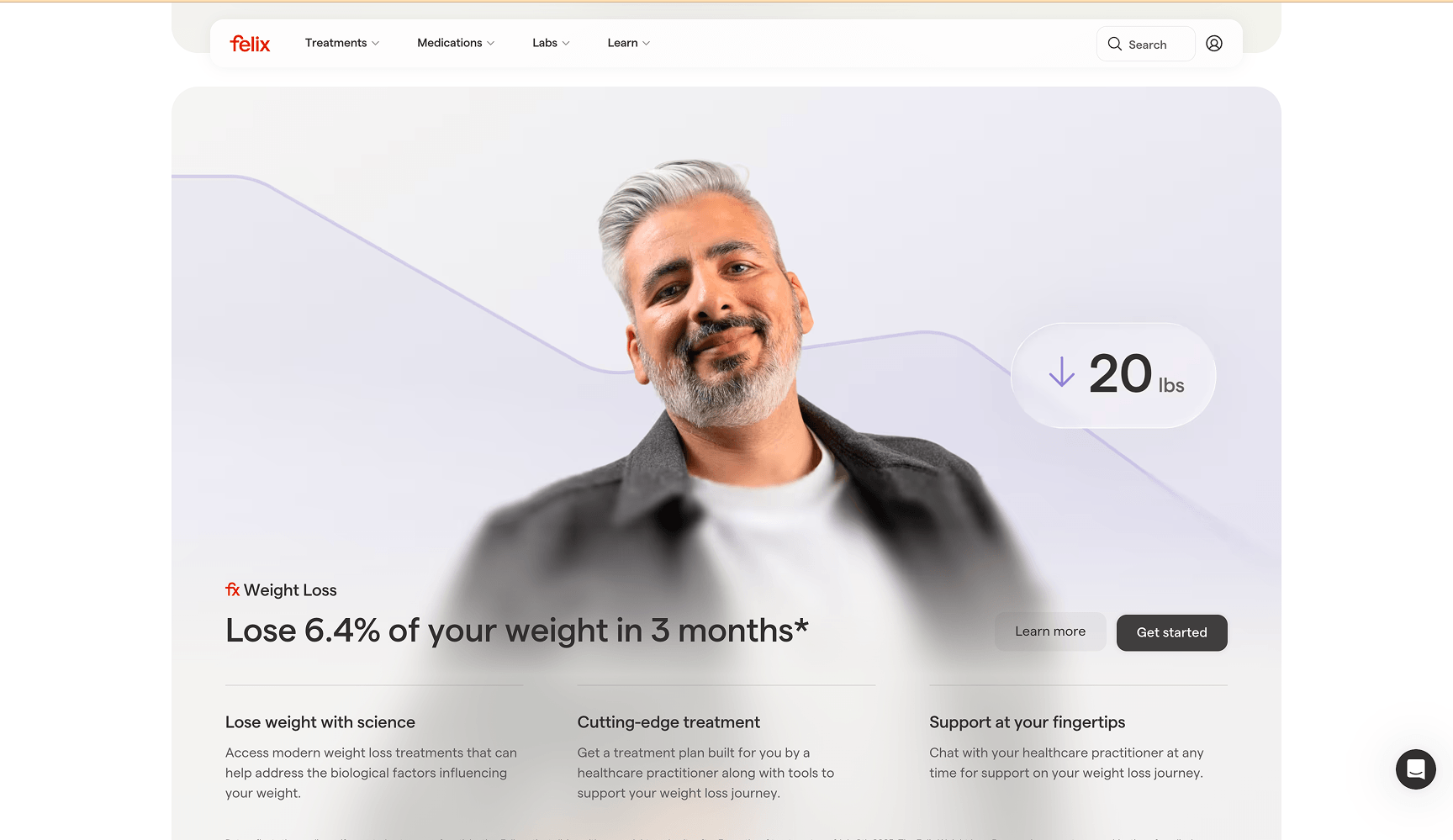
What they copied: The clean white background, the product category grid, the restrained navigation, the mix of lifestyle photography and isolated product shots.
What they missed: Felix is a Canadian brand serving a market with different insurance dynamics, different cultural norms around discussing health, and a French-language requirement for parts of their audience. Their UI says "premium American DTC brand." Their audience is a 38-year-old in Toronto navigating provincial healthcare. The visual language creates a subtle mismatch that erodes trust at exactly the moment they need it most — at the decision point.
The cost: The "FREE VISIT" badge slapped onto cards feels like a discount sticker on a luxury product. It's the brand fighting itself. That tension wouldn't exist if the design started from Felix's actual positioning, not Hims'.
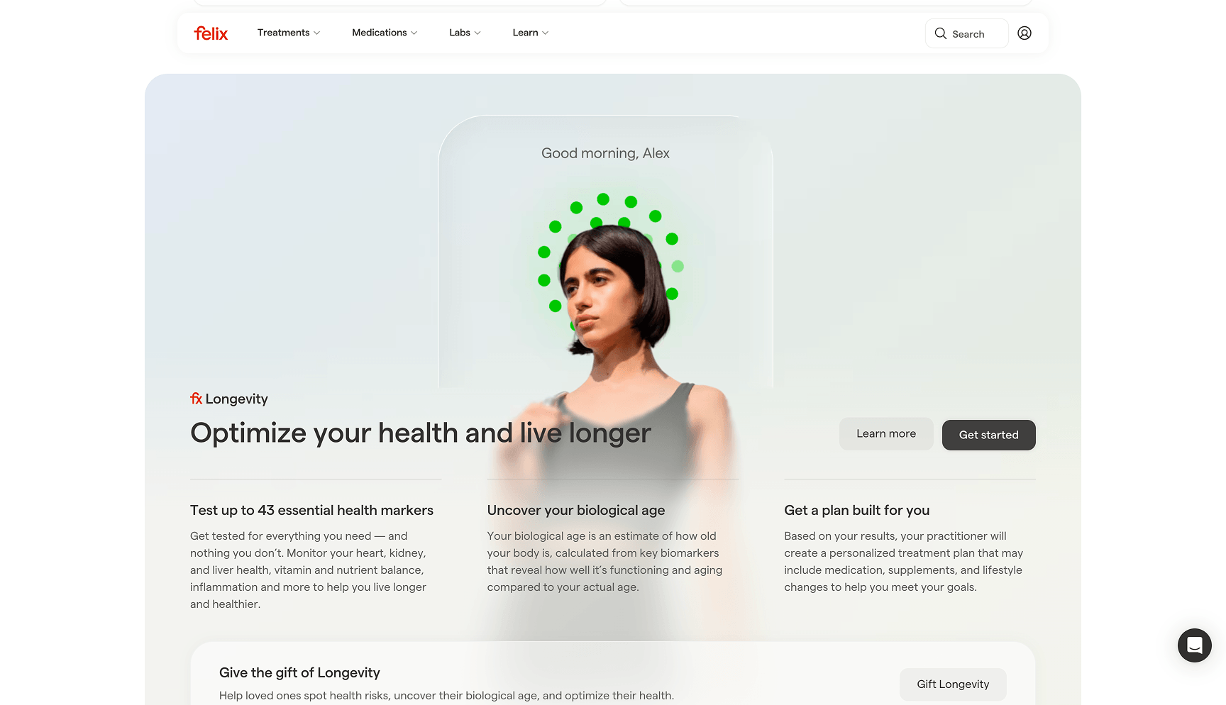
Bioverse (gobioverse.com)
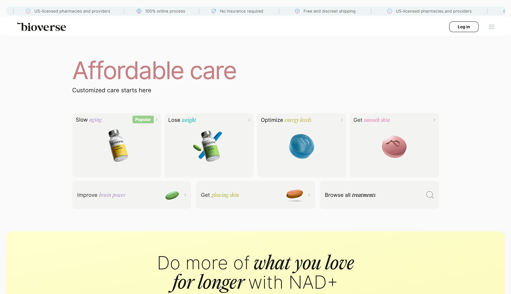
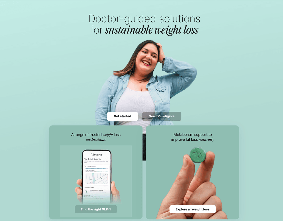
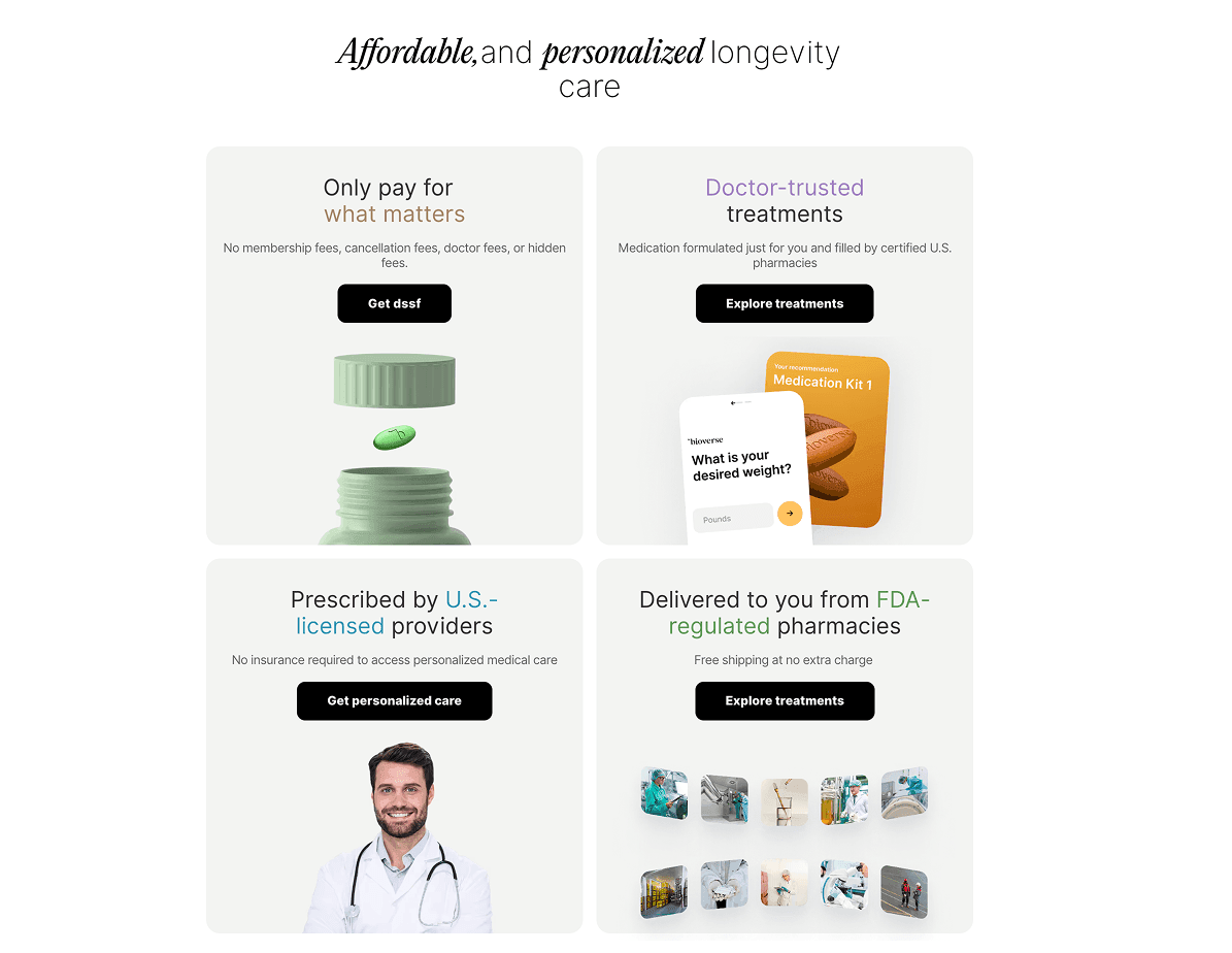
What they copied: The warm yellow-cream palette is so close to Hims' amber that you'd need a color picker to tell them apart. Full-bleed lifestyle hero, same button style, same structural hierarchy.
What they missed: Bioverse's positioning is around longevity and optimization — peptides, NAD+, compounds that require more education than "lose weight your way." Their target user needs to understand what they're taking and why. The Hims template — with its minimal copy and assumption of brand awareness — leaves Bioverse's core value proposition invisible above the fold.
The cost: A user landing on Bioverse cold has no idea they're in the longevity/biohacking space until they scroll. The hero could belong to any wellness brand. That's a critical failure for a product category that lives or dies by differentiation.
Ro (ro.co)
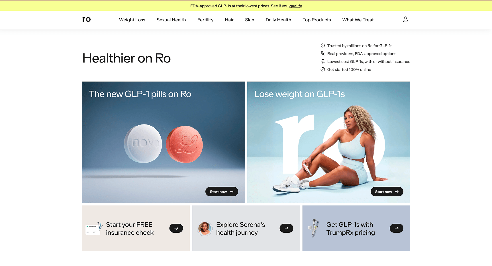
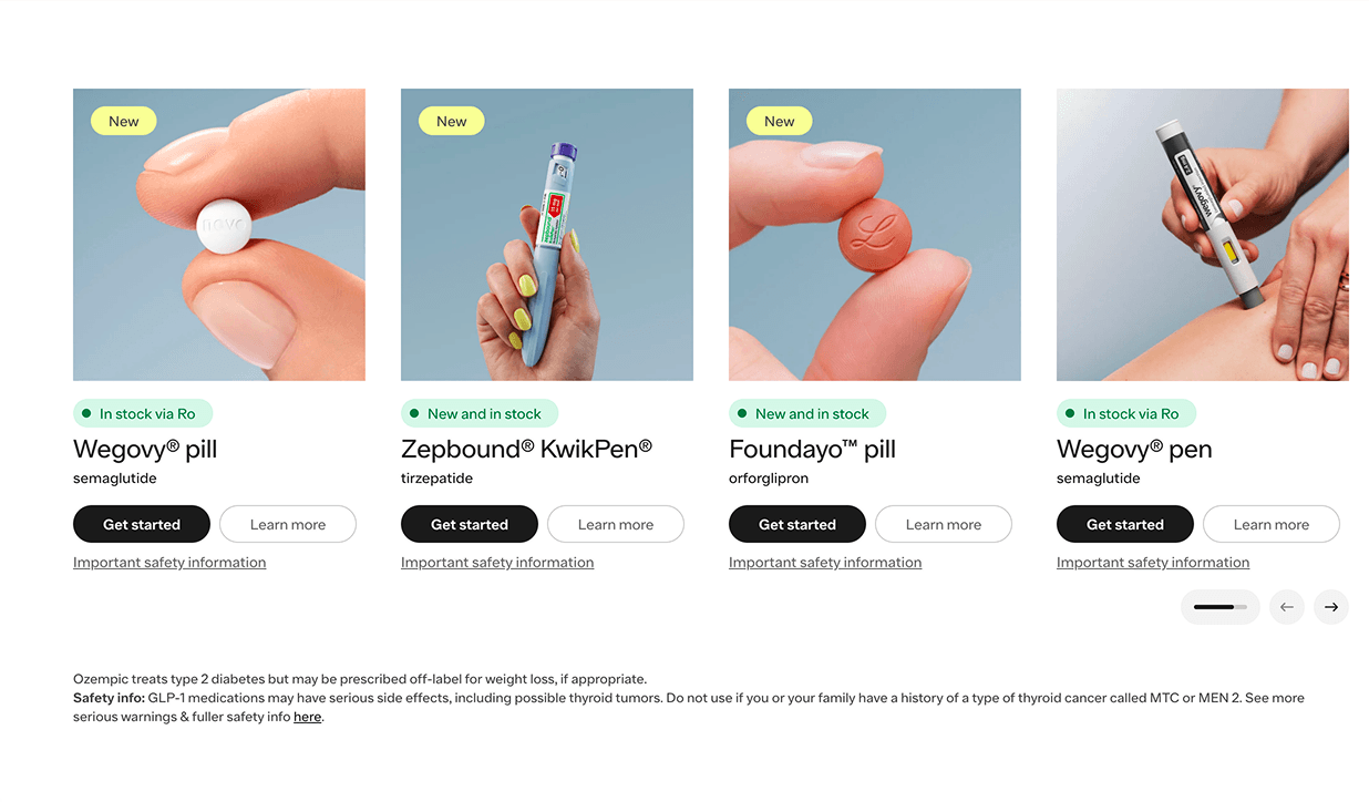
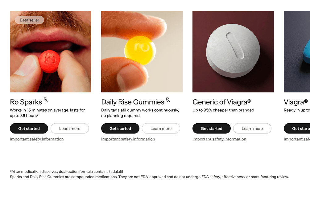
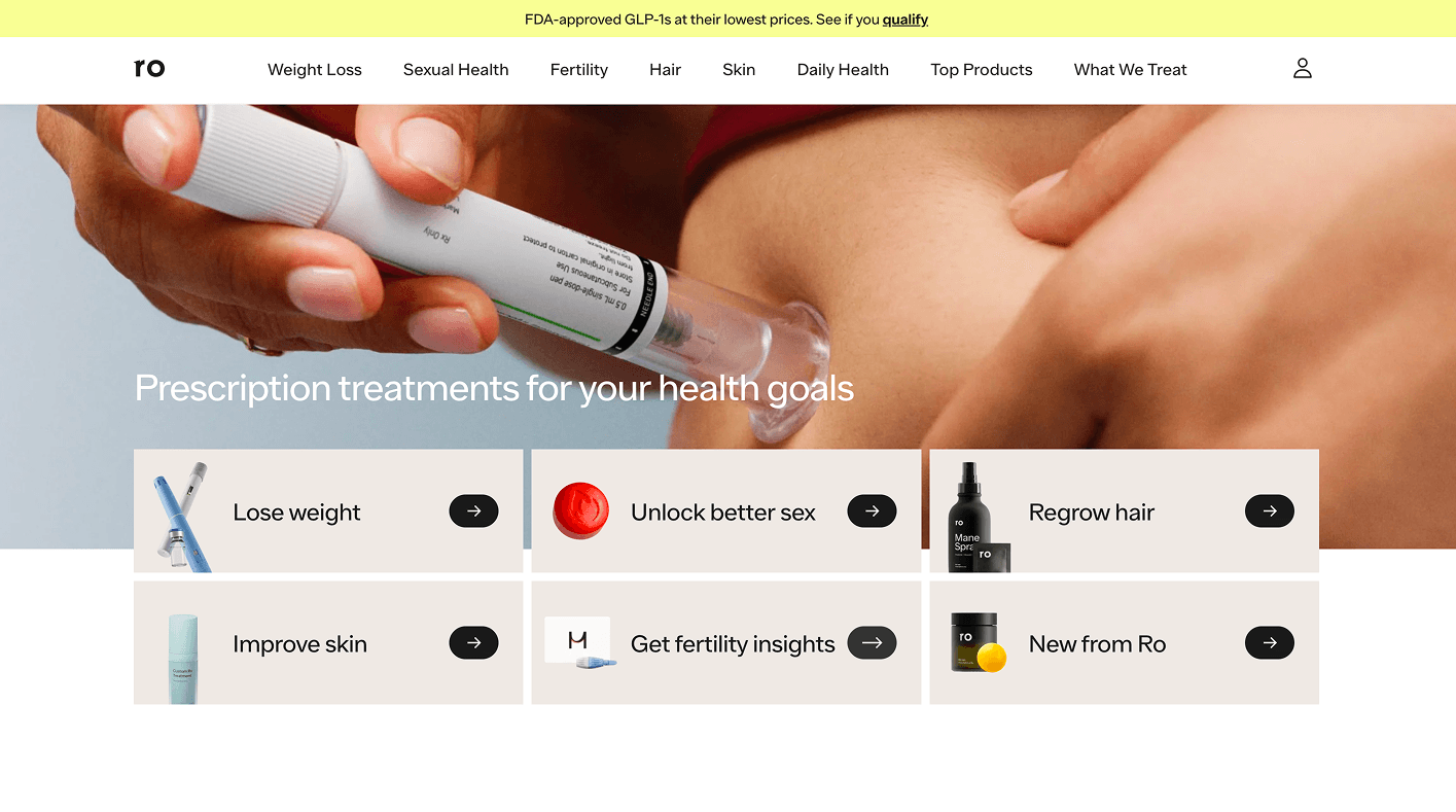
What they copied: The two-column hero card layout, the product-as-luxury-object photography (the Ozempic pill shot is pure Hims energy), the muted blue-grey system as their departure from Hims' warmth.
What they missed: Ro has a more clinical, insurance-adjacent positioning than Hims. They mention FDA approval, real providers, and insurance integration in their trust bar. But their hero visual language says "cool DTC brand," not "medically credible platform." There's a contradiction between the copy (building trust through clinical legitimacy) and the design (borrowing cool from a competitor known for making healthcare feel casual).
The cost: Ro is trying to win a trust game with a design vocabulary borrowed from a brand that deliberately de-medicalized its aesthetic. The user who wants FDA credibility and the user who wants the Hims vibe are often different people.
Eden (tryeden.com)
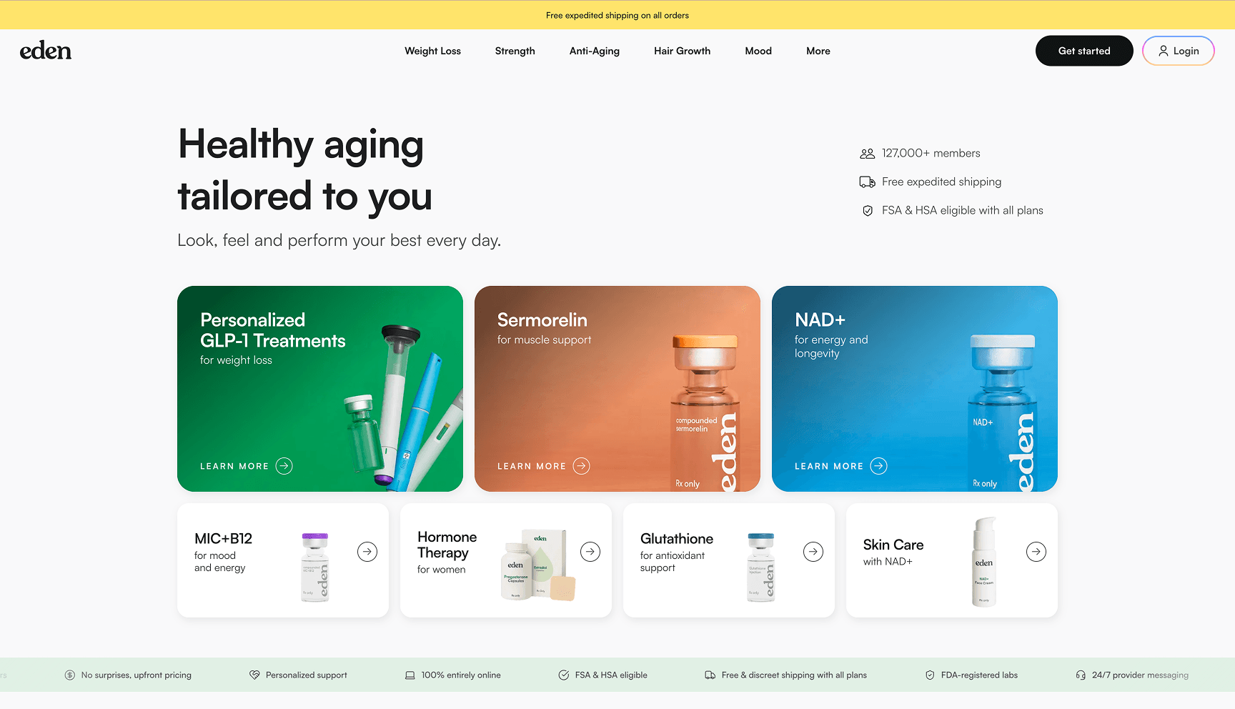
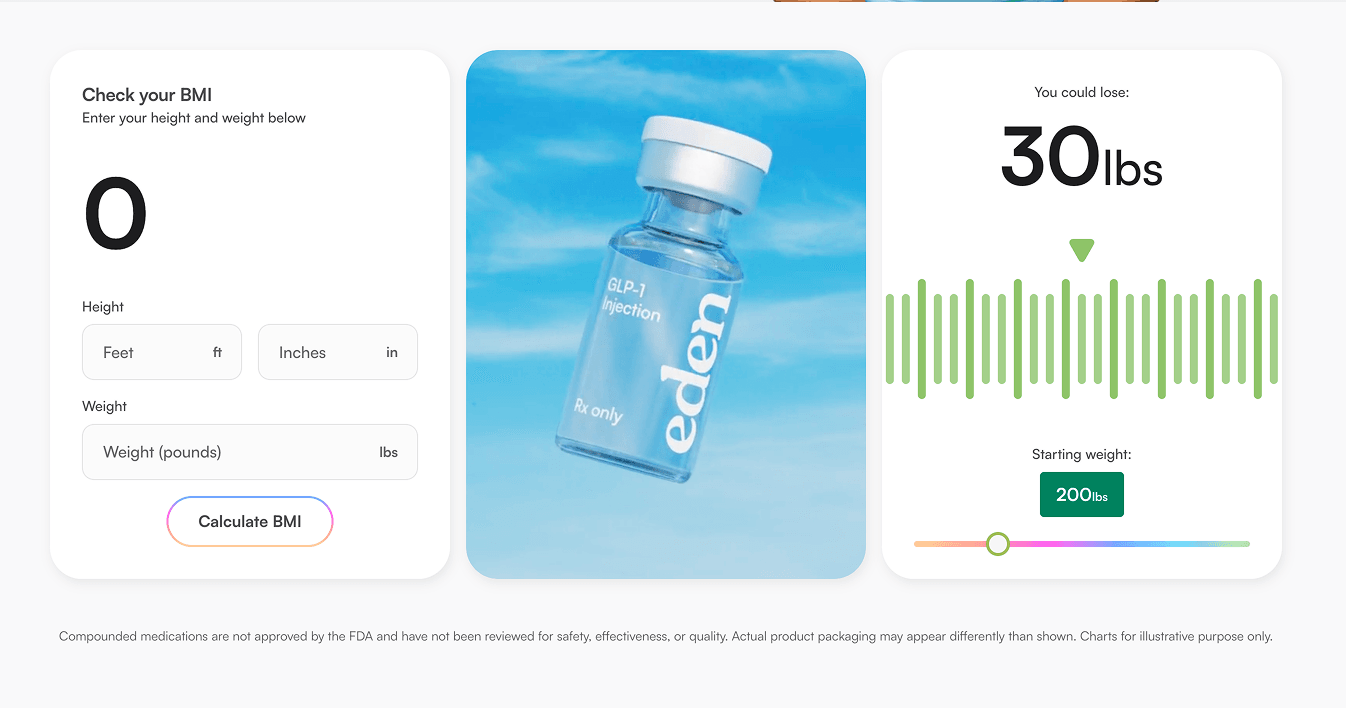
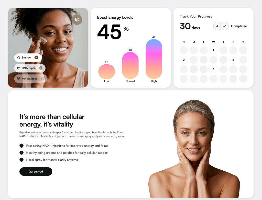
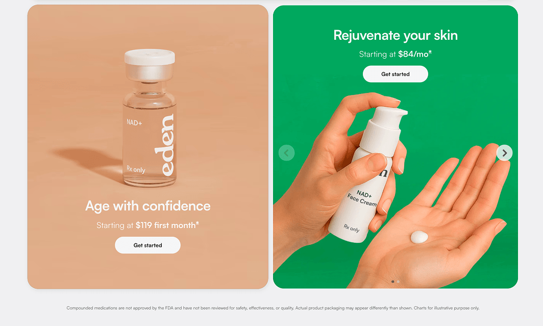
What they copied: The three-column colored card grid is functionally identical to Hims' category tiles. Colored backgrounds per category, product photography centered in the card, the same typographic hierarchy inside each tile.
What they missed: Eden's product is more complex — GLP-1 compounds, hormone therapy, NAD+ injections. These require trust, education, and a clear explanation of how the process works. The visual system borrowed from Hims doesn't give the brand enough room to communicate clinical credibility. The category cards look like a menu at a nice restaurant. Some of these products are injectable compounds that require a doctor's approval.
The cost: The aesthetic creates a perceived simplicity that may actually increase user anxiety for higher-stakes treatments. "This looks too easy" is a real friction point in healthcare UX.
The Pattern Across All Five
Every brand made the same error: they treated Hims' UI as a genre, the way someone might look at a hip restaurant and say "give me that vibe." But Hims' UI is not a genre. It's the visual expression of a specific business model, a specific audience maturity, a specific advertising strategy, and a specific brand narrative.
When you strip the UI from its context and paste it onto a different context, you get a brand that looks like it knows who it is — but doesn't.
The Real Problem: You're Competing With Your Inspiration
There's a deeper strategic issue that nobody talks about.
When five brands in the same vertical adopt the same visual language, they force users into comparison shopping mode. If Ro, Eden, Bioverse, and Felix all look like Hims, the user subconsciously asks: "Which one is the real thing?" The answer, almost always, is Hims.
You have spent money on design to make users think about your competitor.
Differentiation is not just a branding exercise — it's a conversion lever. A user who can immediately feel that a brand is built for them, in their context, for their problem, converts at a higher rate than a user who's comparing interchangeable options. The healthtech brands that have successfully broken from the Hims template — Function Health, for example, with its data-driven, almost dashboard-like aesthetic — have done so by starting from a genuinely different positioning, not just choosing a different accent color.
The question is never "what does the best brand in my space look like?" It's "what does my specific user need to feel in the first five seconds to trust me enough to answer a medical questionnaire?"
Why Founders Keep Doing This
It would be easy to blame designers here. But the clone factory starts with the client brief.
1. Cognitive shortcut under pressure.
Building a healthtech company is hard. Regulatory compliance, physician networks, pharmacy logistics, acquisition costs. The website can feel like the easiest problem to solve. "Just make it look like the market leader" feels like a low-risk decision. It's not — it's a high-risk decision that looks safe.
2. The reference communicates quality, not direction.
When a founder says "I want something like Hims," they usually mean: "I want something that feels premium, trustworthy, and clean." Those are legitimate design requirements. But Hims is the example, not the brief. A good designer needs to extract the requirement and build a solution that expresses those qualities through the lens of the actual brand.
3. Design and strategy are disconnected.
Most healthtech startups haven't done a proper brand strategy before they commission a website. Without a clear positioning document, the Hims reference becomes the de facto strategy. The design ends up expressing Hims' positioning, not the brand's.
What Actually Differentiates in Healthtech UI
They design from the user's emotional state, not the competitor's aesthetic.
A user coming to a mental health platform is in a different headspace than someone looking for hair loss treatment. The UI should feel different because the emotional context is different.
They use visual language to establish clinical credibility where it matters.
Clean doesn't mean medical. A platform that requires a physician to approve your prescription should not look identical to a platform that ships supplements.
They treat the hero as education, not decoration
Hims can run a hero with six words because its users already know what Hims is. A brand without $15M/month in ads needs its hero to establish what the platform does, who it's for, and why it's trustworthy — in that order, without a wall of text.
They build a visual system around their verticals, not borrowed from someone else's.
The visual differentiation between a weight loss product and a mental health product should come from the brand's own design language, not from color-coding inside a template.
The Brief That Would Actually Work
Before you open Figma, answer four questions:
-
Who is your user and what are they feeling when they land on your site?
Fear? Hope? Embarrassment? Relief? The design needs to meet them there. -
What is the one thing you need a new user to believe in the first five seconds?
"This is safe." "This is for people like me." "This is actually different." Design for that belief. -
What is your actual competitive advantage?
If it's clinical rigor, your UI should feel more rigorous than Hims. If it's cultural fit, your UI should visually signal that from the first frame. -
What does your funnel look like, and what does the user know before they arrive?
If you're running cold-traffic ads, your hero needs to work harder than Hims'.
The answers to these questions are your design brief. Hims is an inspiration, not an answer.
Key Findings
1. Hims' UI works because of what happens before users see it — $15–60M/month in ads creates brand familiarity that makes minimal design functional. Without that funnel, minimal design is just underexplaining.
2. Copying a competitor's UI is copying the output of their strategy, not the strategy itself. Different products, different markets, different user psychology — none of which are expressed in the clones' designs.
3. Visual monoculture in a vertical actively benefits the market leader. When multiple brands look like Hims, users default to Hims. The clones are doing brand awareness work for their competitor.
4. The clone pattern starts with the client brief, not the designer. "Make it like Hims" is not a brief. It's a cognitive shortcut that skips the hard work of positioning.
5. Differentiation in healthtech UI is not about aesthetic novelty — it's about visual language that accurately reflects your clinical positioning, your user's emotional state, and your trust-building strategy.
Common Mistakes
Mistake 1: Using the same reference as your direct competitors.
Felix and Ro both showed their designers Hims. They now look like each other and like Hims. Neither wins.
Mistake 2: Copying the minimalism without earning it.
Hims earned the right to use six words in its hero. You haven't. Your hero needs to do real conversion work.
Mistake 3: Treating "clean" as a visual style rather than a UX property.
Clean is not a color palette. Clean means: low cognitive load, obvious next action, nothing fighting for attention. You can achieve clean without looking like Hims.
Mistake 4: Ignoring cultural and market context.
The Hims aesthetic was built for the American men's wellness market. A platform for Saudi Arabia, Canada, or a mental health vertical has different trust signals and different user expectations. Transplanting it creates a mismatch users feel even if they can't articulate it.
Mistake 5: Commissioning design before completing brand strategy.
"I want something like Hims, but for [my product]" guarantees a clone. "My user is X, they feel Y when they arrive, and they need to believe Z before they fill out our intake form" produces a real design.
| Brand | What They Copied | What They Missed | The Cost |
|---|---|---|---|
| Felix | White bg, product grid, photography style | Canadian market, provincial healthcare, bilingual audience | "FREE VISIT" badge on luxury aesthetic = brand contradiction |
| Bioverse | Warm amber palette, lifestyle hero, minimal copy | Longevity/biohacking needs education, not brand assumption | Value proposition invisible above the fold |
| Ro | 2-column card layout, product-as-luxury photography | Clinical/insurance positioning vs. casual DTC visual language | FDA copy + Hims aesthetics = cognitive dissonance |
| Eden | 3-column colored card grid, product tile hierarchy | Injectable compounds need credibility signals, not menu UX | "This looks too easy" friction for high-stakes treatments |
Analysis based on visual audit of Hims, Felix, Bioverse, Ro, and Eden conducted March 2026. All brands were reviewed on their primary homepage at the time of analysis.