Progression Systems That Build Daily Habits (Not Just Gamification)
Most apps add points and call it gamification. We analyzed Duolingo, Headspace, Finch, Forest, and Insight Timer to find what actually builds habits — and what burns users out.
Key takeaways
- Copying Duolingo's XP, levels, and streaks fails when a product values calm or consistency over measurable skill gain.
- Wellness apps retain users by tracking consistency (minutes practiced, days shown up), not performance or quality.
- The same streak counter feels competitive, supportive, or accountable depending entirely on its emotional framing.
- Match the progression pattern to user motivation: achievement, self-care, emotional connection, or accountability.
The Problem With Copying Duolingo's Progression System
Here's what usually happens: a founder sees Duolingo's success and thinks "we need XP, levels, and streaks."
A few sprints later, the app has:
- Points for completing actions
- Levels that unlock at certain thresholds
- Streak counters showing consecutive days
- Badges for milestones
But users don't engage. Streaks break and people don't come back. The progression system feels bolted on, not integral.
The issue isn't that progression systems don't work—it's that Duolingo's specific pattern doesn't fit every product.
Duolingo's multi-layered gamification works because language learning is about measurable skill gain. More XP genuinely means more fluency. Streaks create beneficial pressure because daily practice improves retention.
But for meditation apps? Self-care products? Habit trackers focused on emotional well-being?
Aggressive progression creates anxiety. Users feel pressure to "perform" instead of just showing up. Breaking a streak feels like failure, which is the opposite of what self-care should feel like.
Great progression systems make users feel forward movement without creating the wrong kind of pressure. The best systems answer: "Am I making progress?" in a way that fits what the product actually helps users achieve.
We analyzed five mobile apps with different approaches to progression. Each serves a different user motivation. Each makes different trade-offs. None is universally "best" - but understanding why each pattern works helps you choose the right one for your product.
Pattern #1: Duolingo — Multi-Layered Gamification
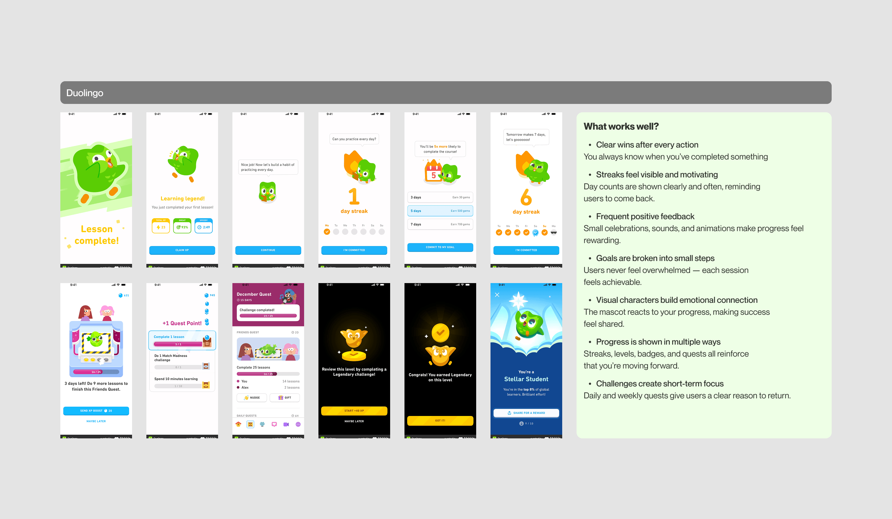
What it is: XP + streaks + levels + quests + badges all working together
How It Works
Duolingo doesn't rely on one progression mechanic—it layers several:
XP (Experience Points): Earned after every lesson, immediate feedback that effort counted
Streaks: Consecutive days tracked prominently, shown in multiple places
Levels: Threshold-based progression (Level 5 → Level 6), creates long-term goals
Daily Quests: Short-term objectives that reset daily, gives reason to return
Badges/Achievements: Milestone celebrations for specific accomplishments
Leaderboards: Social comparison (optional but present)
Key characteristics:
- Clear wins after every action (you always know when you completed something)
- Streaks visible and motivating (day counts shown clearly and often)
- Frequent positive feedback (celebrations, sounds, animations)
- Goals broken into small steps (never feels overwhelming)
- Visual character builds emotional connection (mascot reacts to progress)
- Multiple progress signals reinforce forward movement
Why This Progression System Works
Instant closure after every session
You finish a lesson, see XP gained, level bar fills slightly, streak extends by one day. Every action has visible consequences. There's no ambiguity about whether you made progress.
Short-term and long-term goals layered together
Daily quests give you something to achieve today. Levels give you something to work toward this week. Streaks give you something to maintain this month. The layering keeps engagement high across different timeframes.
Competitive framing matches the product
Language learning benefits from "doing more" and "getting better." XP naturally maps to actual skill gain. More lessons = more vocabulary. Higher levels = real fluency improvement.
Small celebrations keep it rewarding
Every level-up triggers animation. Every streak milestone (7 days, 30 days) gets acknowledged. Frequent wins prevent the grind from feeling tedious.
When To Use This Progression Pattern
✅ Use multi-layered gamification when:
- Your product teaches a measurable skill (language, coding, music)
- "More practice" genuinely equals "better performance"
- Users are motivated by achievement and visible improvement
- Competitive framing feels appropriate (not self-care or wellness)
- You can commit to creating new quests, badges, and content regularly
❌ Don't use when:
- Your product is about relaxation, calm, or emotional well-being
- "More" doesn't equal "better" (meditation quality > meditation quantity)
- Streaks would create anxiety instead of motivation
- Users come to escape pressure, not chase achievements
Trade-offs
What you gain:
High engagement (multiple hooks to return), clear sense of improvement, natural upsell opportunities (streak freezes, XP boosts), strong habit formation
What you sacrifice:
Risk of burnout (too much pressure), complexity (need to balance all systems), ongoing content creation (quests/challenges require updates), not appropriate for calm/wellness contexts
Pattern #2: Headspace — Minimal Time Tracking
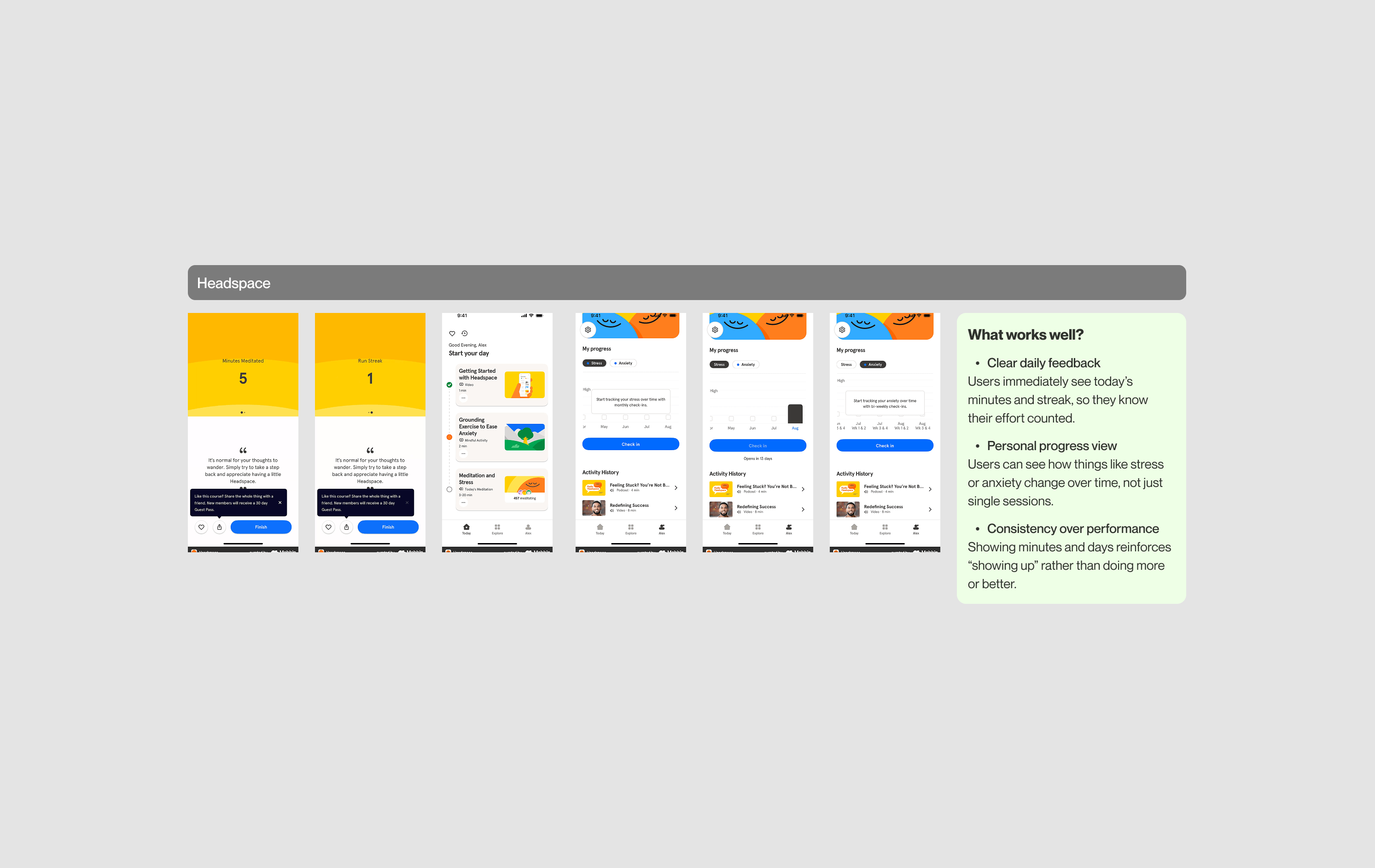
What it is: Minutes practiced + streak count, nothing else
How It Works
Headspace tracks exactly two things:
- Minutes practiced today (and this week, this month)
- Streak (consecutive days, shown but not emphasized heavily)
That's it. No XP. No levels. No badges. No quests.
Key characteristics:
- Clear daily feedback (users immediately see today's minutes and streak)
- Personal progress view (users can see patterns over time, not just single sessions)
- Consistency over performance (showing minutes reinforces "showing up" rather than "doing more")
- Calm visual design (progress indicators feel supportive, not flashy)
Why This Progression System Works
Simplicity matches the product purpose
Headspace is about meditation and mental calm. Adding levels, XP, and competitive elements would conflict with that. The progression system stays minimal so it doesn't distract from the core experience.
Time tracking validates effort without pressure
Seeing "15 minutes today" confirms your practice mattered, even if it was short. There's no judgment about whether 15 minutes is "good enough"—it just is.
Streaks encourage consistency without punishment
The streak is visible, but breaking it doesn't trigger loss messaging or dramatic consequences. It's a gentle nudge to return, not a source of anxiety.
Progress over time, not per session
Users can view total minutes this week or month, which shows patterns without making any single session feel critical. Missing one day doesn't erase your overall progress.
When To Use This Progression Pattern
✅ Use minimal time tracking when:
- Your core value is simplicity or calm
- "Showing up" matters more than "doing more"
- Users value low-pressure environments
- Your product helps with focus, meditation, or emotional regulation
- Complexity would distract from the experience
❌ Don't use when:
- Users want visible achievement and milestones
- Your product benefits from competitive motivation
- You need multiple engagement hooks to drive retention
- Users expect gamification (e.g., learning apps, fitness apps)
Trade-offs
What you gain:
Stays true to product purpose (calm, focus), reduces cognitive load, no risk of progression system overshadowing core value, users appreciate restraint
What you sacrifice:
Fewer engagement touchpoints, limited monetization hooks (can't sell XP boosts or level unlocks), not for users who want visible achievement, less viral/shareable moments.
Pattern #3: Insight Timer — Calendar + Stats (Judgment-Free)
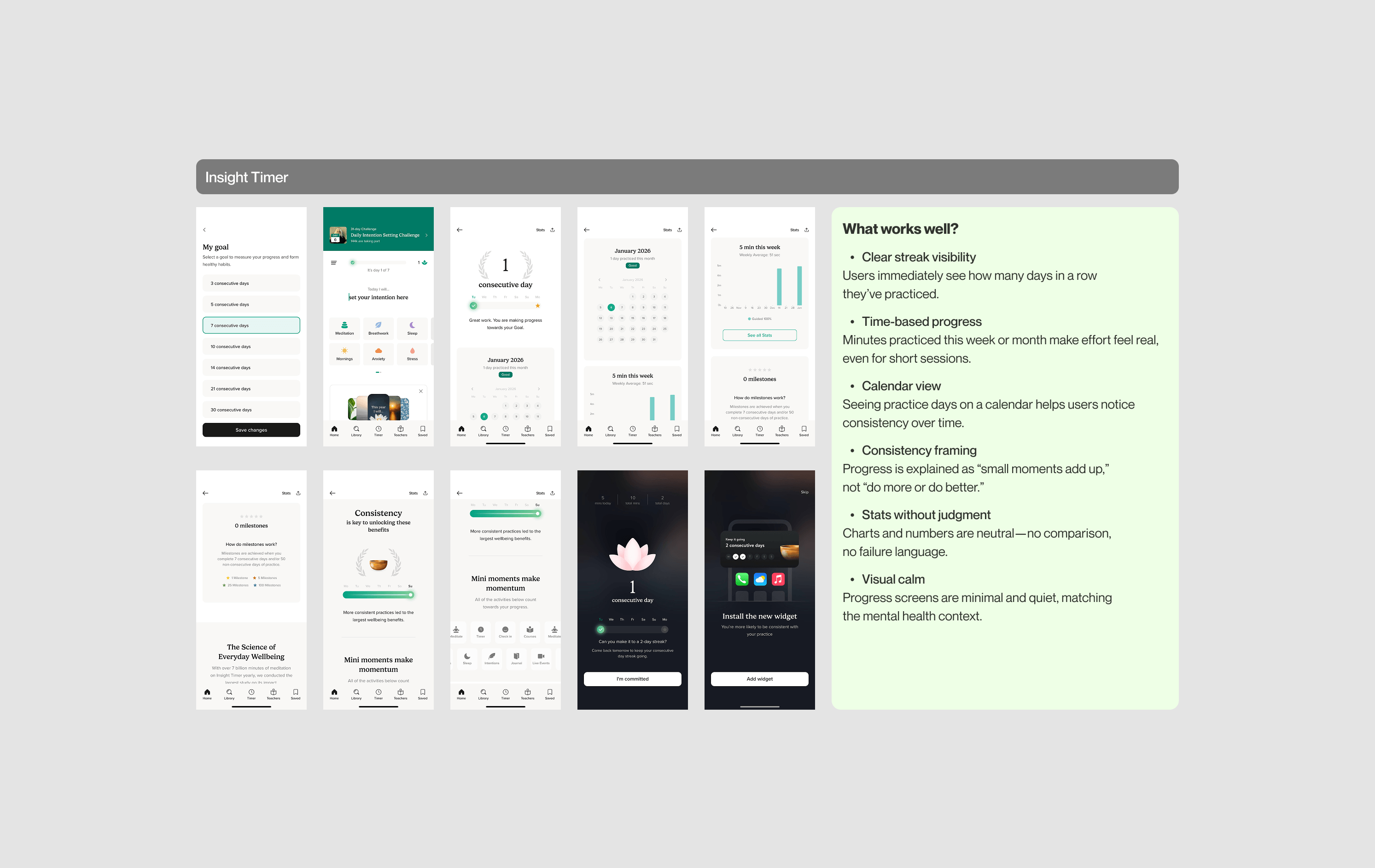
What it is: Time-based tracking + calendar view + neutral charts
How It Works
Insight Timer focuses on pattern recognition without comparison:
Calendar view: Shows which days you practiced (visual consistency tracking)
Time stats: Minutes practiced this week, this month, this year
Streak display: Consecutive days shown, but not heavily emphasized
Charts: Neutral visualizations of practice frequency over time
Key characteristics:
- Clear streak visibility (users see consecutive days immediately)
- Time-based progress (minutes feel real, even for short sessions)
- Visual history (calendar helps users notice consistency)
- Consistency framing ("small moments add up," not "do more or better")
- Stats without judgment (neutral charts, no comparison, no failure language)
- Visual calm (minimal, quiet screens match mental health context)
Why This Progression System Works
Calendar makes patterns visible
Seeing your practice days on a calendar creates awareness. You notice "I practiced 4 out of 7 days this week" without the app telling you whether that's good or bad. The insight is yours.
Time tracking without performance pressure
Minutes practiced ≠ "minutes improved" or "minutes perfected." It's just a count. Ten minutes is ten minutes. This removes the anxiety about whether your practice was "good enough."
Neutral framing reduces shame
There's no "you failed" or "you're behind." If you miss days, the calendar just shows blank spaces. The app doesn't punish you—it just reflects reality.
Long-term view encourages patience
You can see months of practice history. This reinforces that meditation is a long journey, not a daily performance test.
When To Use This Progression Pattern
✅ Use calendar + stats when:
- Users benefit from seeing patterns over time
- Self-awareness is part of the value proposition
- You want to avoid comparison or competition
- Your product focuses on mental health, wellness, or personal growth
- Neutrality supports the experience (no pressure, no judgment)
❌ Don't use when:
- Users want clear milestones and celebrations
- Calendar tracking feels like "homework"
- Your product needs more active engagement hooks
- Immediate feedback matters more than long-term patterns
Trade-offs
What you gain:
Pattern recognition without pressure, judgment-free tracking, supports self-awareness, long-term orientation, fits mental health context perfectly
What you sacrifice:
Less exciting (no celebrations or milestone moments), fewer viral moments (nothing to screenshot and share), not for users motivated by achievement, requires user to interpret their own data
Pattern #4: Finch — Character-Driven Milestones
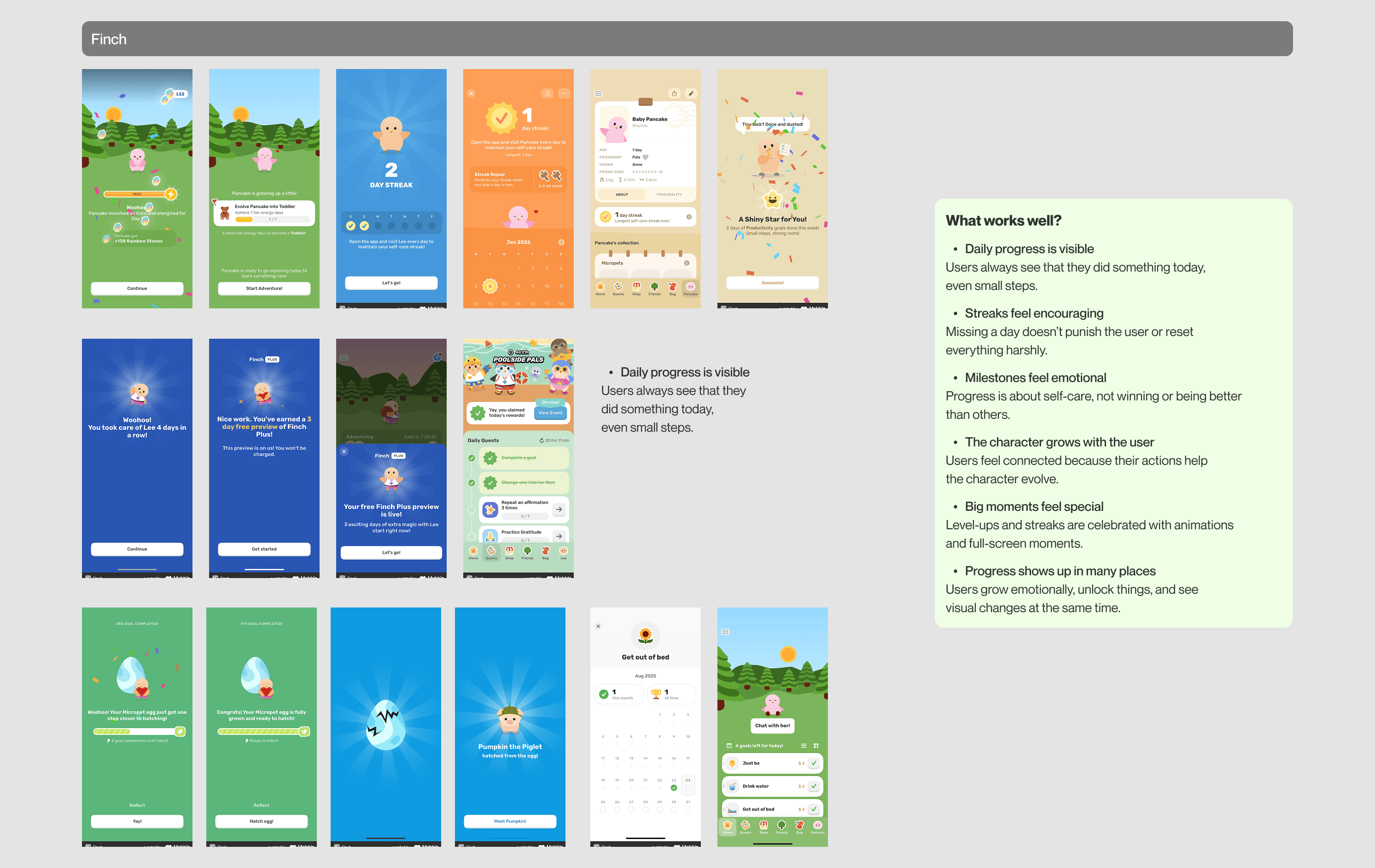
What it is: Days tracked + character evolution + milestone celebrations
How It Works
Finch ties progression to your relationship with a virtual bird companion:
Daily presence tracking: Consecutive days you showed up
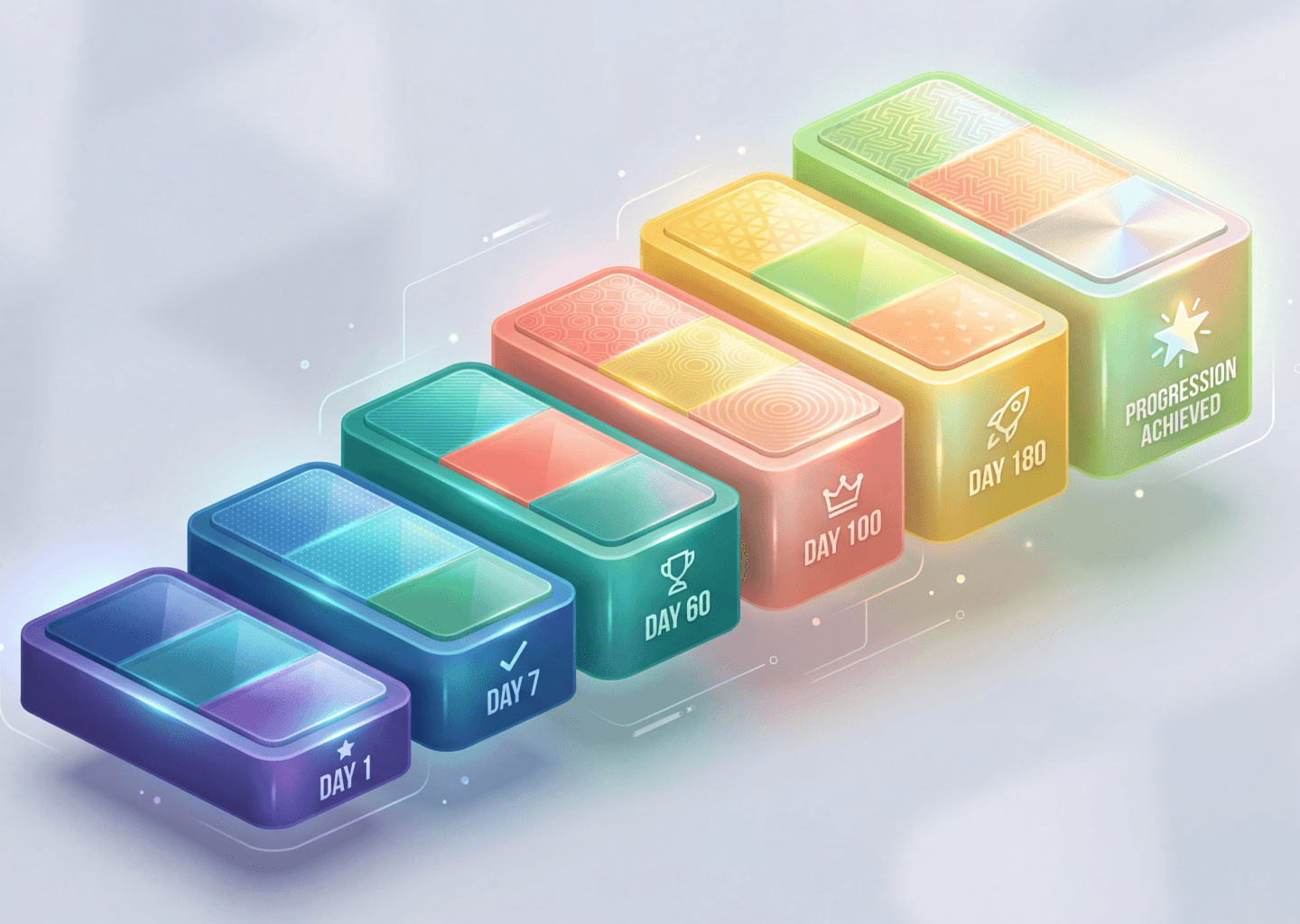
Milestone moments: Special screens at Day 3, Day 7, Day 14, Day 30, etc.
Character evolution: The bird grows and unlocks new interactions over time
Visual environment changes: Your bird's home evolves as you continue practicing
Multiple progress signals: Day count + visual changes + unlocked items + supportive messages
Key characteristics:
- Daily progress visible (you see you did something today, even small steps)
- Streaks feel encouraging (missing a day doesn't reset everything harshly)
- Milestones feel emotional (about self-care, not winning or being better)
- Character grows with you (actions help the character evolve)
- Big moments celebrated (level-ups and streaks get animations and full-screen moments)
- Progress shows up everywhere (day count, visuals, unlocks, messages)
Why This Progression System Works
Care framing changes how progress feels
You're not "earning XP" - you're "helping your bird grow." The emotional frame shifts from achievement to nurturing. Progress feels meaningful because it's about the relationship, not the numbers.
Milestones create memorable moments
At Day 7, a full-screen animation appears. Your bird does something special. You unlock a new interaction. These moments punctuate the experience, making certain days feel important without creating daily pressure.
Character evolution makes progress visible
As days accumulate, your bird changes. New expressions unlock. The environment becomes more detailed. Progress isn't just a number - it's something you can see and feel.
Multiple signals prevent boredom
You're not just watching a streak number go up. You're seeing visual changes, unlocking items, getting messages from your bird. The variety keeps it fresh.
When To Use This Progression Pattern
✅ Use character-driven milestones when:
- Your product has a companion, character, or avatar mechanic
- Emotional connection supports your core value (self-care, habit-building)
- Users benefit from nurturing responsibility (not competitive achievement)
- Milestones can be celebrated meaningfully (not just arbitrary numbers)
- Your audience responds to care framing over achievement framing
❌ Don't use when:
- No character or companion exists in your product
- Users expect utilitarian, professional experiences (B2B tools)
- Achievement motivation is more appropriate than care motivation
- You can't commit to creating milestone content (animations, messages, unlocks)
Trade-offs
What you gain:
Emotional connection (progress feels personally meaningful), multiple engagement layers, memorable milestone moments, sustainable long-term (doesn't require escalating complexity), fits self-care context naturally
What you sacrifice:
Requires character to exist in product, not for achievement-oriented users, milestone content requires design/dev work, less competitive appeal
Pattern #5: Forest — Visual Consequence System
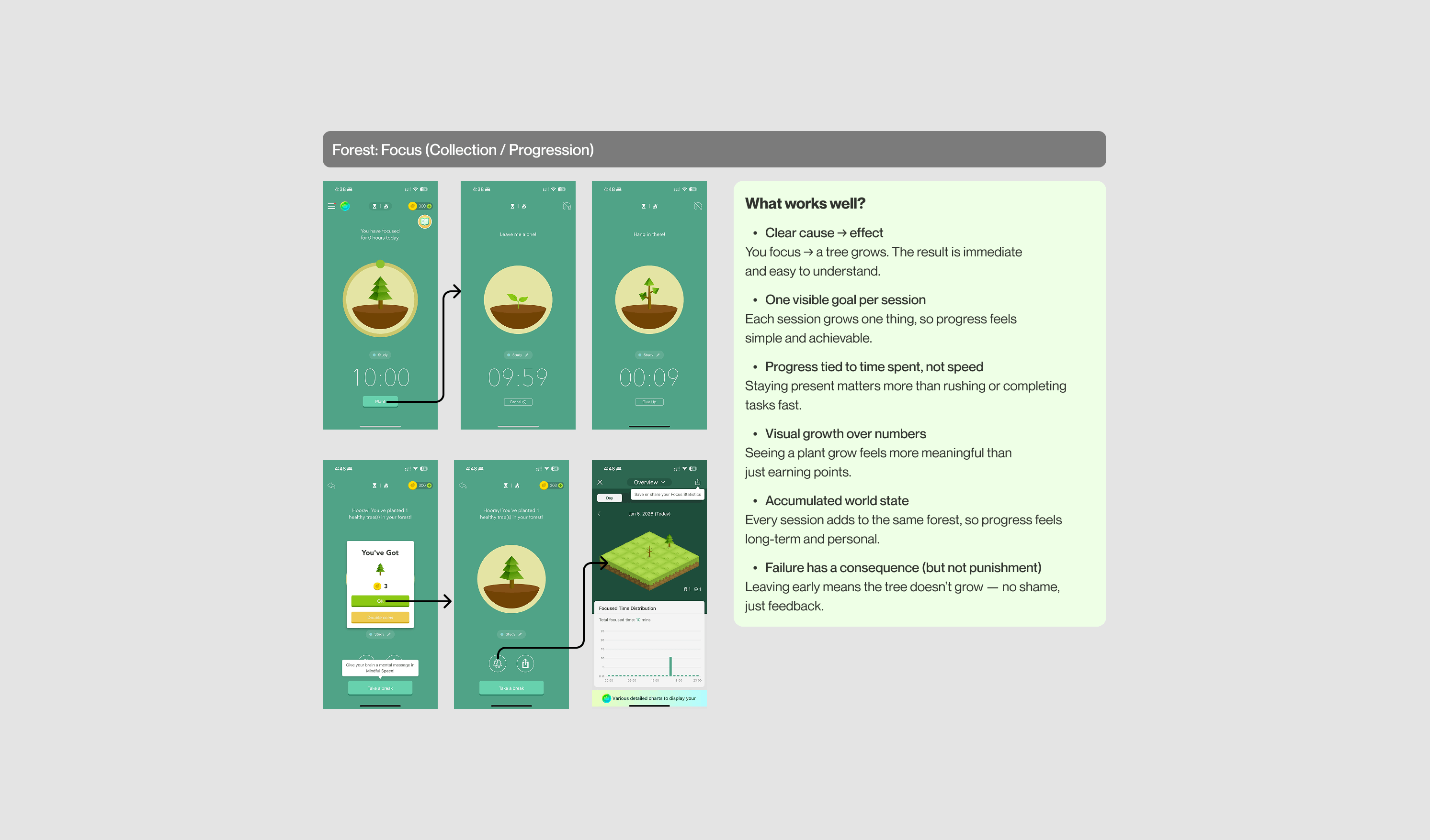
What it is: Each session grows a tree, early exit kills the tree
How It Works
Forest uses visual consequences to drive accountability:
Start a session → A tree begins growing
Stay focused → Tree grows to completion
Leave early → Tree dies (withered, gray)
Accumulated forest → All completed sessions visible together
Key characteristics:
- Clear cause → effect (you focus → tree grows, immediate and understandable)
- One visible goal per session (each session grows one thing - simple, achievable)
- Progress tied to time spent, not speed (staying present matters more than rushing)
- Visual growth over numbers (seeing a plant grow feels more meaningful than earning points)
- Accumulated world state (every session adds to the same forest - long-term, personal)
- Failure has consequence but not punishment (leaving early = tree doesn't grow, no shame)
Why This Progression System Works
Consequence creates commitment
Knowing that leaving the app will kill your tree creates just enough accountability to keep you focused. It's not a harsh punishment - it's a visual consequence that mirrors your behavior.
Visual feedback is immediate and clear
You don't need to interpret stats or check a dashboard. You can see your tree growing. You can see your forest expanding. The feedback is direct and satisfying.
Cumulative world-building creates ownership
Over time, your forest becomes a visual representation of all the work you've done. It's yours. You built it. This creates attachment and makes you less likely to abandon the app.
No performance pressure
A 10-minute session and a 60-minute session both grow a tree. There's no judgment about whether your session was "long enough" or "productive enough." You just get a tree.
When To Use This Progression Pattern
✅ Use visual consequence systems when:
- Your product is about focus, productivity, or time management
- Accountability drives behavior (users want external motivation)
- Visual feedback reinforces the action (seeing results matters)
- Consequences feel appropriate (not self-care or emotional support)
- Cumulative world-building fits your product (users benefit from seeing accumulated effort)
❌ Don't use when:
- Your product is about relaxation or emotional well-being (consequences create stress)
- Failure consequences would feel punishing (meditation, therapy, self-care apps)
- Users need flexibility to stop without "penalty"
- Visual feedback would distract from the core experience
Trade-offs
What you gain:
Strong accountability (consequence creates commitment), immediate visual feedback, cumulative world reflects effort, simple to understand, works well for productivity contexts
What you sacrifice:
Consequences can create anxiety (not appropriate for wellness), less flexibility (users may feel trapped), guilt if trees die (negative emotion), requires visual design investment
| Pattern | Primary Metric | Emotional Tone | Complexity | Best For | Example Apps |
|---|---|---|---|---|---|
| Multi-Layered Gamification | XP + Streaks + Levels + Quests | Playful, competitive | High (many systems) | Skill-building products | Duolingo, Codecademy |
| Minimal Time Tracking | Minutes + Streaks | Calm, neutral | Low (minimal UI) | Focus/meditation products | Headspace, Calm |
| Calendar + Stats | Minutes + Calendar View | Calm, reflective | Medium (stats + visual history) | Pattern recognition products | Insight Timer, Reflectly |
| Character-Driven Milestones | Days + Character Evolution | Warm, caring | Medium (character + environment) | Emotional support products | Finch, Replika |
| Visual Consequence System | Trees Grown + Time | Focused, accountable | Low (simple feedback) | Productivity/focus products | Forest, Flora |
The Progression System Decision Framework
Choosing the right progression pattern depends on what actually motivates your users and what your product helps them achieve.
Step 1: What Is Your Core Value?
Ask: What does your product help users do?
- Build measurable skills (language, coding, music) → Multi-Layered Gamification
- Focus or meditate (calm, presence) → Minimal Time Tracking
- Recognize patterns (mood, habits, reflection) → Calendar + Stats
- Support emotional well-being (self-care, mental health) → Character-Driven Milestones
- Stay productive (time management, deep work) → Visual Consequence System
Step 2: What Motivates Your Users?
Ask: Why do users return?
- Achievement (I want to level up, improve, win) → Multi-Layered Gamification
- Self-care (I want to feel calmer, more present) → Minimal Time Tracking or Calendar + Stats
- Emotional connection (I want to nurture something) → Character-Driven Milestones
- Accountability (I need external motivation to stay focused) → Visual Consequence System
Step 3: What Emotional Tone Fits Your Product?
Ask: How should users feel about their progress?
- Excited, challenged → Multi-Layered Gamification
- Calm, supported → Minimal Time Tracking
- Aware, reflective → Calendar + Stats
- Cared for, connected → Character-Driven Milestones
- Accountable, committed → Visual Consequence System
Step 4: Check System-Product Alignment
Ask these questions:
- Does this progression system reinforce what my product actually helps users achieve?
- Will tracking this metric make users feel good or anxious?
- Does the emotional tone match my product's purpose?
- Can I sustain this system long-term (content, features, updates)?
If any answer is "no," reconsider the pattern.
Common Mistakes With Progression Systems
❌ Mistake #1: Copying Duolingo Into Wellness Apps
Why it fails:
Duolingo's multi-layered gamification works because language learning benefits from competitive pressure and measurable improvement. But meditation apps? Self-care products? Adding XP, levels, and aggressive streaks creates anxiety - the opposite of what users need.
Example of the problem:
A meditation app adds daily XP and levels. Users start meditating to "hit their XP goal" instead of meditating because they need calm. When they miss a day and their streak breaks, they feel like they failed at self-care.
Instead:
Use Minimal Time Tracking or Calendar + Stats. Show users their consistency without making them feel pressured to perform.
❌ Mistake #2: Too Many Progress Signals (Overwhelming Users)
Why it fails:
XP + levels + streaks + badges + quests + leaderboards = cognitive overload. Users don't know what to focus on. Progress feels scattered instead of clear.
Example of the problem:
A habit tracker shows: daily points, weekly points, total points, streak count, level, badges, and monthly challenges. Users feel confused about what actually matters.
Instead:
Choose 1-2 primary metrics that clearly map to your core value. If you're a meditation app, show minutes and streaks - that's it. Everything else is noise.
❌ Mistake #3: Punishing Missed Days (Breaking Trust in Self-Care Apps)
Why it fails:
Harsh streak resets or loss messaging makes users feel like they failed. In self-care contexts, this creates shame and guilt - emotions that push people away from the app.
Example of the problem:
A journaling app resets your streak to zero if you miss one day. You had a 47-day streak. Now it's gone. You feel like you lost all your progress, even though you journaled 47 out of 48 days.
Instead:
Use gentle streak systems. Show total days practiced (not just consecutive). Or use "streak freezes" that let users protect their streak during life events. Focus on overall consistency, not perfection.
❌ Mistake #4: No Milestone Celebrations (Progress Feels Invisible)
Why it fails:
Users accumulate days, minutes, or XP, but nothing ever acknowledges their effort. Progress becomes invisible. There's no emotional payoff for showing up consistently.
Example of the problem:
A habit tracker counts your streak: 7 days, 14 days, 30 days, 100 days. But nothing happens. No animation, no message, no unlock. It just keeps counting. Users don't feel celebrated.
Instead:
Celebrate key milestones. Day 7, Day 30, Day 100—these should trigger something meaningful. An animation. A supportive message. An unlock. Something that says "This matters. You did it."
❌ Mistake #5: Abstract Metrics That Don't Map to Real Value
Why it fails:
Users earn points or levels, but they don't understand how those metrics connect to actual improvement or benefit.
Example of the problem:
A wellness app gives "wellness points" for completing actions. But users don't know what wellness points mean. Do 500 points mean I'm healthier? Is 1,000 better than 500? The metric feels arbitrary.
Instead:
Use metrics that have real meaning. Minutes practiced. Days showed up. Skills learned. These are concrete and understandable. Users know what they mean without explanation.
Key Findings From Our Analysis
After analyzing these five apps, clear patterns emerged:
Finding #1: Wellness apps succeed by tracking consistency, not performance.
Headspace and Insight Timer track minutes and days - not "quality" or "improvement." This removes pressure and supports the mental health context.
Finding #2: Streaks work, but tone matters (pressure vs. encouragement).
Duolingo uses streaks to create beneficial pressure ("Don't break your streak!"). Finch uses streaks to encourage ("You're doing great - keep it up!"). Same mechanic, completely different emotional impact.
Finding #3: Visual progress (character, forest) beats abstract points for emotional products.
Finch's character evolution and Forest's tree growth create emotional connection. Points feel cold and transactional by comparison.
Finding #4: Short-term + long-term goals create sustainable engagement.
Duolingo layers daily quests (short) with levels (medium) and streaks (long). This prevents engagement from dropping after one goal is achieved.
Finding #5: Emotional framing (achievement vs. care vs. accountability) changes how the same mechanic feels.
A streak counter can feel:
- Competitive (Duolingo: "Beat your friends!")
- Supportive (Finch: "You showed up for yourself")
- Accountable (Forest: "Stay focused or the tree dies")
The mechanic is the same. The emotional context changes everything.
Implementation Checklist
If you're adding or redesigning a progression system, use this checklist:
Before You Build
- Identify what your product helps users achieve (skill? calm? focus? emotional support?)
- Identify what motivates your users (achievement? self-care? accountability?)
- Choose progression pattern that matches both product value and user motivation
- Define 1-2 primary metrics (don't overwhelm with too many)
During Design
- Design celebration moments for key milestones (Day 7, Day 30, etc.)
- Choose emotional tone (competitive? supportive? neutral?)
- Decide: streaks or total days? (or both?)
- Plan what happens when users miss days (harsh reset or gentle acknowledgment?)
Before Launch
- Test: Does this system make users feel good or anxious?
- Test: Can users explain what the metrics mean?
- Verify: Does the system reinforce core value or distract from it?
- Set success metrics (retention, session frequency, milestone completion)
After Launch
- Monitor: Which milestones get celebrated? Which feel ignored?
- Track: Does progression usage correlate with retention?
- Listen: Do users mention feeling pressured or supported?
- Iterate: Adjust tone, frequency, or visibility based on feedback
What We Learned
The best progression systems don't feel like achievement ladders. They feel like natural reflections of the value users are already getting from your product.
Three principles emerged across all five patterns:
- Match system to motivation — Achievement-driven products use competitive progression. Self-care products use supportive progression. Productivity products use accountable progression. The system should amplify what already motivates users.
- Consistency > performance for wellness — Wellness apps succeed by celebrating "showing up" not "doing more." Minutes practiced > minutes improved. Days present > days perfect.
- Emotional tone changes everything — A streak counter can create pressure, support, or accountability depending on messaging. The mechanic matters less than the framing.
There's no universal "best" progression system. But there is a best system for your product—and it's the one that makes users feel good about the progress they're already making.
Research Methodology
We analyzed five mobile apps over three weeks:
- Downloaded and actively used each app (10+ sessions per app)
- Documented progression flows in Figma (onboarding, daily use, milestones)
- Identified emotional tone and user response to different mechanics
- Tested how missing days, completing milestones, and long-term use felt
Apps analyzed:
- Duolingo (iOS/Android) — Language learning
- Headspace (iOS/Android) — Meditation and mindfulness
- Insight Timer (iOS/Android) — Meditation and sleep
- Finch (iOS/Android) — Self-care companion app
- Forest (iOS/Android) — Focus and productivity