The Complete Guide to SaaS Onboarding UX: What Works in 2026
Teardowns of Notion, Loom, and Linear — the onboarding UX patterns that activate users faster, hit the aha moment earlier, and cut first-week churn.
The short answer
Fast SaaS onboarding comes down to one move: define your activation event, then delete every step between signup and that moment that isn't strictly necessary. Notion, Loom, and Linear build onboarding into the product itself instead of layering tours on top — and defer profile setup, invites, and billing until after first value.
Key takeaways
- Define your activation event, then strip out every step between signup and that moment that isn't strictly necessary.
- Build onboarding into the product itself, like Notion, Loom, and Linear do, instead of layering tooltips and modals on top.
- Front-loading friction (profile setup, team invites, billing) before first value is the most common and costly onboarding mistake.
- Checklists only work when completion predicts retention; as disguised feature tours like "add a profile photo" they fail.
The Product Isn't the Problem. The First Five Minutes Are.
Acquisition is expensive. A user who signs up, bounces in the first session, and never returns is a complete loss — you paid to acquire them and got nothing back. And yet most product teams invest far more in building features than in designing the experience that determines whether users ever reach those features.
Research from Userpilot suggests that users who complete onboarding are significantly more likely to convert from trial to paid and to remain customers long-term. The specific numbers vary by product, but the directional finding is consistent: onboarding is not a nice-to-have. It's the highest-leverage moment in the user lifecycle.
The reason most onboarding fails comes down to three patterns.
Treating onboarding as a tutorial. The instinct is to explain everything: features, settings, shortcuts, integrations. The result is a 12-step walkthrough that users click through without reading — just to get to the product. Onboarding isn't documentation. It's the first product experience. The goal isn't to inform — it's to activate.
Front-loading friction. Profile setup. Team invites. Workspace configuration. Billing. All before the user has seen why your product is worth configuring. Every step before the first value delivery is a dropout risk. The best products defer everything that isn't essential to activation.
Designing onboarding separately from the product. Onboarding is often built as an overlay on top of the product — tooltips, modals, checklists — rather than as an integral part of the product experience. When onboarding ends, users are dropped into an interface they don't know how to use. The products with the best retention design onboarding into the product itself, not on top of it.
Masterly Onboarding Framework
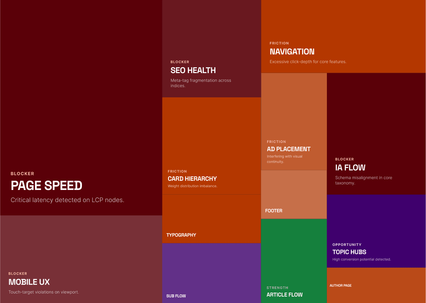
After auditing onboarding flows across dozens of SaaS products — including the UX audits we run for B2B product companies — we've identified four phases that separate the products users stick with from the ones they abandon.
Phase 1: Activation
Goal: Get the user to their first moment of value as fast as possible.
Activation is not account creation. It's not email verification. It's the moment when the user does the thing your product is built for — sends a message, creates a document, completes a task, sees a result.
Everything before that moment is overhead. Design to minimize it.
Key principle: Identify your activation event, then remove every step between signup and that event that isn't strictly necessary.
Phase 2: Orientation
Goal: Help the user build a mental model of where they are and what they can do.
Once the user has completed their first action, they need to understand the space they're in. This isn't a feature tour — it's spatial orientation. Where are things? How do they relate to each other? What's the next logical step?
Good orientation design uses the product itself — empty states, default content, and progressive disclosure — rather than overlays and tooltips.
Key principle: Show, don't explain. Use example content and default states to communicate structure.
Phase 3: Habit Loop
Goal: Get the user to repeat the core action.
A single activation isn't retention. Retention is built on repeated behavior. The third phase is about designing the conditions for return — notifications, streaks, collaborative triggers, or simply a product that users want to come back to.
Key principle: Identify the behavior you want to become habitual and design a trigger for it in the first session.
Phase 4: Expansion
Goal: Surface additional value at the right moment, not all at once.
Features users discover at the right moment feel like rewards. Features dumped on users in the first session feel like complexity. Expansion is the ongoing onboarding — revealing more of the product as the user demonstrates readiness for it.
Key principle: Gate feature discovery behind behavior, not time. Show the next feature when the user has mastered the current one.
Teardowns: Three Products, Three Approaches
Notion — Segmentation First, Checklist as Option
Notion faces an unusually hard onboarding problem: it's a blank canvas product that means different things to different users. A solo writer, a project manager, and a student all need a different first experience.
Notion's answer is segmentation. Before the user sees a single page of the product, they answer two questions: how they want to use Notion (work, personal life, or school) and whether they'll use it alone or with others. Then they select their interests from a multi-select list — to-do lists, habit tracking, project tracking, and more.
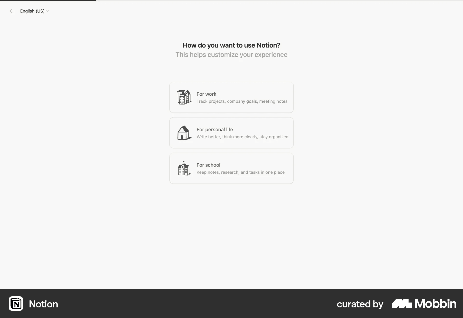
Notion — "How do you want to use Notion?" screen. Source: mobbin.com
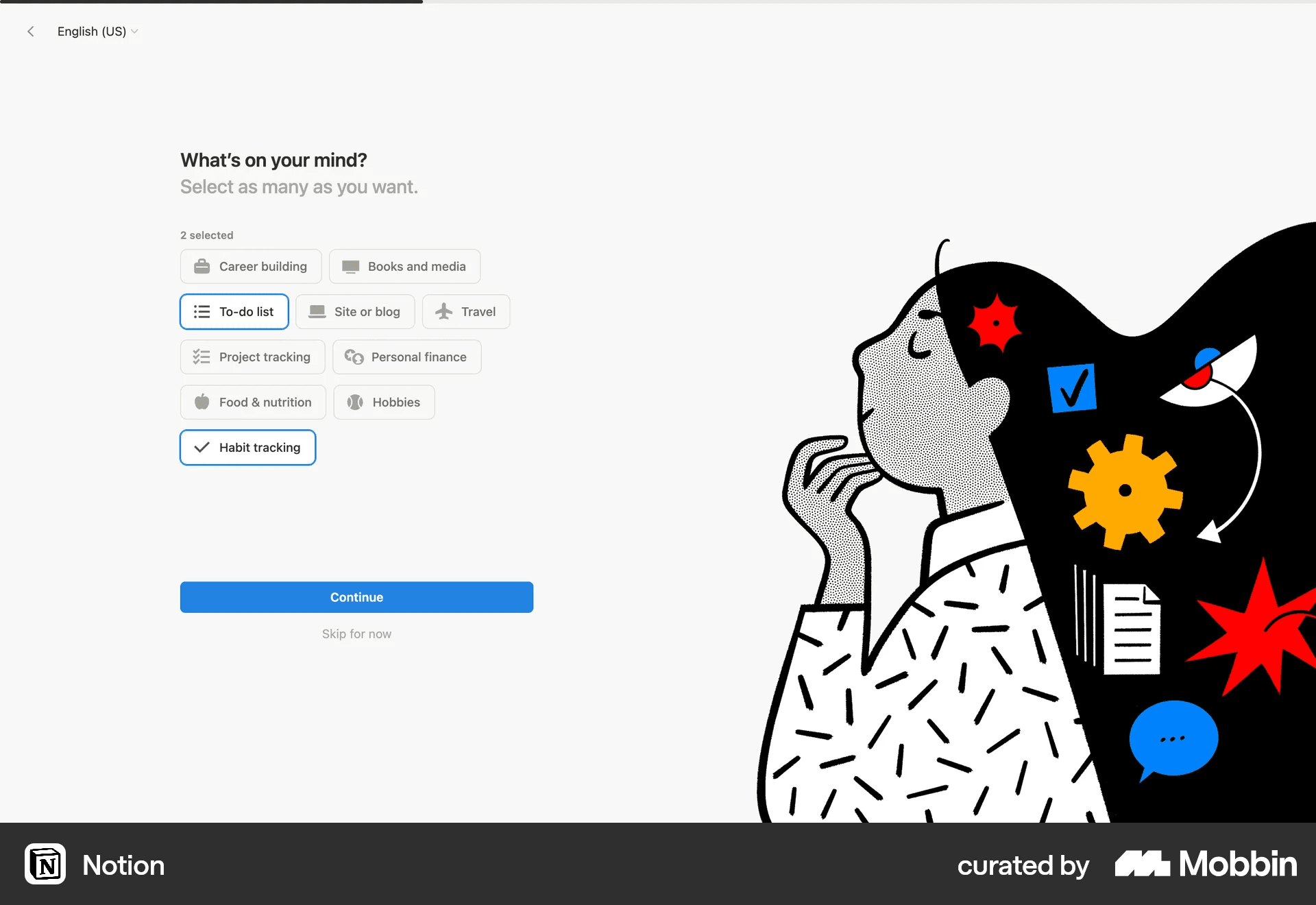
Notion — "What's on your mind?" multi-select screen. Source: mobbin.com
Only after this does the user land in the product — a "Welcome to Notion!" page with an interactive in-product checklist that teaches the basics by doing, not by watching.
The checklist is the core of Notion's onboarding philosophy: it gives structure to users who want guidance, while staying completely out of the way for users who don't. There are no blocking modals, no forced walkthroughs. A user can close the welcome page and start building immediately. The checklist is an offer, not a requirement.
![Notion — "Welcome to Notion!" in-product checklist]Source: mobbin.com](/_next/image?url=%2Fimages%2Fblog%2Fsaas-onboarding-ux-guide%2Fbody-6.png&w=3840&q=85&dpl=dpl_CNtRanjRVhvx2XuX5af1Jt6EN6yQ)
Notion — "Welcome to Notion!" in-product checklist. Source: mobbin.com
**What works:**Use-case segmentation sets up a personalized experience before the user touches the product. The in-product checklist gives structure without forcing it. No blocking overlays or forced walkthrough steps — the product respects the user's autonomy.
**What could be better:**The flow has too many steps before the user reaches the product: email verification → profile setup → use case → interests → desktop app upsell = 5+ screens of friction before first value delivery. The desktop app upsell appears immediately before the user enters the product — a classic example of interrupting the activation moment with a sales message.
Loom — The Product Teaches Itself
Loom has an elegant solution to the onboarding problem: the product demonstrates its own value throughout every step of the flow.
During the use-case selection screen — before the user has even entered the product — a Loom video is already playing on the right side of the screen. The user is watching Loom while signing up for Loom. Once inside the dashboard, the "Inspiration from the Loom Community" section fills the screen with real Loom videos from real users. There's no abstract explanation of what Loom does — only proof of it.
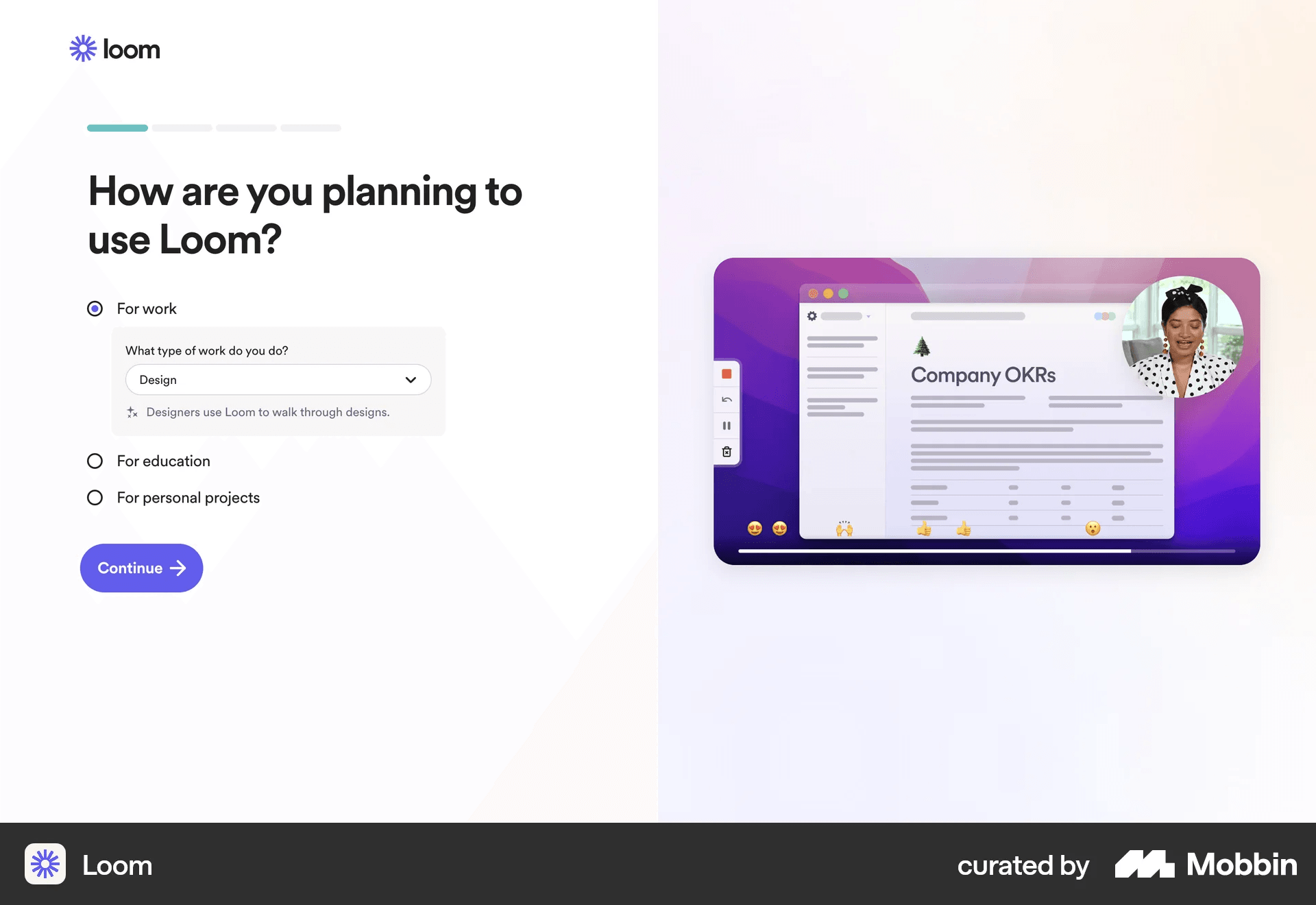
Loom — "How are you planning to use Loom?" with video playing on right. Source: mobbin.com
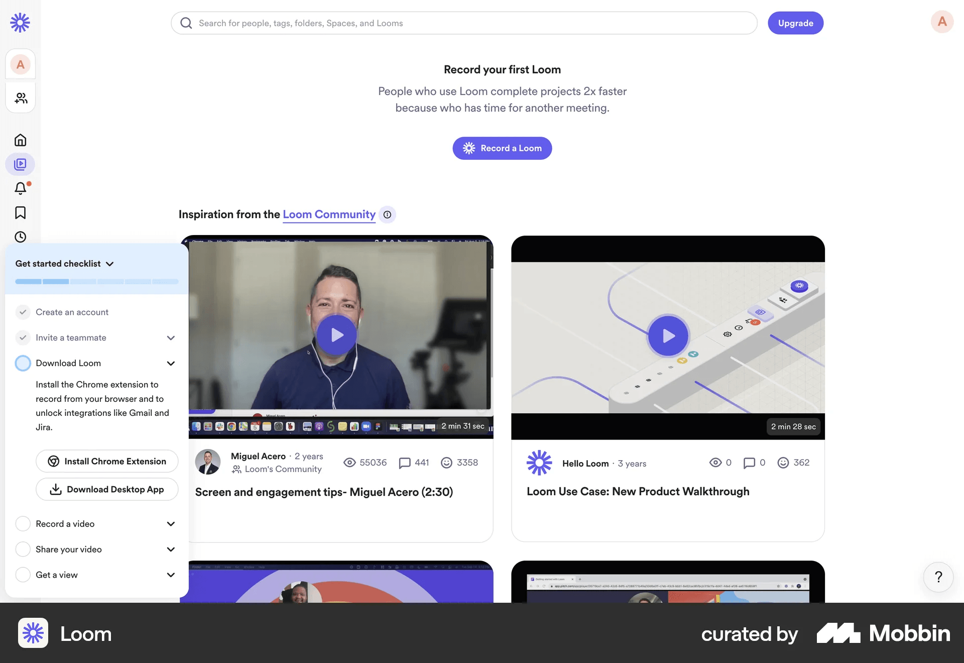
Loom — dashboard with "Record your first Loom" and community videos. Source: mobbin.com
When the user is ready to record, the guided tutorial gives them a choice: "I want to practice" or "I'll explore on my own." The practice path is framed deliberately: "No pressure here. This is just for practice, with friendly tips." Low stakes, high encouragement.
![Loom — guided tutorial record screen with "Ready or not, let's record"]Source: mobbin.com](/_next/image?url=%2Fimages%2Fblog%2Fsaas-onboarding-ux-guide%2Fbody-7.png&w=3840&q=85&dpl=dpl_CNtRanjRVhvx2XuX5af1Jt6EN6yQ)
Loom — guided tutorial record screen. Source: mobbin.com
The activation event — recording a video — immediately produces the shareable artifact that is the product's entire value proposition. The moment the user finishes recording, they have a Loom video ready to share. The product has demonstrated its value not by explaining it, but by delivering it.
**What works:**The product demonstrates itself before the user has finished signing up. Community videos on the dashboard are the best possible product demo: real use cases, real people, no marketing language. "I want to practice / I'll explore on my own" gives the user agency over how much guidance they receive. The first recording immediately produces a shareable link — activation and value delivery happen simultaneously.
**What could be better:**The "Invite your teammates" step appears before the user has recorded anything — asking for referrals before delivering value is the wrong sequence. The choice between Chrome extension and desktop app adds a decision point where there should be a clear recommendation.
Linear — Onboarding Inside the Product
Linear takes a fundamentally different approach: there's no separate onboarding experience. The workspace you land in after signup IS the onboarding. It comes pre-populated with a set of issues — actual Linear issues, in the actual Linear interface — that guide you through the product one step at a time.
"Welcome to Linear 🎉." "Try 3 ways to navigate Linear: Command menu, keyboard or mouse." "Connect to Slack." "Use Cycles to focus work over n-weeks." Each item is a real issue in your real workspace. You onboard by doing exactly what Linear is built for: working through a list of issues.
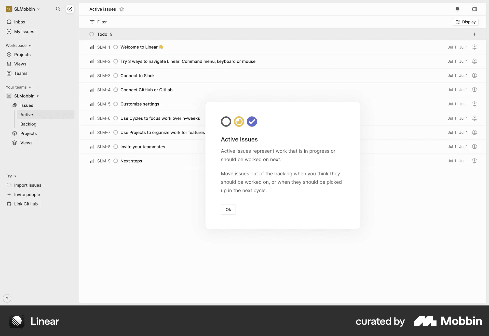
Linear — workspace with pre-populated onboarding issues. Source: mobbin.com
There's one moment before this where Linear breaks from its minimalism deliberately: the command menu screen. Before the user enters the product, they're shown a single screen — "Meet the command menu" — and prompted to press Cmd+K. One shortcut. One lesson. The most important interaction in the product, taught at the moment of highest attention.
[Screenshot: Linear — "Meet the command menu" screen with Cmd+K]Source: mobbin.com
**What works:**Onboarding happens inside the product using the product's own interface — there's no disconnect between learning and doing. Pre-populated issues mean the workspace never feels empty on day one. Teaching Cmd+K before anything else is a smart prioritization: if a user learns one thing, it should be the command that unlocks everything else. "Choose your style" (light/dark) creates a sense of ownership before the user has done any real work.
**What could be better:**Workspace configuration (company size, role) is front-loaded before the user has seen any value. The pre-populated issues are useful, but users who want to create their first real issue have to navigate past the onboarding content to start actual work.
What All Three Get Right
Notion, Loom, and Linear use different approaches — segmentation, self-demonstration, product-native onboarding — but they share three principles:
The product teaches through itself. None of them rely on a separate tutorial layer that describes the product abstractly. Notion uses its own checklist system. Loom uses its own videos. Linear uses its own issue tracker. Onboarding and product are the same thing.
User agency is preserved. In all three cases, the user can choose to skip or explore freely. There are no mandatory walkthroughs, no blocking modals, no "you must complete this before proceeding." The guidance is offered, not imposed.
One lesson at a time. Linear teaches Cmd+K before anything else. Loom gets you to record before anything else. Notion gets you to pick a use case before anything else. Each product identifies the single most important thing for a new user to understand — and makes that the onboarding.
SaaS Onboarding Patterns That Actually Work
Empty states are onboarding. Most teams treat empty states as placeholders. The best products treat them as the first onboarding screen. A well-designed empty state explains what goes here, why it matters, and what the user should do first.
Progressive disclosure over front-loading. Don't show users everything at once. Start with the minimum viable interface and surface additional options as they become relevant. Front-loading complexity is the most common onboarding mistake.
Checklists work — but only for the right actions. Onboarding checklists work when completion is genuinely meaningful — when users who complete all items are demonstrably more likely to stay. They don't work as feature tours. A checklist should contain only the actions that predictably lead to retention, not "add a profile photo" or "explore the dashboard."
In-product onboarding beats tooltips. Tooltips and modals are overlays — they sit on top of the product and explain it abstractly. In-product onboarding uses the product itself as the learning environment. The user learns the feature by using it, not by reading about it.
How to Audit Your Own SaaS Onboarding
If you're not sure whether your onboarding is working, start with five questions. (If you want a structured audit by an outside team, see how we approach UX audits →)
**1. What is your activation event?**Define it precisely — not "the user logs in" but "the user completes [specific action] for the first time." If you can't define it, your onboarding has no target.
**2. How many steps are between signup and activation?**Count every click, form field, and decision point. Each one is a potential dropout. For most products, this number is higher than it should be.
**3. What does a new user see in the first 30 seconds?**Not what you intended them to see — what they actually see. Watch session recordings of first-time users. The gap between intention and reality is usually where the problem lives. Tools like Hotjar or FullStory make this straightforward.
**4. What is your Day 1 retention rate?**If users aren't coming back after the first session, the onboarding isn't creating the habit loop. Day 1 retention below 30% is a signal to investigate.
**5. When do users who churn drop off?**Map your churn against the onboarding flow. If users consistently drop off at the same step, that step is the problem.
The Bottom Line
SaaS onboarding isn't a tutorial. It's the first product experience — and the first test of whether your product delivers on its promise.
The best onboarding flows share three traits: they're short, they're purposeful, and they teach through doing rather than explaining. They get users to the activation event as fast as possible, orient them in the product space, and create the conditions for repeated behavior.
If your onboarding isn't doing those three things, you're losing users who would have stayed.
Looking at your own onboarding and not sure what's breaking? We run structured UX audits for B2B SaaS and AI product companies — see how it works →
Also worth reading: The Hims Effect: Why Healthtech Built a Clone Factory — a teardown of design monoculture in a different vertical.