How to Conduct a UX Audit (And What to Do with the Findings)
A practical UX audit guide backed by a real audit — covering design review, information architecture, performance, monetization, and SEO. Learn the 6-layer framework Masterly uses with clients.
A UX audit is a systematic six-layer diagnosis — design review, information architecture, performance, monetization, SEO, and analytics — that produces traceable, prioritized findings rather than annotated screenshots. The layers compound (slow pages hurt revenue, weak IA fragments SEO), so audit them together, then fix low-cost high-urgency issues first.
Key takeaways
- A real UX audit produces traceable findings across six layers, not a design review of a few annotated screens.
- The six audit layers compound: performance hurts ad revenue, weak IA fragments SEO, and design inconsistencies erode user trust.
- Monetization is the layer most teams skip, yet poor ad placement is a trust problem that lowers return rate and revenue.
- Prioritize findings by urgency with an owner and deadline; fix low-cost high-urgency issues first to build momentum.
Most UX audits fail before they start — not because the team lacks skill, but because the scope is too narrow. A design team reviews a few screens, marks some contrast issues and unclear button labels, and hands back a PDF of annotated screenshots. The client nods, fixes two things, and six months later wonders why conversion still hasn't moved.
The problem: they got a design review, not an audit.
A real UX audit is a diagnostic. It looks at the product the way a doctor looks at a patient — not just the surface symptoms, but the underlying systems. Design is one layer. Information architecture is another. So is technical performance. So is how well the product actually supports the business model it's supposed to serve.
This article explains how we structure UX audits at Masterly, with examples drawn from a real engagement: a high-traffic pop-culture media website with over 100,000 monthly visitors, thousands of articles, and a monetization model built around display advertising and a subscription tier.
What a UX Audit Is (And What It Isn't)
A UX audit is a structured evaluation of a digital product that identifies friction, usability failures, and design inconsistencies — and connects them to outcomes the business cares about.
The word "audit" matters. An audit produces findings, not opinions. Every observation should be traceable to a user behavior, a heuristic principle, or a measurable impact. "The navigation looks cluttered" is an opinion. "The navigation combines six content types and three format types in a single row with no visual hierarchy, making it impossible for a user to predict where they'll land" is a finding.
A UX audit is also not a redesign. It's not a recommendation to rebuild everything. A good audit tells you what's broken, what's sub-optimal, what's actually working, and in what order to address it. The output should enable confident decisions — not more debate about whether to change something.
When You Need a UX Audit
The clearest signal is a gap between traffic and outcomes. If users are arriving and leaving without converting, subscribing, or engaging, something in the experience is creating friction or confusion that analytics alone can't explain.
| Symptom | What it usually means | Most relevant audit layer |
|---|---|---|
| High traffic, low conversion | Friction in the critical path — CTA, onboarding, or pricing flow | Design Review + Monetization |
| Good desktop metrics, poor mobile | Performance or layout issues on mobile specifically | Technical Performance + Design Review |
| Traffic dropping without obvious cause | Indexability problems, crawl issues, or Google quality signals | SEO Health |
| Users complete onboarding but don't return | Weak activation loop or no clear "next action" after setup | IA + Design Review |
| New team inheriting an existing product | No documented baseline — need to understand what works before touching anything | All 6 layers |
| Pre-redesign | Redesigning without a baseline means repeating the same mistakes | All 6 layers |
| Monetization underperforming despite traffic | Ad placement, subscription CTA, or upsell moment design | Monetization |
Before a redesign.
Launching a redesign without understanding why the current product is underperforming is expensive. An audit gives you a baseline — what to preserve, what to fix, and what to rethink entirely.
After a product has grown beyond its original design.
Features get added. New templates get built. Teams change. The original design logic degrades. What started as a clean system becomes a patchwork of inconsistencies that slows users down without any single person having intentionally broken it.
When a new stakeholder needs to understand the product quickly.
A new CPO, a new design lead, or a new agency coming onto an existing product benefits enormously from a rigorous audit before making any changes.
When monetization is underperforming.
This is underrated. Design directly affects ad viewability, subscription conversion, and the effectiveness of upsell moments. A UX audit that covers monetization logic is often the fastest path to meaningful revenue improvement.
The 6-Layer Audit Framework
A comprehensive audit covers six distinct layers. Each can be run independently depending on scope, but they compound: performance issues affect ad revenue, IA issues affect SEO, design inconsistencies affect trust. The full picture is always more actionable than any single layer alone.
| Layer | What it covers | Key questions answered |
|---|---|---|
| 1. Design Review | Heuristic evaluation, visual hierarchy, consistency, UI patterns | What's creating friction screen by screen? What's working and must be preserved? |
| 2. Information Architecture | Sitemap, navigation logic, content hierarchy, user flows | Can users find what they came for? What happens after they finish a key action? |
| 3. Monetization & Conversion | Ad placement, subscription CTAs, upsell moments, pricing page design | Is the product structured to convert? Are revenue moments competing with trust? |
| 4. Technical Performance | Core Web Vitals, PageSpeed, render-blocking assets, mobile load | Is the experience fast enough to be usable? What's causing performance degradation? |
| 5. SEO Health | Indexability, URL structure, crawl budget, on-page signals, structured data | What can Google access and rank? Where is crawl budget being wasted? |
| 6. Analytics | Traffic sources, device split, bounce rate, funnel drop-offs | What does actual user behavior confirm or contradict from the other layers? |
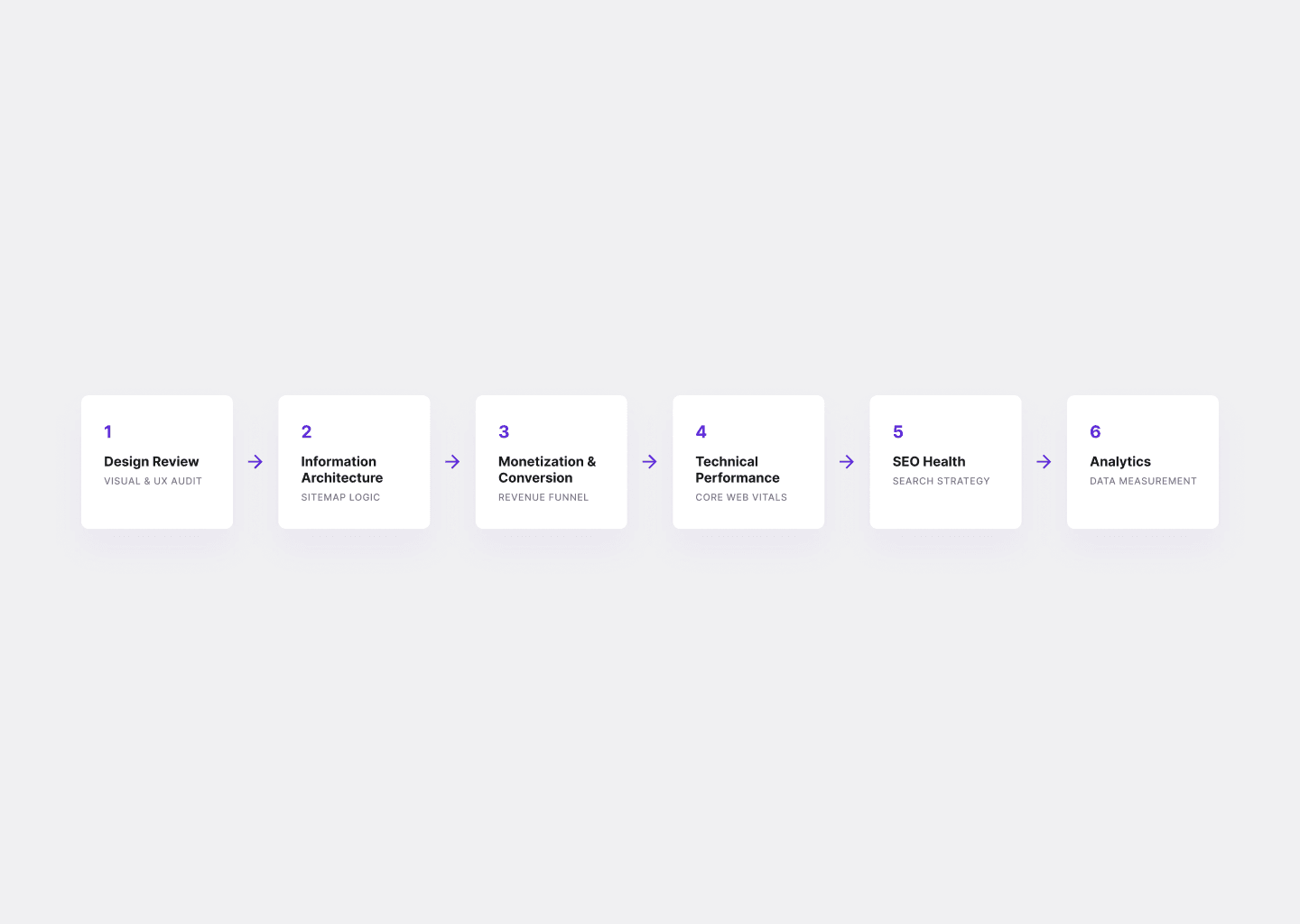
The 6-Layer Framework
Layer 1: Design Review
This is the heuristic evaluation — the most familiar part of a UX audit, and the one most often done in isolation.
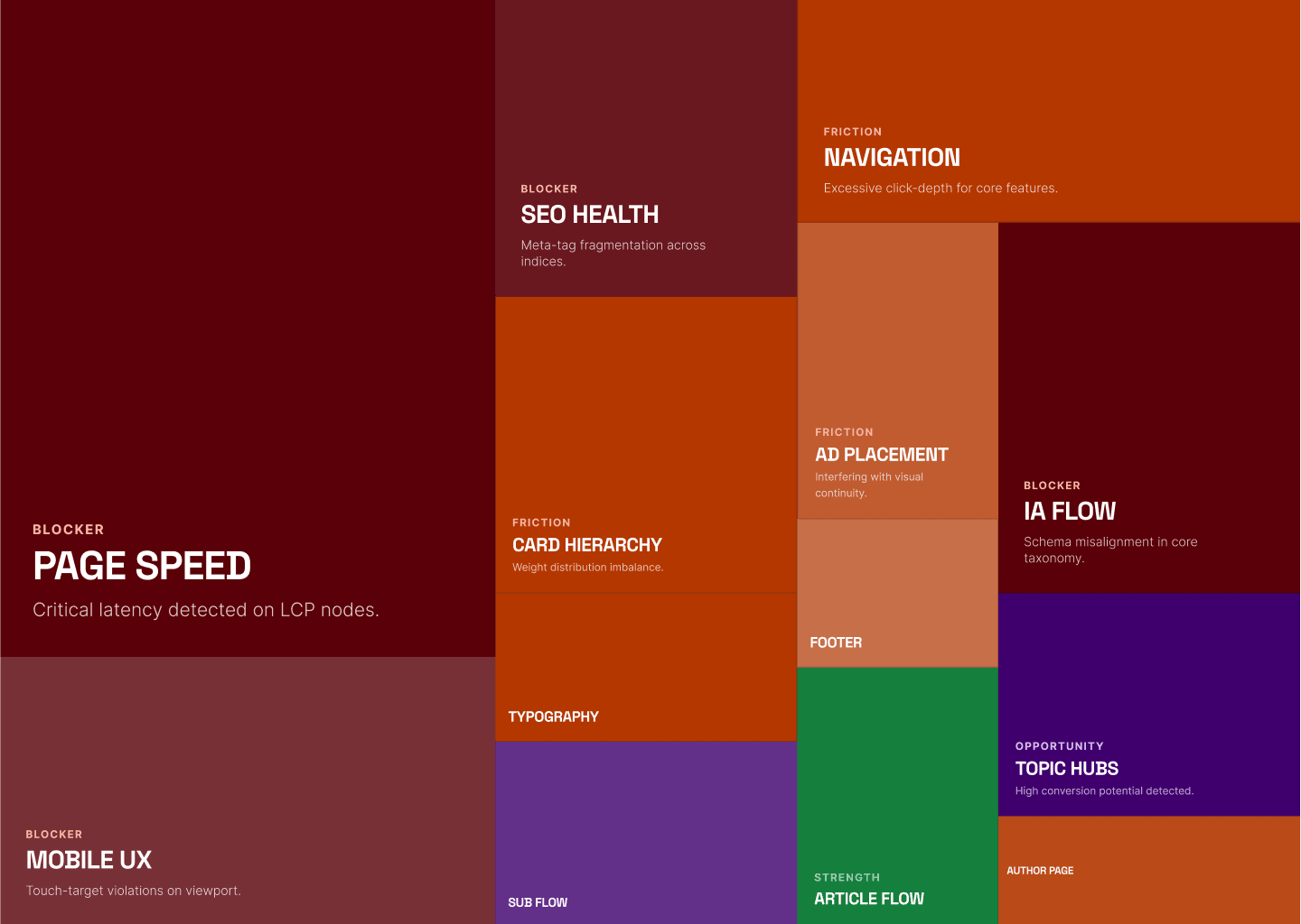
We work screen by screen: home, category, article, author, search results, checkout or subscription flow, footer. For each screen, every element gets classified into one of four tiers — what we call the Masterly Impact Tiers:
Strength — something that's working and worth preserving. Documenting what's working is as important as documenting what isn't. It prevents teams from accidentally redesigning away things that are actually effective.
Friction — usable but suboptimal. These issues create friction or confusion that erodes engagement over time.
Blocker — a clear usability failure. Users are being actively misled, blocked, or confused.
Opportunity — a design improvement that doesn't fix a current problem but would noticeably increase the value of the experience if implemented.
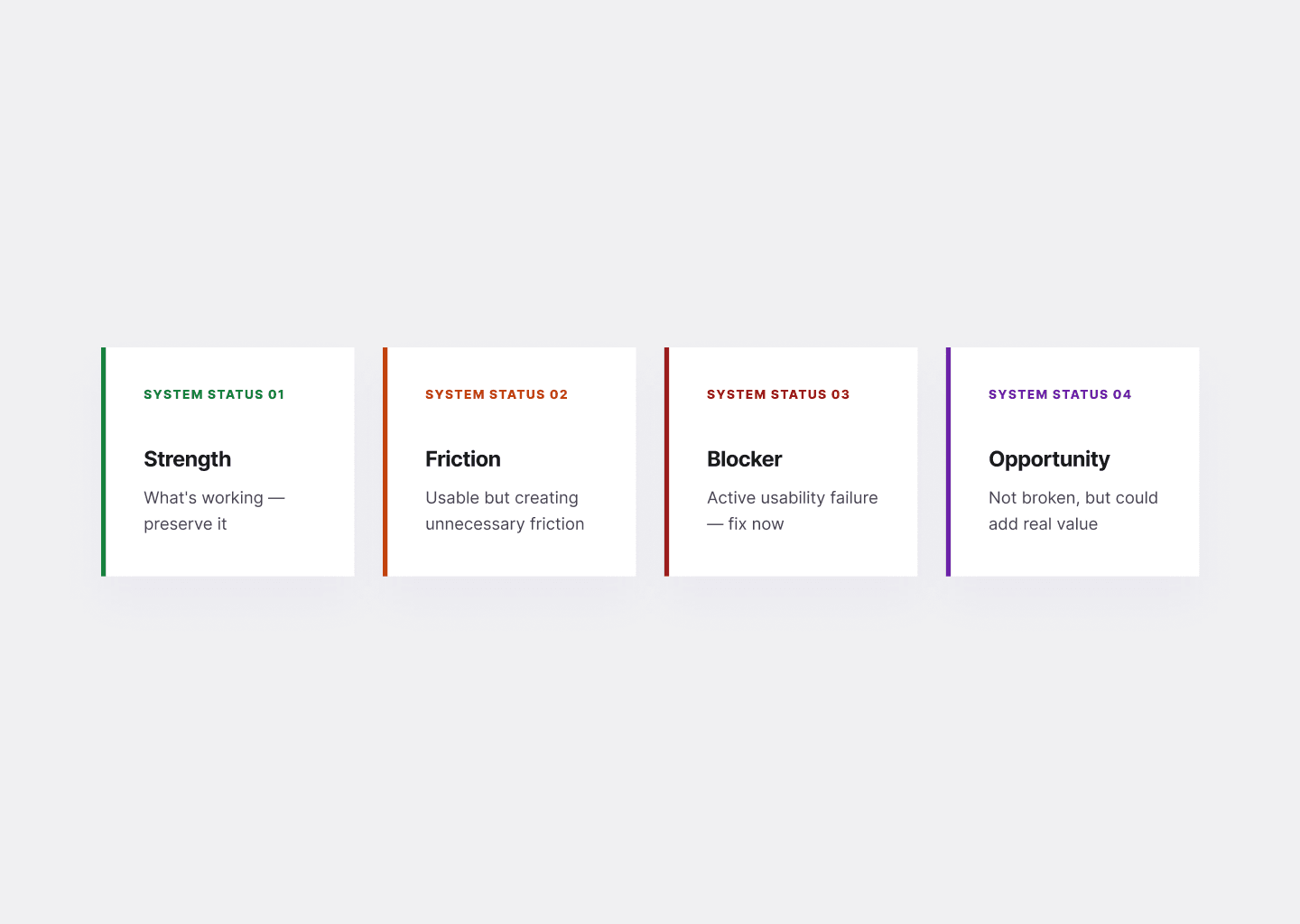
Masterly Impact Tiers
In the media platform audit referenced here, design review surfaced a consistent pattern: low visual hierarchy everywhere. Navigation mixed content types (Reviews, Movie News, TV News) with domain categories (Comic Books, Wrestling, Music) in a single row, with no logic a user could internalize. Article cards had four elements — headline, date, author, excerpt, rating — all at similar weight and size, so nothing pulled the eye. The "POST COMMENT" button was visually lighter than the "SIGN UP FOR PARAMOUNT+" promotional block directly below it, making an ad look more like the primary action than the actual interaction the user came to take.
None of these are catastrophic errors. All of them compound. A user who can't quickly orient themselves reads less, clicks less, and leaves sooner.
The design review also surfaces what's working. In this case: no pop-ups, no autoplay video, no aggressive interstitials. Reading articles was clean. That's a genuine competitive advantage for an ad-supported platform, and worth naming explicitly so no future redesign accidentally introduces the things the current product wisely avoided.
Layer 2: Information Architecture
Information architecture determines whether users can find what they came for and discover what they didn't know they wanted. Most IA problems aren't visible in individual screens — they emerge when you map the full structure.
The audit framework maps the current sitemap: every page type, how users navigate between them, what happens when they finish an article, and what the site's structure communicates about content priorities.
Common IA failure modes in content-heavy products:
- Navigation that mixes formats and topics in the same row, making the hierarchy impossible to read
- Category pages that behave identically to archives — an article list is not a hub
- Footer that functions as a dead end rather than a navigation aid
- Author pages with no identity signals — just a list of articles with a placeholder avatar
- No clear path from article completion to next article, next topic, or subscription
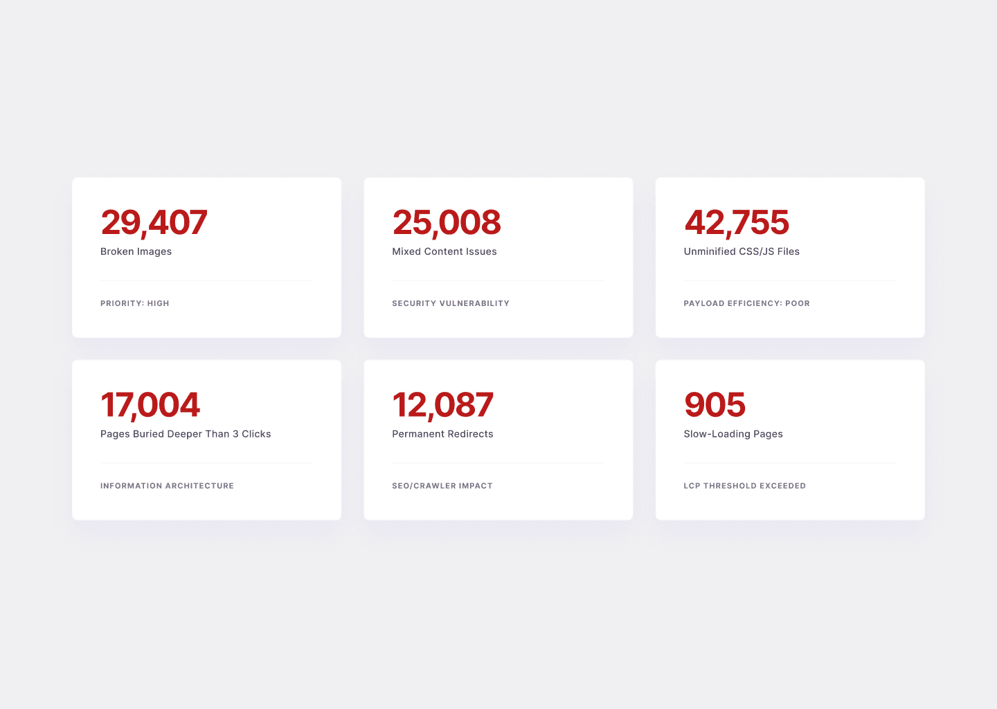
In the media platform audit, the site had 17,000+ pages buried deeper than three clicks from the homepage, and 12,000+ permanent redirects fragmenting crawl paths. The structure had grown organically over years without a governing IA logic, resulting in what we characterized as "a big blog with many lists" rather than an entertainment hub. Topic hubs — dedicated pages for Marvel, Star Wars, Horror, Anime — didn't exist. When a user arrived at a wrestling article, there was no structured path into more wrestling content. They either clicked a related post at random or left.
The IA redesign recommendation centered on a hub-and-spoke model: clear top-level entry points (News, Reviews, Topics, Specials), dedicated franchise and genre hubs with filtered content, and defined article templates that always included a "More from this topic" module and a clear "Up next" link. Not revolutionary. Entirely achievable. Measurably better for both users and ad impressions.
Layer 3: Monetization & Conversion
This layer is the one most design teams skip, which is why it's often where the biggest opportunities live.
For ad-supported products, monetization review looks at: where ads are placed, how they're labeled, how they compete with editorial content for visual attention, and whether the ad layout is optimized for the devices users actually use.
In the media platform audit, the primary sponsor's banner appeared above the navigation bar — so the first thing users saw on both desktop and mobile was an ad, not the site's own brand or content. The same sponsor appeared in multiple positions on the same page without clear "Ad" or "Sponsored" labeling, blurring the line between editorial and commercial content. On mobile, desktop-sized banner units were simply scaled down rather than redesigned for the smaller context.
Each of these is a trust issue before it's a revenue issue. Users who feel a site is primarily an ad delivery mechanism — rather than a content platform that happens to carry ads — disengage faster and return less often. Lower return rate means lower total impressions, which means lower ad revenue. The UX problem and the business problem are the same problem.
Monetization recommendations for this client covered four immediate fixes (define clear ad zones, rebalance the first screen so editorial content is visible on load, label ads clearly, design mobile-first ad components) alongside longer-term opportunities (subscription tier with ad removal, curated "fandom paths" at end of articles, topic hubs as high-value contextual ad surfaces, release calendar pages as always-on ad inventory).
For SaaS and subscription products, this layer instead covers conversion flow, onboarding completion rate, upgrade path clarity, and the design of pricing pages and CTAs.
Layer 4: Technical Performance & Core Web Vitals
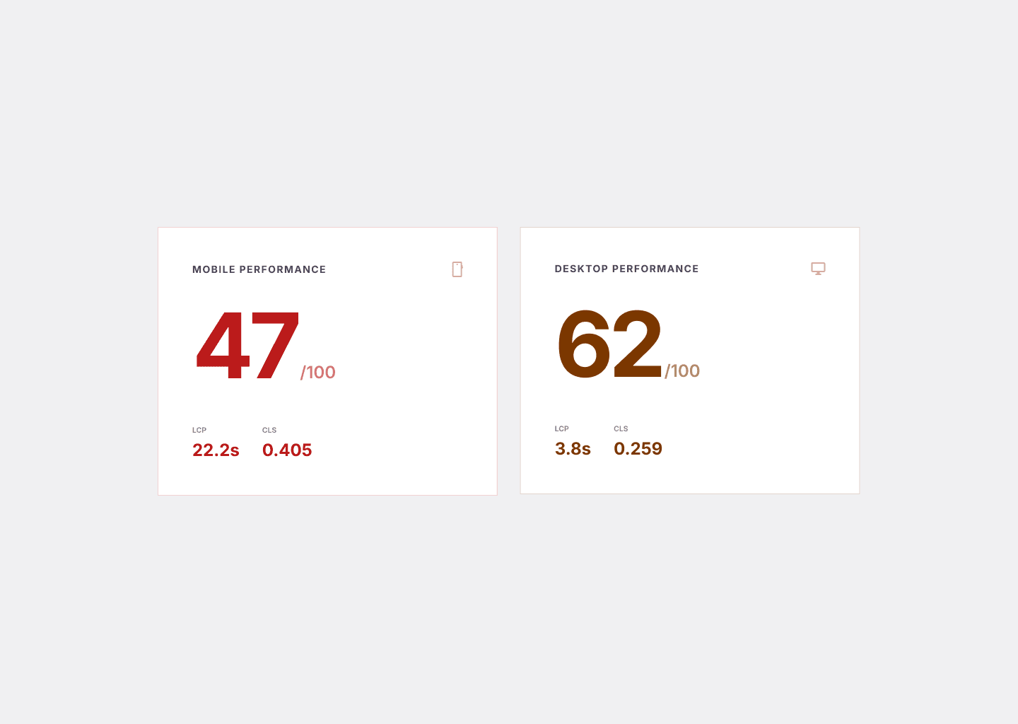
A UX audit that ignores performance is incomplete. Slow pages create a user experience problem independently of any design decision. They also directly limit what's possible — a page that scores 47/100 on mobile PageSpeed cannot safely carry additional ad slots or feature richness without degrading further.
The performance layer benchmarks Core Web Vitals (LCP, CLS, TBT) on both mobile and desktop, identifies root causes, and maps them to specific fixes.
In the media platform audit, mobile performance scored 47/100 on PageSpeed Insights — significantly below Google's "Good" threshold. The LCP (Largest Contentful Paint) was 22.2 seconds on mobile, meaning users stared at a partially loaded screen for over 20 seconds before seeing real content. Cumulative Layout Shift (0.405) meant buttons and headlines jumped while the page loaded, causing mis-taps and reading position loss. GTmetrix gave the site a D grade (55% performance, 78% structure).
Performance Snapshot
Root causes: 29,000+ broken images increasing rendering instability; 42,000+ unminified CSS and JS files increasing payload; inconsistent caching with no object caching configured; render-blocking CSS and JS delaying first paint; oversized media with no compression or lazy loading.
These aren't design problems. But they directly affect design outcomes — ad viewability, engagement depth, bounce rate, and Google's quality signals for organic ranking. A design team that doesn't surface these issues is delivering an incomplete audit.
The performance roadmap prioritized three workstreams in sequence: caching setup (Redis for WordPress, full-page caching), image and media optimization (WebP/AVIF, lazy loading, responsive sizes), and frontend cleanup (deferred non-critical JS, CDN for static assets).
Layer 5: SEO Health
For content platforms, SEO is an existential concern — organic search is typically the dominant traffic channel. For product companies, it still matters for service pages, case studies, and blog content that supports inbound.
The SEO layer of a UX audit covers: indexability (what Google can and can't access), URL health (duplicates, redirects, broken pages), on-page signals (title tags, meta descriptions, H1s, schema), and crawl efficiency (whether Google's crawl budget is being spent on pages that matter).
The media platform audit revealed critical SEO fragility. A Screaming Frog crawl — only 52% complete — had already discovered 326,000+ URLs. For a content site, this is far above normal and indicates index bloat: auto-generated archives, infinite pagination loops, and parameter variations creating thousands of near-identical pages that dilute crawl budget and fragment authority.
Specific critical issues: 21,719 mixed-content URLs (HTTP references inside HTTPS pages); 11,831 internal 5xx server errors; 9,191 HTTP URLs lowering canonical consistency; 881 pagination errors creating infinite crawl loops; inconsistent structured data across article and review templates limiting rich result eligibility.
Technical Debt Snapshot
SEO rating: Critical. Immediate action required.
The SEO health layer connects directly to IA. A fragmented URL structure with 12,000+ permanent redirects and 17,000+ pages deeper than three clicks is both an IA problem and an SEO problem. Fixing IA improves SEO. Fixing SEO reinforces the value of IA investment. This is why the layers compound.
Layer 6: Analytics & User Data
The analytics layer grounds the audit in actual behavior rather than inferred intent. It answers: who is actually using this product, on what devices, arriving from what sources, and what are they doing (or not doing) once they arrive?
For the media platform, analytics revealed a 78.3% desktop / 21% mobile split — unusually low mobile share for a content platform. Industry benchmarks for media and entertainment typically run 60–70% mobile. Low mobile share indicates that mobile UX friction, performance issues, or intrusive ad layouts are suppressing mobile engagement. The users are coming — Google Search sends mobile traffic — but they're bouncing at a higher rate. This quantifies what the design review and performance audit described qualitatively.
Analytics also validates hypotheses from other layers. If heuristic review identifies a weak article-to-article navigation system, you expect to see low pages-per-session. If the audit identifies no clear subscription upsell moment, you expect to see low subscription conversion from organic traffic. Analytics either confirms or challenges what the other layers suggest.
What a Good Audit Output Looks Like
A good audit output has three properties:
It's layered by urgency, not by screen. A 47-page deck organized by page type is hard to act on. A roadmap organized by priority — what to fix in the next two weeks, what to plan for Q2, what to monitor over time — tells the team what to do on Monday.
It names the business impact, not just the design problem. "The comment form input fields are cramped" is a design observation. "The cramped comment form creates friction at the point of highest engagement intent — users who have read a full article and want to respond — reducing community participation and repeat visit motivation" is a finding with business context.
It documents what's working. A good audit is not a hit list. It identifies what to preserve, what to protect in the redesign, and what competitive advantages the product already has. In the media platform audit, clean reading experience and no intrusive ad formats were genuine positives worth explicitly noting — because they're easy to accidentally eliminate in a redesign focused on "improving" the experience.
What to Do with the Findings
The most common audit failure mode isn't a bad audit. It's a good audit that sits in a Google Drive folder and influences nothing.
Findings need an owner and a deadline before they leave the audit presentation. The prioritization framework is simple: fix high-urgency issues that have low implementation cost first — these are quick wins that build momentum and trust. Then sequence medium-urgency improvements into the next design sprint. Treat low-urgency items and suggestions as a backlog to revisit quarterly.
For structural problems (IA redesign, performance overhaul, SEO clean-up), create a parallel workstream with its own timeline and resourcing. These don't compete with feature work — they enable it. A platform with 47/100 mobile performance can't safely add features without making the problem worse.
The audit output should end with a clear statement of expected impact: what changes when these recommendations are implemented, expressed in terms the business cares about. More pages per session. Higher ad viewability. Stronger Core Web Vitals scores. Lower bounce rate on mobile. Subscription conversion from organic traffic. These aren't guarantees — they're the logical outcomes of solving the specific problems the audit identified.
If your product has traffic but not the outcomes you expect — users who arrive but don't convert, subscribe, or come back — a UX audit is the fastest way to find out why.
We run audits across design, IA, performance, and SEO, and deliver a prioritized roadmap your team can act on the week it lands.
Related: The Complete Guide to SaaS Onboarding UX · The Hims Effect: Why Healthtech Built a Clone Factory