Ocoord: healthcare compliance SaaS, designed so practices know what to do next
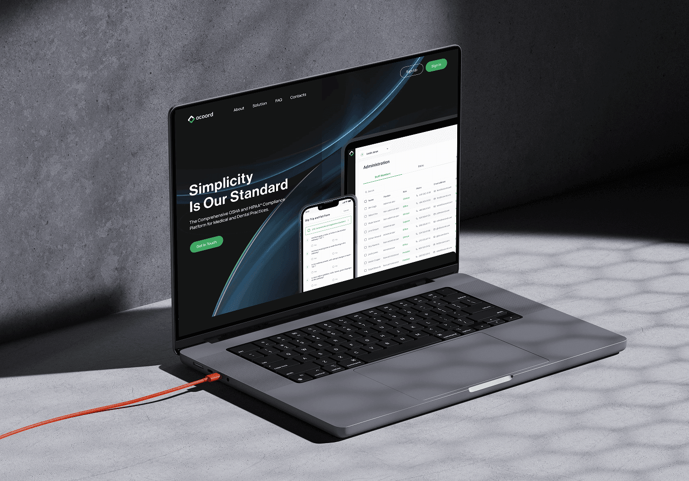
Ocoord turns OSHA and HIPAA compliance into a task list medical and dental practices can actually follow. We designed the SaaS platform, the marketing site and the investor deck. Ocoord raised $500K, lifted site conversion by 192% and grew monthly subscriptions by 87%.
The question
Medical and dental practices have to comply with OSHA and HIPAA, and most of them have no dedicated compliance staff. The regulations are dense, the penalties are severe, and the people responsible are busy treating patients.
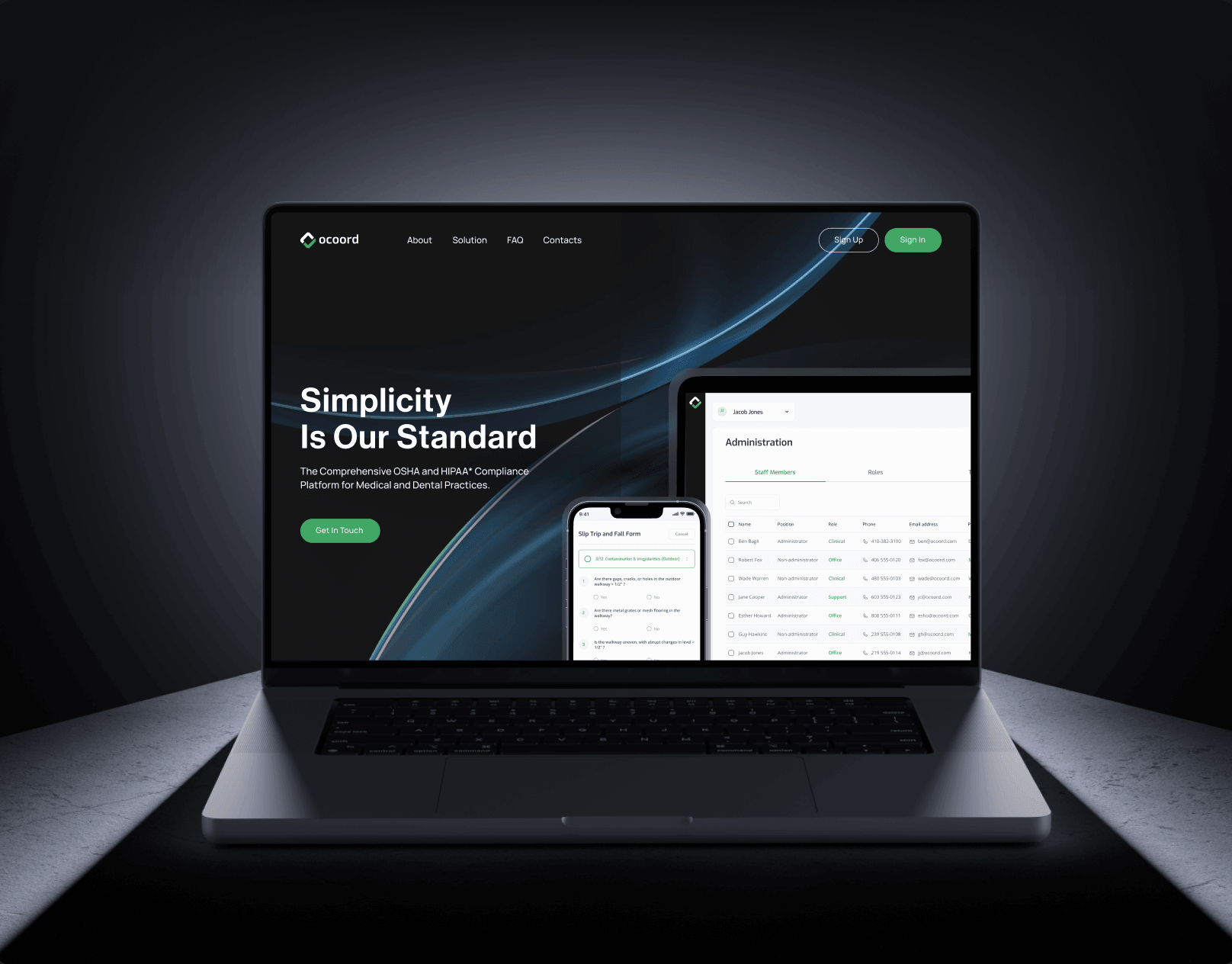
Ocoord set out to turn compliance into something a practice can manage without an expert on staff. Their tagline is "Simplicity Is Our Standard". The question for us was whether a SaaS product could make a practice manager feel that way in the first session: not "here are the regulations", but "here is what to do today".
What we found
Four constraints shaped the work.
- The domain is intimidating by default. OSHA workplace safety, HIPAA privacy and Safety Data Sheets each have their own requirements. Presented as regulation, they overwhelm. Presented as tasks, they become manageable.
- Trust has to be visible. Practices handle patient data. The design had to communicate security and professionalism before anyone read a feature list.
- Two products, one experience. Ocoord needed the SaaS platform where users manage compliance and the marketing site where prospects learn about it, and the two had to feel like the same company.
- The user is on the move. Practitioners access tools between patients, often on a phone.
What we decided
Design the product around "what to do and when". Compliance tasks are integrated into a guided interface that tells the user the next action rather than asking them to remember the regulation. Systematic guidance replaces specialised knowledge. The same patterns cover OSHA, HIPAA and SDS so the user learns the product once.
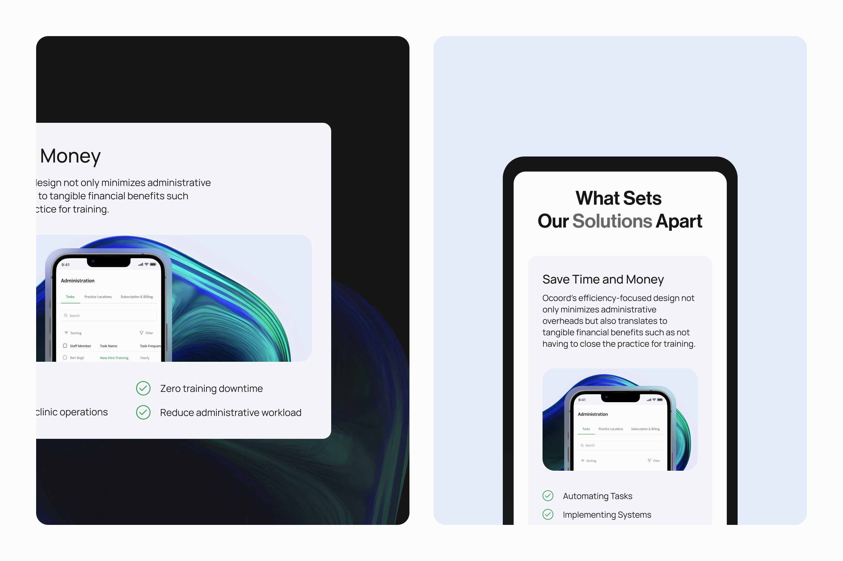
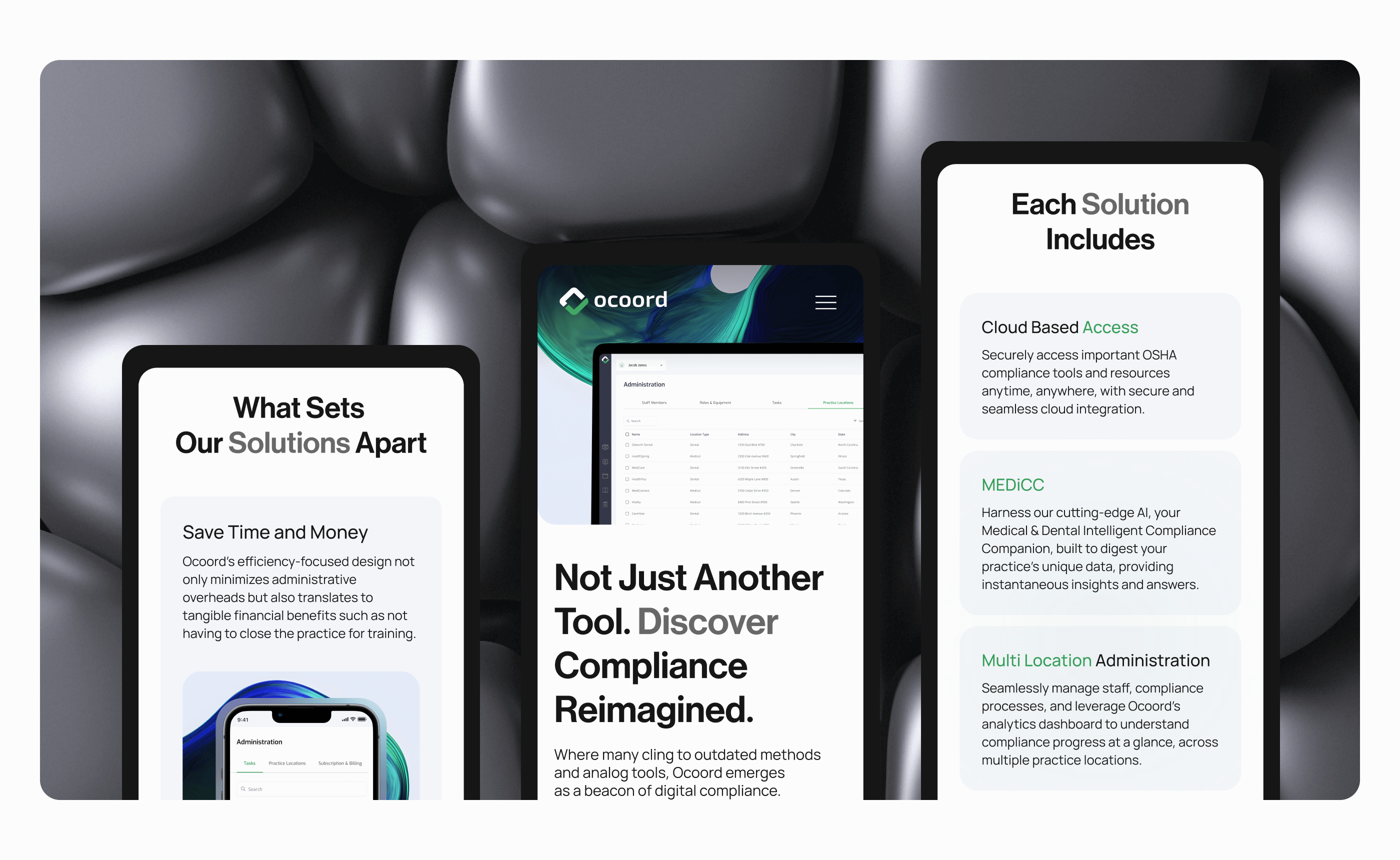
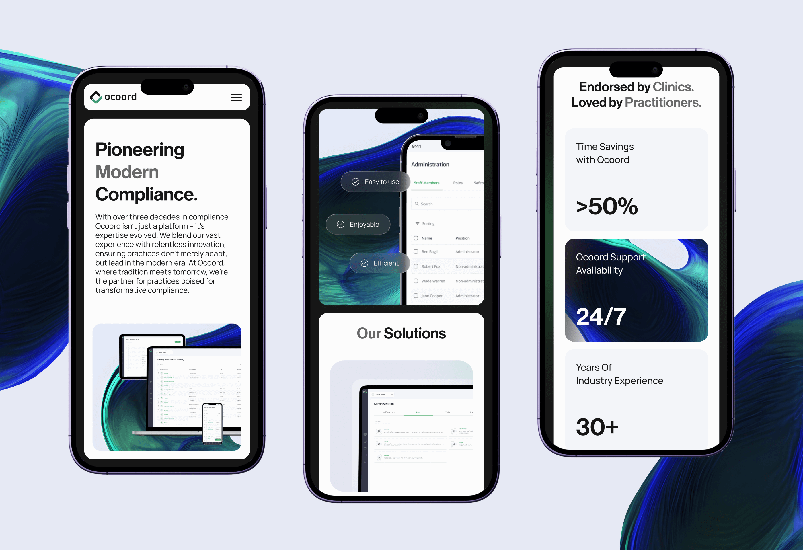
Mobile first, for real. Essential tasks were designed for a small screen from the start, then expanded for desktop.
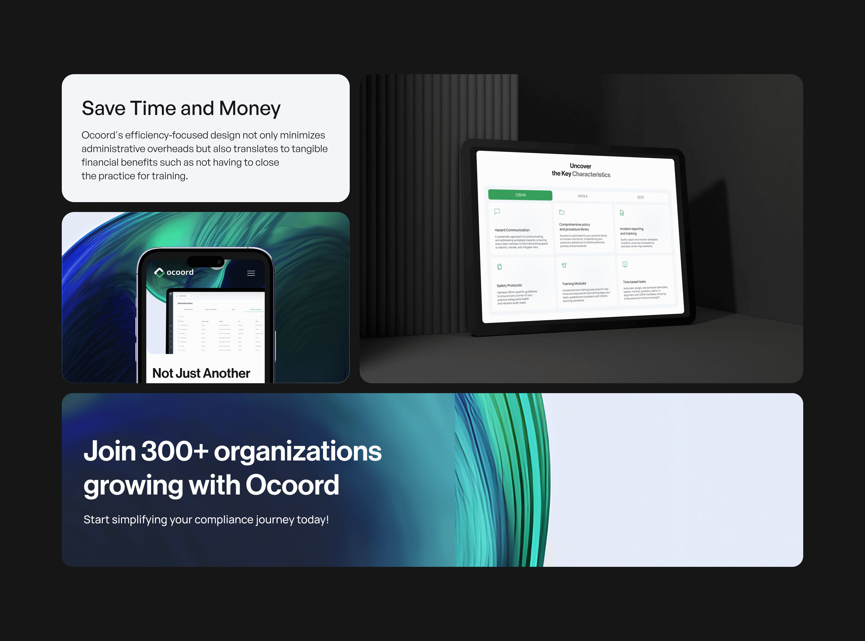
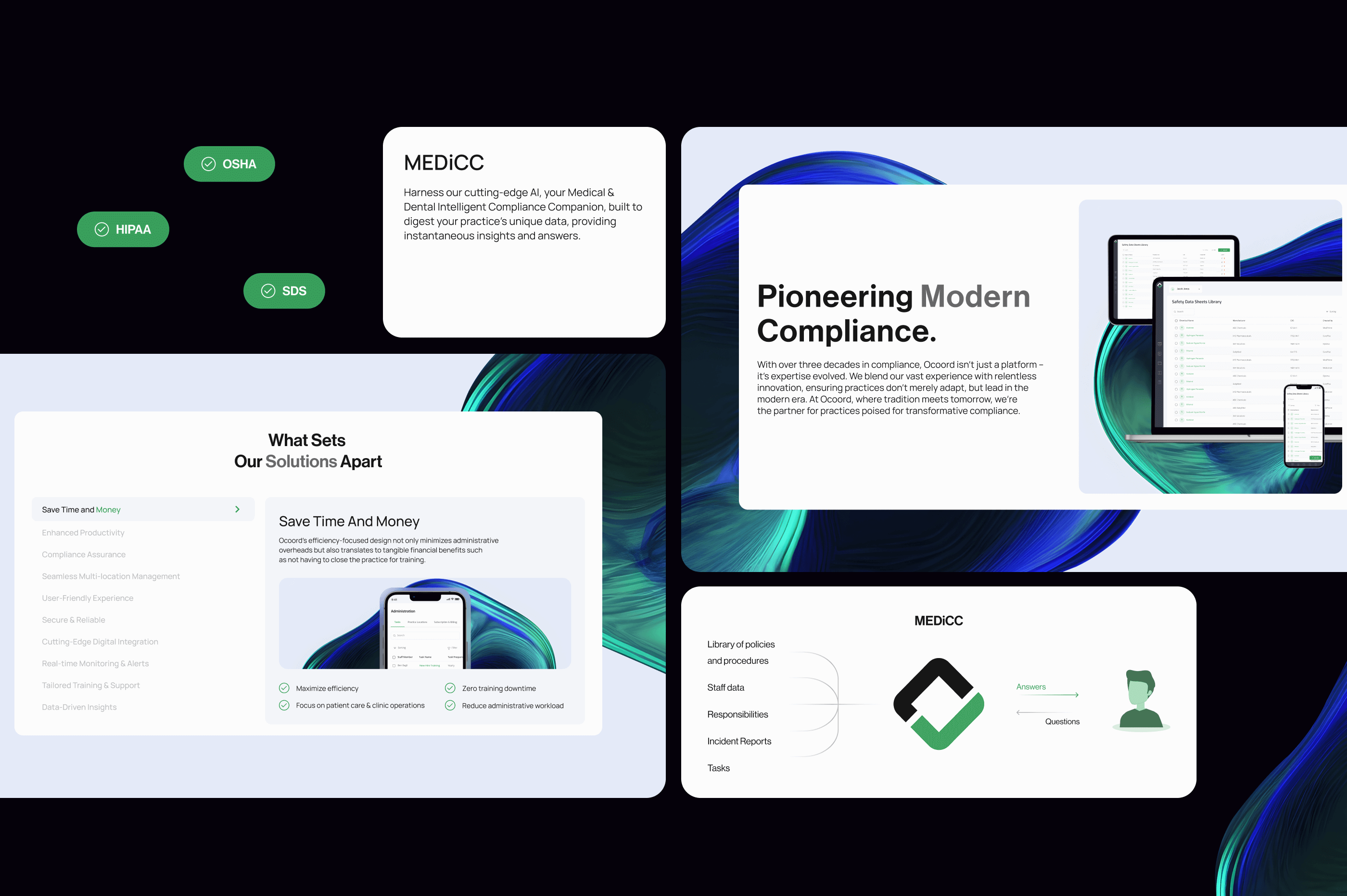
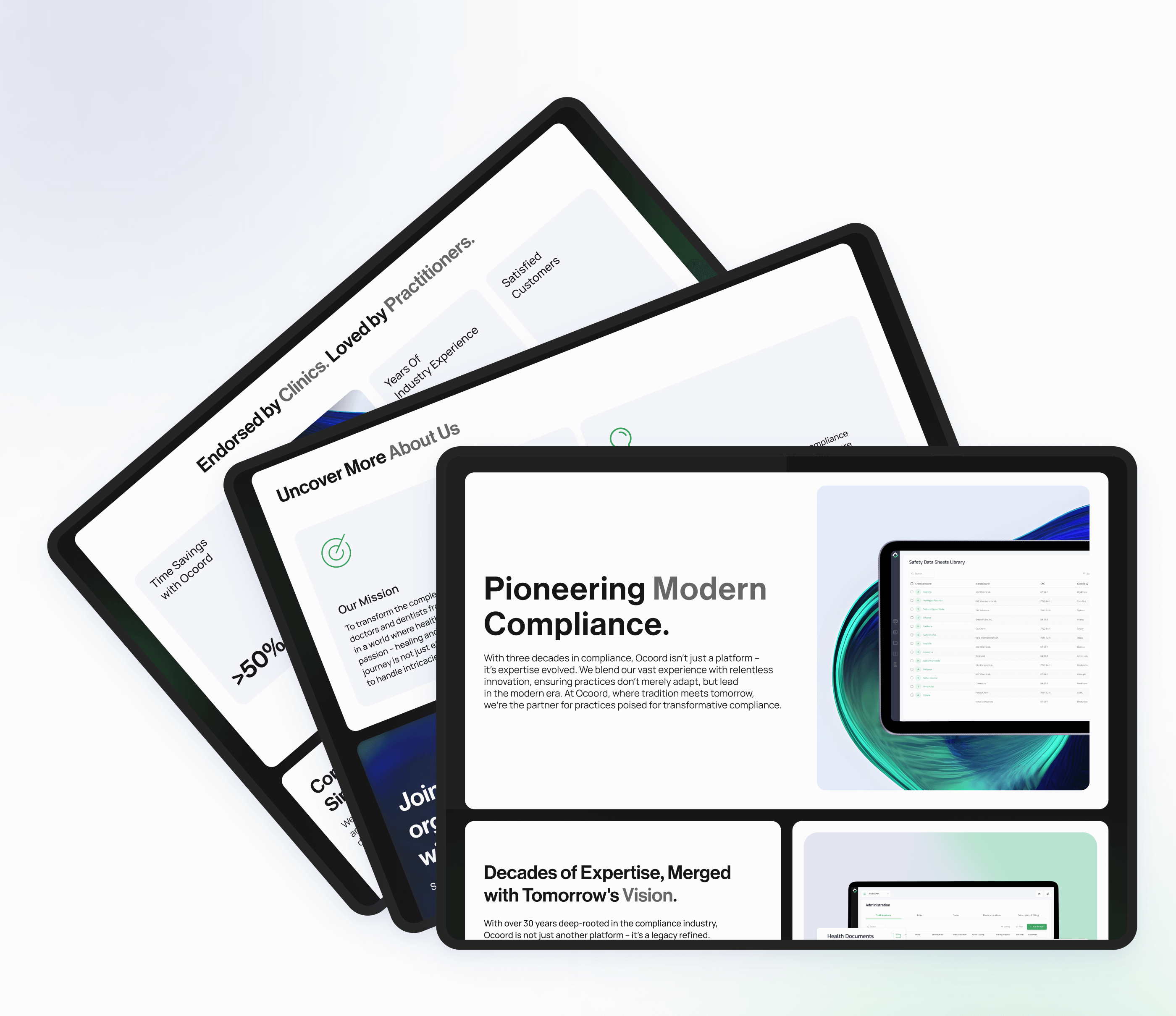
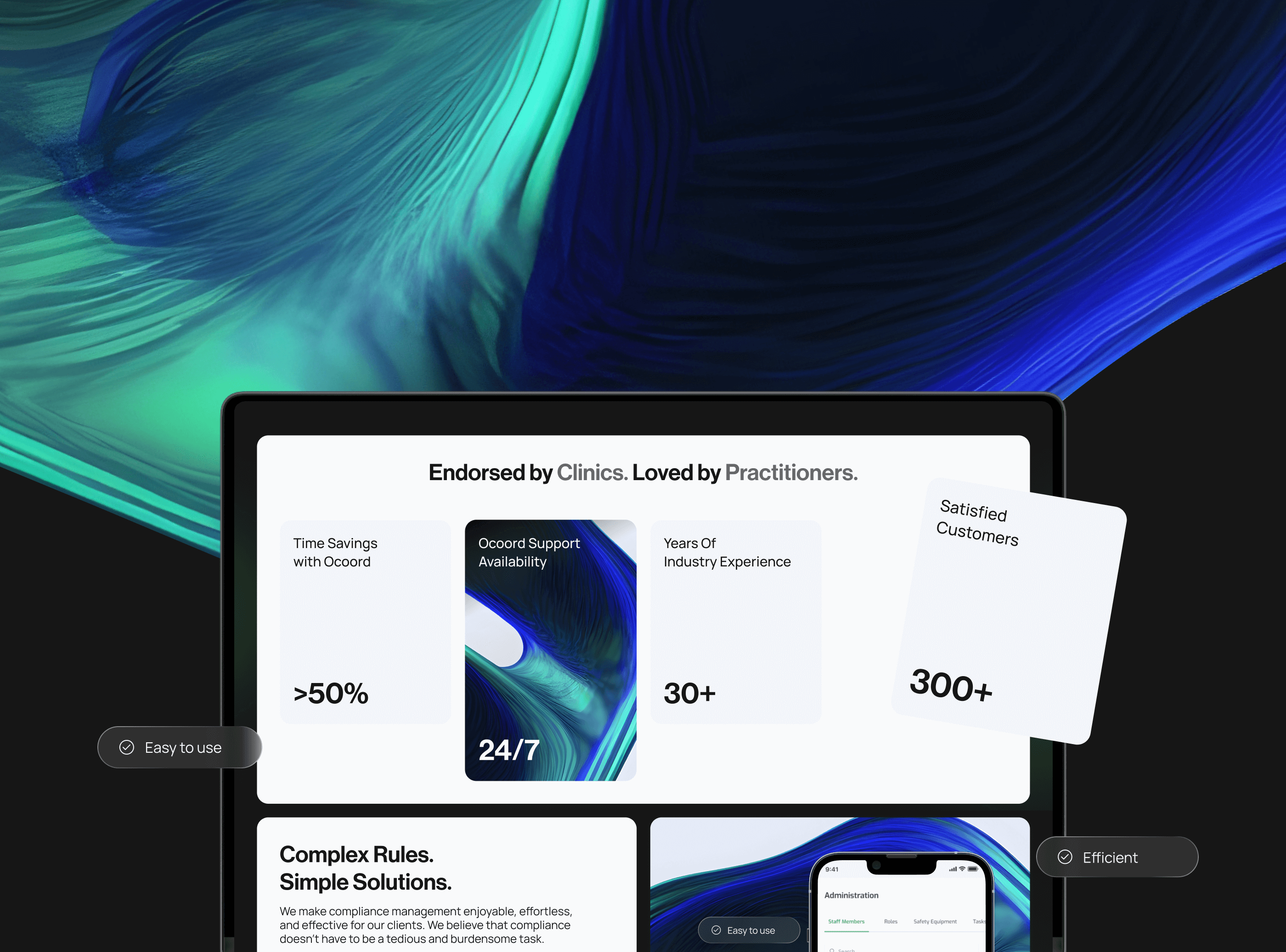
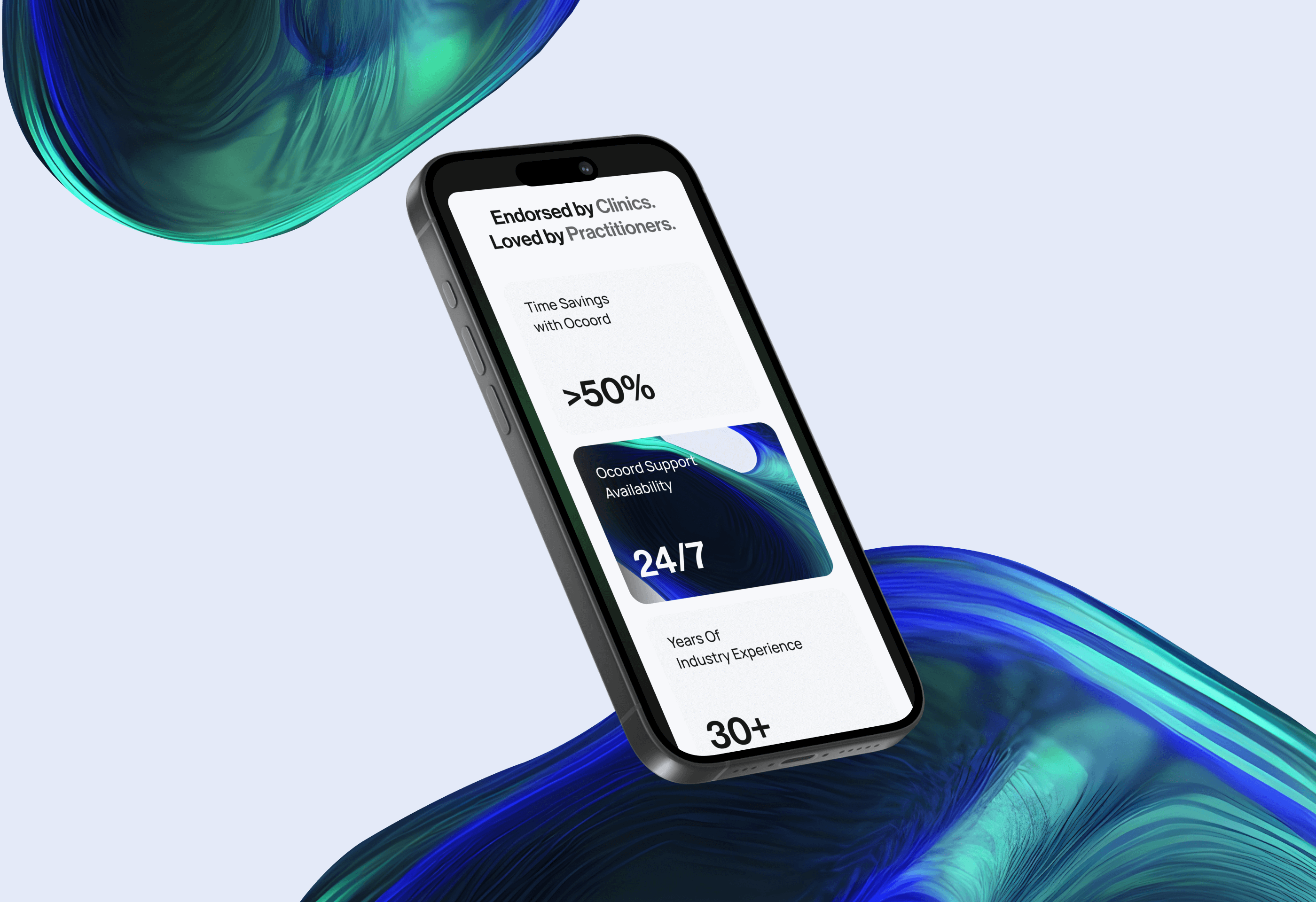
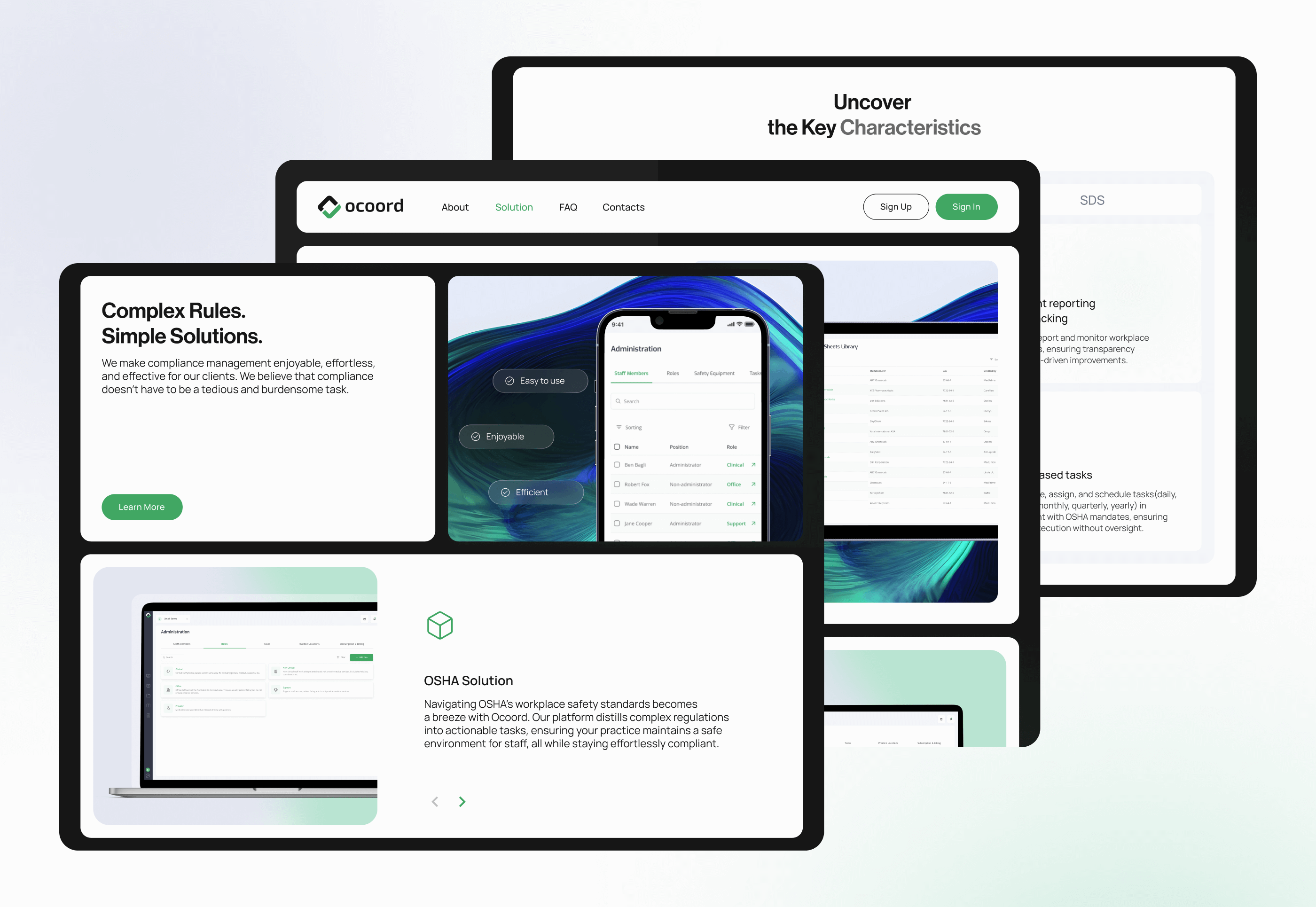
Let the marketing site carry proof, not adjectives. Left-aligned copy with product screens beside it, so a prospect sees the platform before reading about it. The numbers Ocoord could stand behind are prominent: more than 50% time savings, 24/7 support, 30+ years of industry experience, 300+ customers. Core tools get named and shown: MEDiCC, the AI assistant; the SDS library of more than 900,000 safety data sheets; CheckMate, the audit simulation; and the searchable policy library.
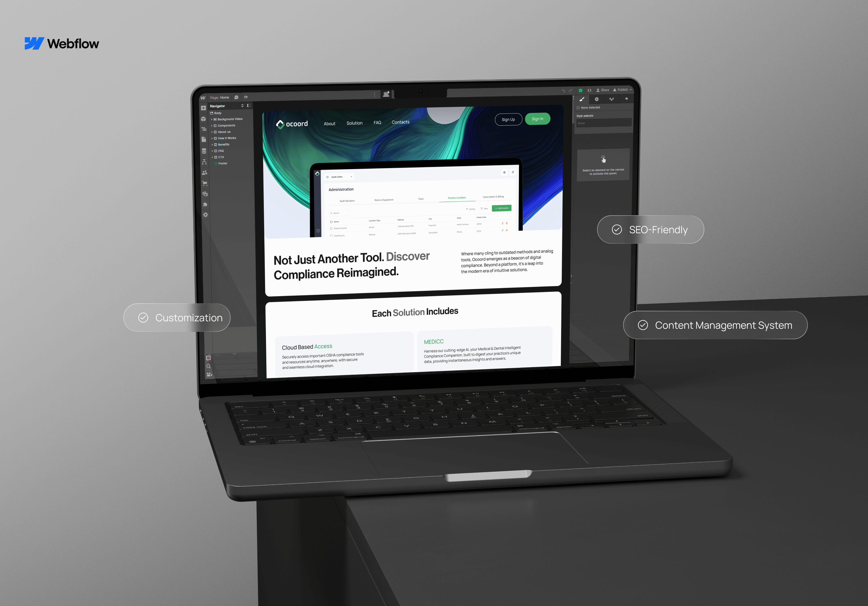
Build the site so the team can change it. We implemented the site in Webflow with a CMS, so Ocoord can iterate on messaging and add pages without a developer.
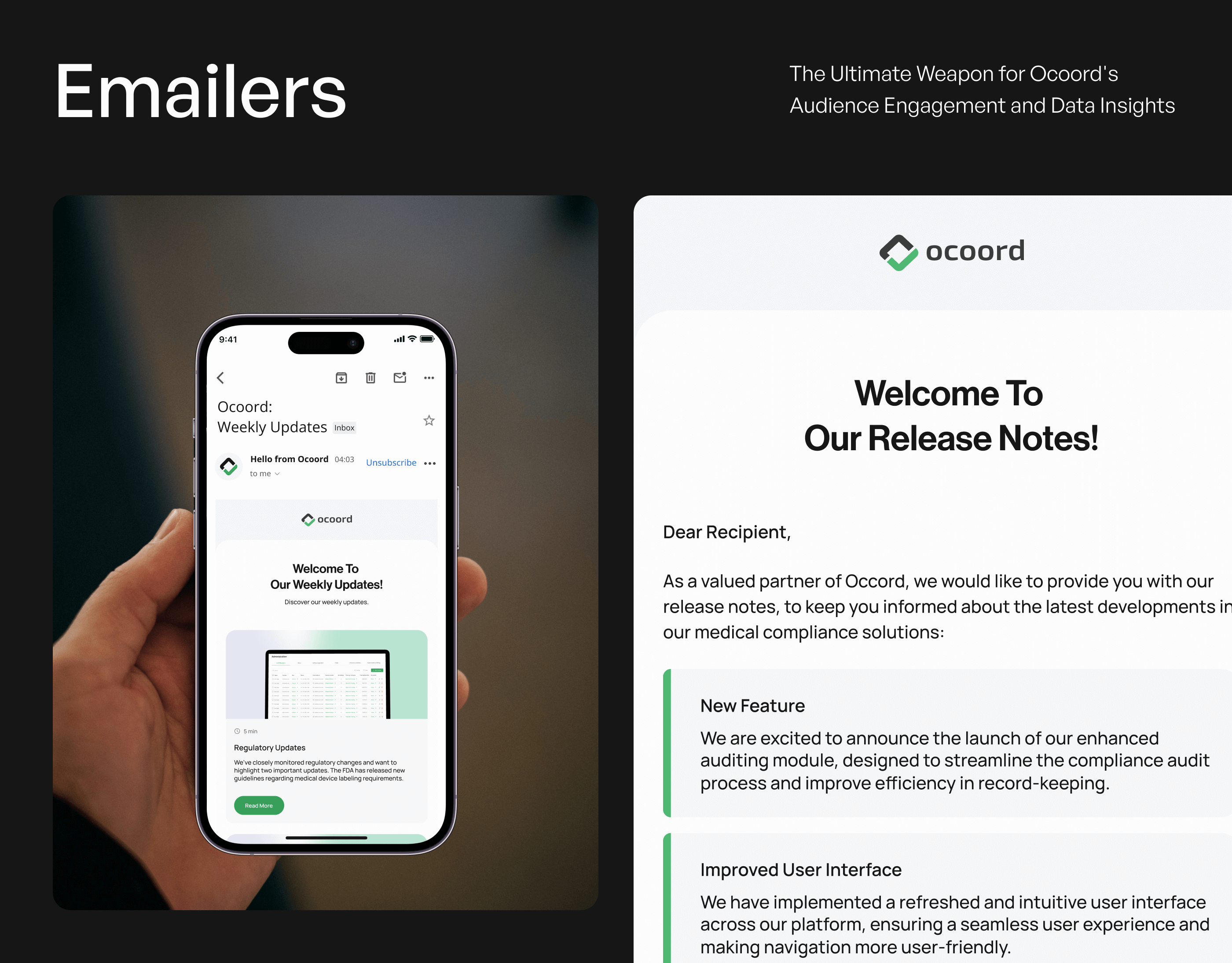
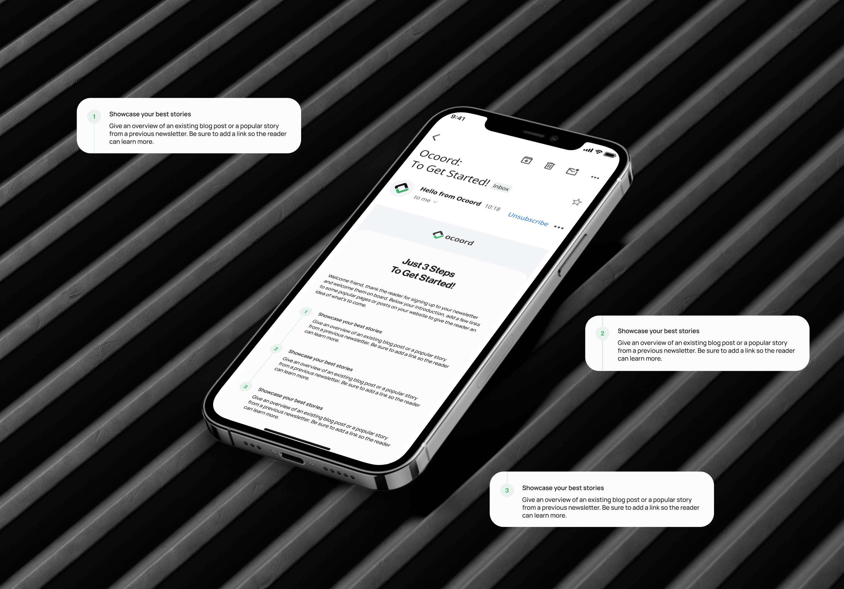
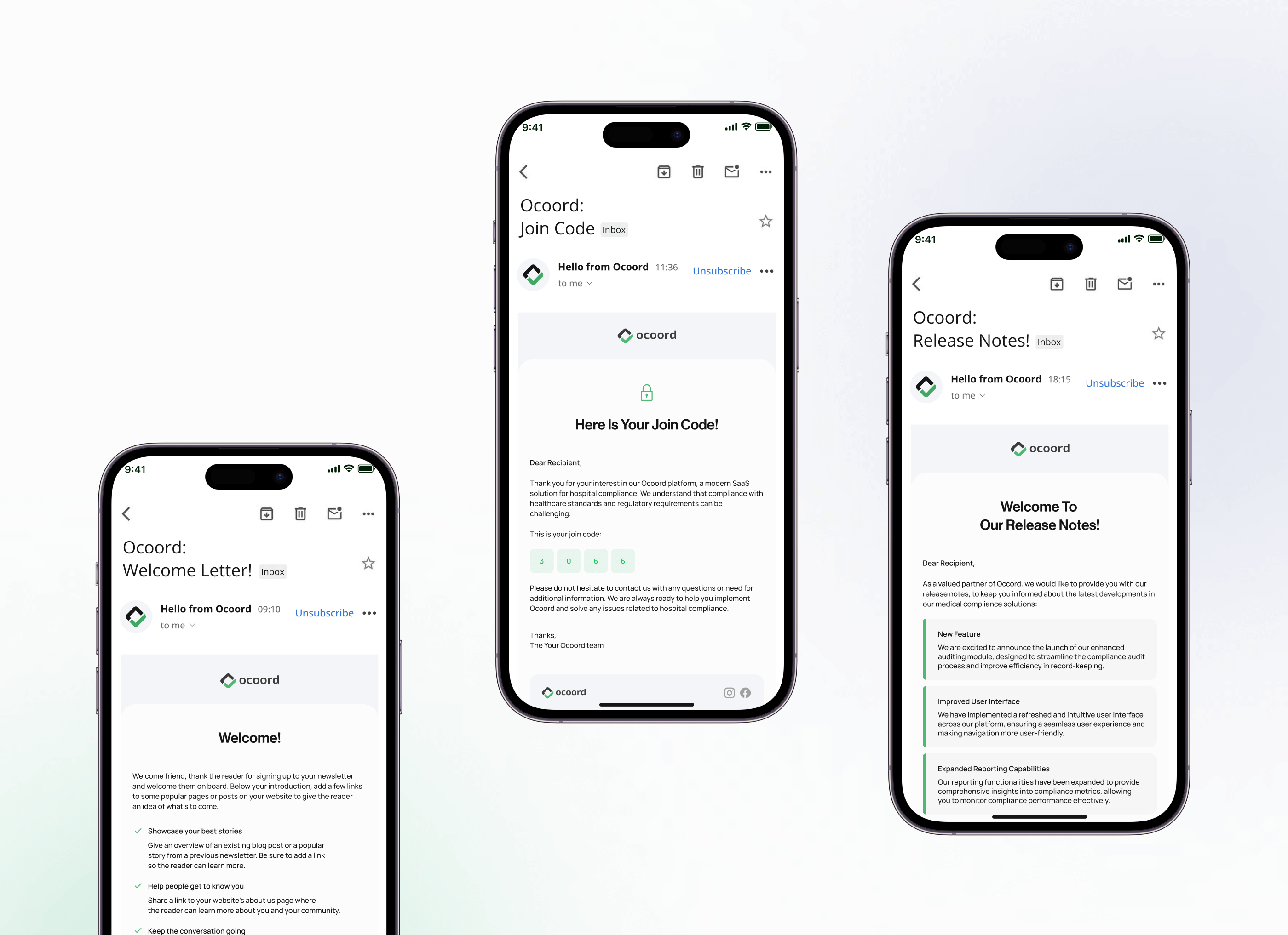
Keep the voice consistent after signup. Email design for onboarding and release notes follows the same system, so the product keeps sounding like the website.
Give a dry subject a face. Custom AI-generated illustrations make compliance feel approachable and set the brand apart visually.
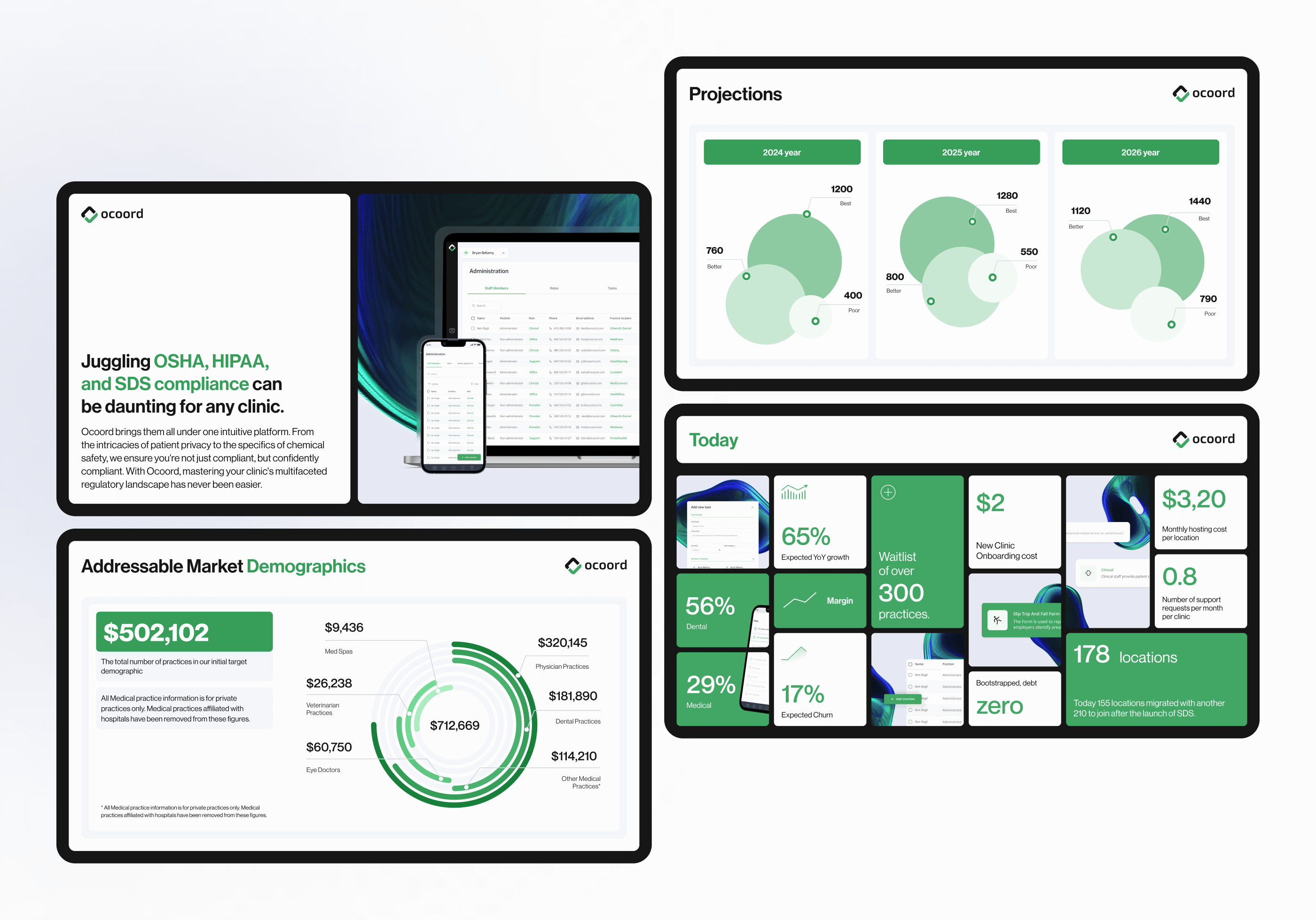
Tell the same story to investors. We turned the vision into a pitch deck so stakeholders could see the platform's potential in the same language as the product.
What it produced
- $500K raised in a pre-seed round
- +192% conversion rate on the marketing site
- +87% growth in monthly subscriptions
- 10,000+ practitioners guided through compliance tasks on the platform
- One design system across the SaaS product, the marketing site and email
- A Webflow site the team can update without a developer, and an investor deck in the same voice
What this looks like for your team
Regulated products succeed when the interface does the remembering. If your healthtech product still asks users to understand the rules before they can act, a Trial Week on the flow that generates the most support tickets will show what a guided version looks like.