Fintech Dashboard Design: Patterns That Work (And the Mistakes That Kill Retention)
How top fintech products structure their dashboards — data hierarchy, KPI layout, dark mode, and role-aware views. From Ramp, Mercury, Stripe, and Brex.

Key takeaways
- Dashboard hierarchy is a retention lever: users disengage when the default view doesn't answer their most important question fast enough.
- Apply the Role-Metric-Density-Action framework — lead with the one number that answers the primary user's first question.
- Calibrate density to user role: Ramp and Brex serve finance teams high-density views, while Mercury keeps founder banking minimal.
- Friction in high-stakes flows is a trust signal, and structural honesty like Wise's upfront fees beats decorative certification badges.
The fintech dashboard is the moment of truth.
It's the screen users see every time they open the product. It's where they decide — subconsciously, in the first few seconds — whether the product is worth their attention today. And it's where most fintech products fail not because of bad visual design, but because of wrong hierarchy.
A dashboard that opens on total transaction count is a dashboard designed for the product team, not the user. A dashboard that opens on current balance for a finance professional managing a $10M budget is a dashboard that misunderstands the job. A dashboard that shows the same view to a CFO, a founder, and a developer is a dashboard that treats all users as interchangeable — which they are not.
We analyzed five of the most-referenced fintech dashboards — Ramp, Mercury, Brex, Stripe, and Wise — through the lens of a single question: whose job does this dashboard make easier, and how?
The findings reinforce what we outlined in our broader fintech design analysis: the products that stand out aren't the most visually refined — they're the ones designed for a specific user's role and context.
Why Dashboard Design Is a Retention Problem, Not a Visual Problem
Research on financial management tools consistently shows that the primary reason users stop actively engaging with a product is not feature gaps — it's that the default view doesn't answer their most important question quickly enough. The product trained them that it takes effort to get to the useful information, so they stop making the effort.
This makes dashboard hierarchy a retention lever, not just a UX preference. And hierarchy decisions are almost entirely about user role.
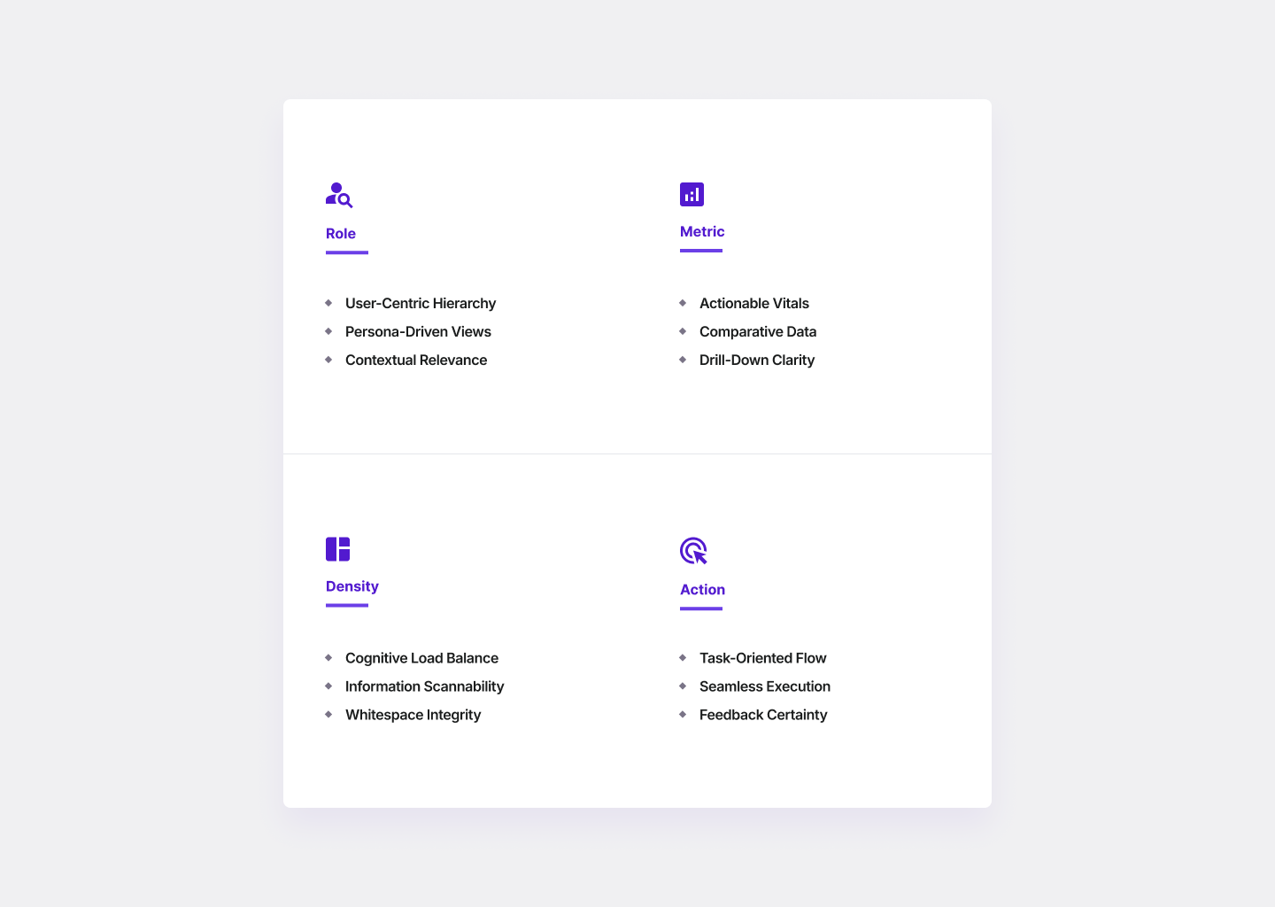
The Masterly Fintech Dashboard Framework
After analyzing fintech dashboards across spend management, banking, payments, and transfer products, we identified four decisions that determine whether a dashboard retains users or loses them:
Role — Who is the primary user, and what do they care about most?
Metric — What is the one number or status that answers the user's first question? This should dominate the dashboard hierarchy above everything else.
Density — How much information can the user process at once without cognitive overload?
Action — What is the primary action the dashboard should drive? The best fintech dashboards aren't just reports — they create a clear next step.
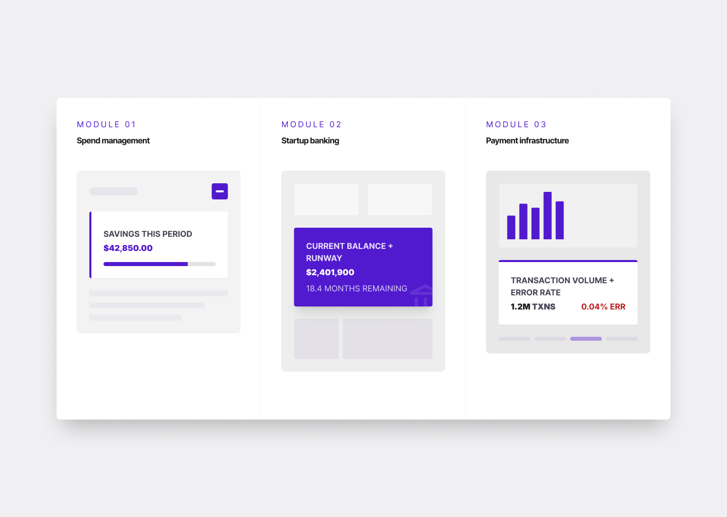
Ramp: Savings as the Primary Metric
Ramp's dashboard does something almost no other spend management product does: it leads with savings, not spend.
Most expense management tools open on transaction lists or budget summaries — useful reports, but passive. Ramp's dashboard opens on a savings number: how much the company saved this period versus prior spend. For a finance team whose job is to control and reduce expenditure, this is the most motivating possible opening screen.
After a 2024 expense-flow refresh, Ramp customers saw 20% of memos auto-suggested by AI, 33% faster transaction review, and 50% faster repayment of non-compliant spend.
Framework breakdown: Role: Finance team at a growth-stage company. Metric: Savings vs. prior period. Density: High. Action: Review flagged transactions, approve pending items.
Mercury: Clarity for Founders Who Aren't Bankers
Mercury's dashboard solves a different problem. The user is a founder in their first 18 months, managing their own banking. Their most important number is cash balance and implied runway — not transaction velocity or payment method breakdown.
Mercury's primary dashboard metric is current balance with a visible trend. Everything else is secondary. The navigation is shallow, the most important actions are always one tap away, and the product never makes the user feel like they need to understand banking to use it.
Framework breakdown: Role: Early-stage founder. Metric: Current balance + cash trend. Density: Low. Action: Check balance, initiate payment, review recent activity.
Brex: The Finance Operating System
Brex took a structurally different approach. Rather than optimizing for one user role, the product is built as a finance operating system that adapts to the org chart. The 2025 Spring Release introduced custom fields, custom roles, and a policy engine that lets finance teams bring their own HRIS or ERP data into Brex to automatically provision cards, set limits, and automate accounting rules.
This makes the Brex dashboard look less like a banking interface and more like an administrative console — because for a finance leader at a 500-person company, that's exactly what it needs to be.
Framework breakdown: Role: Finance leadership at mid-market companies. Metric: Policy compliance + spend vs. budget by department. Density: Very high. Action: Review exceptions, adjust policies, approve escalations.
Stripe: Infrastructure Designed for Inspection
Stripe's dashboard is designed for developers and technical finance teams who need to inspect, debug, and understand the behavior of a payment system. The primary metric is operational: transaction volume, success rate, and error breakdown.
Stripe earns trust through completeness — every log entry is actionable, every error code links to documentation, every transaction can be replicated and inspected. The mistake fintech products make when copying Stripe's dashboard: they adopt the visual language without adopting the logic. Event logs work in Stripe because every entry is linked to an API call a developer can replicate. Applied to a consumer or SMB product, the same format is noise formatted to look sophisticated.
Framework breakdown: Role: Developer or technical finance team. Metric: Transaction success rate + error breakdown. Density: Very high. Action: Investigate error, replicate failed transaction.
Wise: The Dashboard as a Trust Signal
Wise leads with pending transfers and their exact status — not balance. For a user sending money internationally, the most anxious moment is the period between initiating a transfer and seeing it confirmed. The Wise dashboard acknowledges this anxiety directly.
Wise's own design leadership described a rebrand process driven by the recognition that the company had "slowly started drowning in the sea of sameness." The differentiation they returned to was transparency — showing the numbers a competitor would hide, making the fee visible before commitment.
Framework breakdown: Role: Individual or SMB sending international transfers. Metric: Pending transfer status + fee transparency. Density: Low to medium. Action: Track active transfer, initiate new transfer.
The Four Most Common Fintech Dashboard Mistakes
1. Leading with the wrong primary metric. Showing total transaction count to a CFO. Showing account balance to a developer. The wrong metric as the hero signals immediately that the product doesn't understand the user's job.
2. Applying Stripe's density to non-technical users. Stripe's event log format is designed for developers. Applied to a small business owner or consumer user, the same format produces anxiety and confusion. Density is not a proxy for seriousness.
3. Treating all dashboard users as identical. Most products have multiple user types. Designing a single dashboard that serves all of them at 60% rather than serving the primary user at 100% is the most common mistake.
4. Eliminating friction from high-stakes flows. In high-stakes financial flows — large transfers, significant transactions, irreversible actions — friction is the trust signal. A final confirmation screen, a visible processing state, a clear warning — these aren't UX failures. They're what users need to feel the system is taking the action seriously.
Dashboard Design Checklist
Before finalizing any fintech dashboard design, these questions should have clear answers:
| Question | What a good answer looks like |
|---|---|
| Who is the primary user and what is their job? | Specific role + context, not "our users" |
| What question do they need answered first? | One specific question, validated with real users |
| What metric answers that question? | One number or status that dominates the hierarchy |
| What is the primary action the dashboard drives? | One clear next step that appears without searching |
| What is the appropriate density for this user? | Calibrated to role and frequency of use |
| Where are the high-stakes flows that need friction? | Explicitly mapped — not eliminated by default |
| What trust signals are structural vs. decorative? | Structural signals (fee transparency, status visibility) prioritized over badges |
What This Means for Fintech Product Teams
The pattern across all five products is consistent: the dashboards that retain users are not the most visually sophisticated — they're the most role-aware. If your fintech dashboard isn't retaining users the way you'd expect, a UX audit almost always reveals the same root cause: the hierarchy was designed around available data rather than around the user's job.
Want to Audit Your Fintech Dashboard?
Masterly works with fintech companies at Series A–D to audit, redesign, and test financial product interfaces — including dashboards, transaction flows, and onboarding. If your retention metrics are lower than your activation metrics, the dashboard is usually where the gap lives.
View our fintech design work or learn about our UX audit service.